Hi,
Please use our contact form next time:
www.hikashop.com/support/contact-us.html
I'm not the only one handling the support here and others don't have access to my PMs.
I've checked your link but I don't see the problem you're describing:
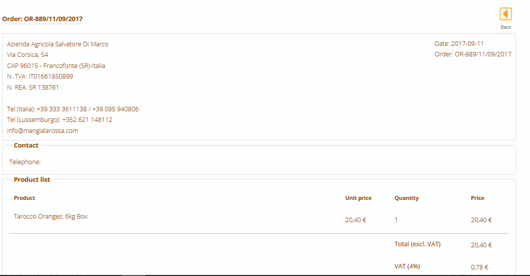
I just realized that now the product name and the unit price in the order table are not displayed and also the amount of Total (excl. VAT) is nil
Even in your screenshot (
www.hikashop.com/media/kunena/attachment...45/orderfrontend.PNG
) I do see the rpodut name, the unit price and the total amount.
So I don't understand what you mean.


 HIKASHOP ESSENTIAL 49,95€The basic version. With the main features for a little shop.
 HIKAMARKETAdd-on Create a multivendor platform. Enable many vendors on your website.
 HIKASERIALAdd-on Sale e-tickets, vouchers, gift certificates, serial numbers and more!
 MARKETPLACEPlugins, modules and other kinds of integrations for HikaShop
 HIKAAUCTION 40€Add-on Create auctions and let your customers bid for products.
 ACCESS THE CHECKOUTClick here to access the payment area

