

- Posts: 61
- Thank you received: 0
responsive template hikashop images not resizing
12 years 8 months ago #138608
by hsojhsoj
responsive template hikashop images not resizing was created by hsojhsoj
-- url of the page with the problem -- :
cepedabaseball.com/store/product/852-hoodie
-- HikaShop version -- : com_hikashop_business_2.2.3_2013-12-23.tar
-- Joomla version -- : 2.5.17
-- PHP version -- : 5.3.5
-- Browser(s) name and version -- : Version 31.0.1650.63
-- Error-message(debug-mod must be tuned on) -- : Error reporting is set to maximum and there is nothing to see
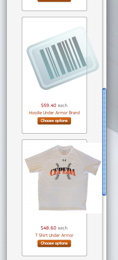
The template I am using is by rockettheme called Rt_chapelco, and it is responsive and using bootstrap. The images throughout the site change size automatically at the brows changes size but not in the hikashop store. I have enabled the Use bootstrap design radio button in the display tab of the configuration, is there something else I am missing? Why don't the images change size in the store section of the site?
cepedabaseball.com/store
-- HikaShop version -- : com_hikashop_business_2.2.3_2013-12-23.tar
-- Joomla version -- : 2.5.17
-- PHP version -- : 5.3.5
-- Browser(s) name and version -- : Version 31.0.1650.63
-- Error-message(debug-mod must be tuned on) -- : Error reporting is set to maximum and there is nothing to see
The template I am using is by rockettheme called Rt_chapelco, and it is responsive and using bootstrap. The images throughout the site change size automatically at the brows changes size but not in the hikashop store. I have enabled the Use bootstrap design radio button in the display tab of the configuration, is there something else I am missing? Why don't the images change size in the store section of the site?
cepedabaseball.com/store
Please Log in or Create an account to join the conversation.

12 years 8 months ago #138670
by Xavier
Replied by Xavier on topic responsive template hikashop images not resizing
Hi,
The given urls are not correct, it gives me 404 errors.
Thanks to look with your browser console the html code to see if the image size in forced in px.
If it's the case, you can use css properties to override that and set it in %.
hikashop.com/support/153.html
The given urls are not correct, it gives me 404 errors.
Thanks to look with your browser console the html code to see if the image size in forced in px.
If it's the case, you can use css properties to override that and set it in %.
hikashop.com/support/153.html
Please Log in or Create an account to join the conversation.
12 years 8 months ago #138738
by hsojhsoj
Replied by hsojhsoj on topic responsive template hikashop images not resizing
i turned the menu items off after i did not hear back for a while. They are on now.
Please Log in or Create an account to join the conversation.
12 years 8 months ago #138807
by Xavier
Replied by Xavier on topic responsive template hikashop images not resizing
Hi,
Thanks to try the following css property in your template file or in the hikashop frontend css file:
Thanks to try the following css property in your template file or in the hikashop frontend css file:
Code:
.hikashop_product_image_subdiv{ width: auto !important; }
Please Log in or Create an account to join the conversation.
Less
More
- Posts: 32
- Thank you received: 0
9 years 6 months ago #264569
by Tuscan Triangle
Replied by Tuscan Triangle on topic responsive template hikashop images not resizing
Hi all,
I actually have this exact issue and the CSS change suggested hasn't worked. Responsiveness is so important.
How can I fix this?
Thanks
I actually have this exact issue and the CSS change suggested hasn't worked. Responsiveness is so important.
How can I fix this?
Thanks
Please Log in or Create an account to join the conversation.

9 years 6 months ago #264574
by nicolas
Replied by nicolas on topic responsive template hikashop images not resizing
Hi,
Please provide a link to the page with the issue so that we can see what you're talking about.
Please provide a link to the page with the issue so that we can see what you're talking about.
Please Log in or Create an account to join the conversation.
Less
More
- Posts: 32
- Thank you received: 0
9 years 6 months ago #264662
by Tuscan Triangle
Replied by Tuscan Triangle on topic responsive template hikashop images not resizing
The problem is on a product page:
www.stsdrapes.co.uk/shop-online/product/8-black-bolton-twill
As the page gets narrower the pricing and add to cart button overlaps the image for some time until it eventually moves to underneath the image. This happens on my mobile in a horizontal position.
On a mobile in the vertical position, the image goes off the right hand side of the screen because the width hasn't resized.
Thanks
www.stsdrapes.co.uk/shop-online/product/8-black-bolton-twill
As the page gets narrower the pricing and add to cart button overlaps the image for some time until it eventually moves to underneath the image. This happens on my mobile in a horizontal position.
On a mobile in the vertical position, the image goes off the right hand side of the screen because the width hasn't resized.
Thanks
Please Log in or Create an account to join the conversation.

Less
More
- Posts: 12953
- Thank you received: 1778
9 years 6 months ago #264669
by Mohamed Thelji
Replied by Mohamed Thelji on topic responsive template hikashop images not resizing
Hello,
In your case the solution will probably be to directly use some CSS code like media queries :
In your case the solution will probably be to directly use some CSS code like media queries :
You can do the modifications in the frontend css file via the menu Configuration > Display > CSS
Use the @media tags to change the width of the columns when the width of the page is less than xx.
ex:
@media (min-width: 992px)
.hkc-md-4 {
width: 33.33333333%;
}
Here is some documentation about the layout customization:
www.hikashop.com/support/documentation/1...ize-the-display.html
Please Log in or Create an account to join the conversation.
Less
More
- Posts: 32
- Thank you received: 0
9 years 6 months ago #264858
by Tuscan Triangle
Replied by Tuscan Triangle on topic responsive template hikashop images not resizing
Thanks Mohamed, I was hoping that those sorts of changed wouldn't be required.
,Responsiveness is so important these days how come this isn't part of Hikashop? We're in a 'mobile first' era .
Thanks
,Responsiveness is so important these days how come this isn't part of Hikashop? We're in a 'mobile first' era .
Thanks
Please Log in or Create an account to join the conversation.

9 years 6 months ago - 9 years 6 months ago #264865
by Philip
Replied by Philip on topic responsive template hikashop images not resizing
Hello,
You're right responsiveness is an important criteria for modern e-shop, and in mine mind HikaShop integretaed this specification.
So, can you check in your Item Menu configuration, if you have some image size configuration ?
In Menus => Main Menu, and select your concerned listing, then go in Products Options tab :
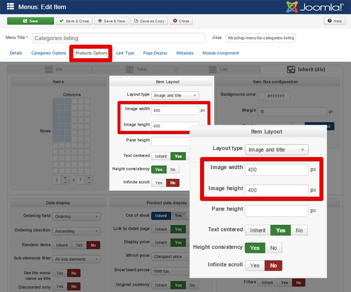
Here, if you have some size configuration that will "break" HikaShop responsiveness, and so maybe add Css order won't be required.
Awaiting news from you.
Regards
You're right responsiveness is an important criteria for modern e-shop, and in mine mind HikaShop integretaed this specification.
So, can you check in your Item Menu configuration, if you have some image size configuration ?
In Menus => Main Menu, and select your concerned listing, then go in Products Options tab :
Here, if you have some size configuration that will "break" HikaShop responsiveness, and so maybe add Css order won't be required.
Awaiting news from you.
Regards
Last edit: 9 years 6 months ago by Philip.
Please Log in or Create an account to join the conversation.
Less
More
- Posts: 32
- Thank you received: 0
9 years 6 months ago #264986
by Tuscan Triangle
Replied by Tuscan Triangle on topic responsive template hikashop images not resizing
Thanks so much for your detailed response. Both of those size boxes are empty. I have noticed, though, that there is an element style applied to the image which is setting the width manually - I must have missed that before. I'll track that down, get rid of it and get back to you.
Thanks.
Thanks.
Please Log in or Create an account to join the conversation.
Less
More
- Posts: 32
- Thank you received: 0
9 years 6 months ago #264994
by Tuscan Triangle
Replied by Tuscan Triangle on topic responsive template hikashop images not resizing
This line seems to be thew problem:
<div style="position:relative;text-align:center;clear:both;<?php if(!empty($divWidth)){ echo 'width:'.$divWidth.'px;'; } ?>margin: auto;" class="hikashop_product_main_image_subdiv">
it's in product/show_block_img. This file was still the original according to Hikashop.
I have removed the section about width but it actually doesn't make any difference to the front end when viewed on mobile.
<div style="position:relative;text-align:center;clear:both;<?php if(!empty($divWidth)){ echo 'width:'.$divWidth.'px;'; } ?>margin: auto;" class="hikashop_product_main_image_subdiv">
it's in product/show_block_img. This file was still the original according to Hikashop.
I have removed the section about width but it actually doesn't make any difference to the front end when viewed on mobile.
Please Log in or Create an account to join the conversation.

9 years 6 months ago #265015
by Jerome
Jerome - Obsidev.com
HikaMarket & HikaSerial developer / HikaShop core dev team.
Also helping the HikaShop support team when having some time or couldn't sleep.
By the way, do not send me private message, use the "contact us" form instead.
Replied by Jerome on topic responsive template hikashop images not resizing
Hello,
Specifying a width on an element is not problematic knowing that responsive rules will add something to the "max-width" so if the image is too big for the device, the max-width will "override" the width.
Regards,
Specifying a width on an element is not problematic knowing that responsive rules will add something to the "max-width" so if the image is too big for the device, the max-width will "override" the width.
Regards,
Jerome - Obsidev.com
HikaMarket & HikaSerial developer / HikaShop core dev team.
Also helping the HikaShop support team when having some time or couldn't sleep.
By the way, do not send me private message, use the "contact us" form instead.
Please Log in or Create an account to join the conversation.
Time to create page: 0.284 seconds