Responsive template image sizes

  • Posts: 43
  • Thank you received: 1
11 years 4 months ago #82113

I'm trying to make my Hikashop product images behave with my responsive template but I understand that HS 2.0 is not yet fully responsive? In case it helps someone else, I have solved a couple of problems but still have one I need help with please.

I fixed the problem of the product display page right part being overlapped by my main product image in the left part by forcing the right part onto a separate line for screens below a certain size. I inserted this code in the frontend CSS and now the product options and add to cart button etc move underneath the main image, which looks OK:

@media only screen and (max-width: 640px) {
.hikashop_product_left_part{
width:100%
}

On my category product listing pages my thumbnail images were expanding out of their containers and overlapping each other at smaller screen sizes because I had increased the general thumbnail size to 175px in the configuration display. So this is not really a fix but I solved my issue by reverting back to thumbnails of 100px.

My remaining problem is that on my main category pages I want the image thumbnail sizes to be bigger at 200px (there are six categories currently displayed in 3 columns 2 rows). However, in smaller screen sizes, although the photos get smaller, the image containers have a big white space between the photo and the bottom bottom of the container box (see attached). It would maybe be OK if I could force the display for mobile screens to show just 2 columns instead of 3? Can anyone tell me the code to make that happen please? Or offer an alternative solution to remove the white space just on these pages?

Thanks!

Attachments:

Please Log in or Create an account to join the conversation.

  • Posts: 26008
  • Thank you received: 4004
  • MODERATOR
11 years 4 months ago #82404

Hi,

We introduced in HikaShop 2.0 some responsive rules in order to be compatible with the new philosophy of Joomla 3.0
We made some tests of our views for classical uses.

The product listing use the image thumbnail height in the div. It means that 175px would be allocate for the image height.
But the responsive listing would automatically resize the image because there is too few width. So, it generates the blank height.
If you removed the forced height, at this moment, your cells could not have the same size (if your images does not have the same ratio). It could break your design.

The idea could be to change screen rules, in order to switch from the columns mode to the row mode before the "smartphone" size.

@media (max-width: 767px) {

Regards,


Jerome - Obsidev.com
HikaMarket & HikaSerial developer / HikaShop core dev team.

Also helping the HikaShop support team when having some time or couldn't sleep.
By the way, do not send me private message, use the "contact us" form instead.

Please Log in or Create an account to join the conversation.

  • Posts: 43
  • Thank you received: 1
11 years 4 months ago #82590

Thanks, I think that's one option, but I'm not clear on your instructions on how to do this. Where do I type that code please? If I show in 1 or 2 columns then it looks OK on the smallest screen sizes, but what I really want to do is to have the border box (div??) and image margins resize to fit the image.

Please Log in or Create an account to join the conversation.

  • Posts: 26008
  • Thank you received: 4004
  • MODERATOR
11 years 4 months ago #82620

Hi,

If think that, if you remove the thumbnail height option (set it to "0"), your problem would be solve.
With just have the thumbnail width, HikaShop would not set the height in the HTML so the responsive design would be better.

Regards,


Jerome - Obsidev.com
HikaMarket & HikaSerial developer / HikaShop core dev team.

Also helping the HikaShop support team when having some time or couldn't sleep.
By the way, do not send me private message, use the "contact us" form instead.
The following user(s) said Thank You: mhunter, yfrolov

Please Log in or Create an account to join the conversation.

  • Posts: 43
  • Thank you received: 1
11 years 4 months ago #82621

Thanks, Jerome, that didn't work, but I have just before you responded found a solution that works for me to display the page in a single column for small screen sizes only. In my front-end CSS I added the following (where 132 and 112 are the ID numbers of my menu and module for the categories I have displayed):

@media only screen and (max-width: 640px) {
#hikashop_category_information_menu_132 div.hikashop_category, #hikashop_category_information_module_112 div.hikashop_category {
width: 100% !important;
}

Not sure if that's the best solution but it seems to work OK for now.

Please Log in or Create an account to join the conversation.

  • Posts: 26008
  • Thank you received: 4004
  • MODERATOR
11 years 4 months ago #82761

Hi,

I will made some test in some local J3 websites and see if this fix works fine for everyone.
If so, your patch would be added directly in HikaShop.

Regards,


Jerome - Obsidev.com
HikaMarket & HikaSerial developer / HikaShop core dev team.

Also helping the HikaShop support team when having some time or couldn't sleep.
By the way, do not send me private message, use the "contact us" form instead.

Please Log in or Create an account to join the conversation.

  • Posts: 8
  • Thank you received: 2
10 years 5 months ago #133730

Hi!
I have the same problem, but the solution doesn't work for me. I inserted the code into frontend_custom.css, but nothing happens.
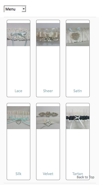
Could you tell me, how to fix the img width exactly? I have 170px pictures both for categories and products.

I attached 2 pics. First is showing the problem, huge space below category/product-images.
Second shows the code. If I change the "170px" with Firebug to "auto", everything works fine, also in smartphone-size!

So the only question is: how can I change this permanently? The 170px are produced via php-file in "/components/com_hikashop/views/category/tmpl/"
Where can I cange the fixed height into a simple "auto"?

Thanks, Michael

Attachments:

Please Log in or Create an account to join the conversation.

  • Posts: 81540
  • Thank you received: 13071
  • MODERATOR
10 years 5 months ago #133749

Look at the CSS code proposed by mhunter:
@media only screen and (max-width: 640px) {
#hikashop_category_information_menu_132 div.hikashop_category, #hikashop_category_information_module_112 div.hikashop_category {
width: 100% !important;
}

That code will only apply to the hikashop_category div if the id of the module displaying it is 112. So you need to change the id in the CSS if you want it to apply to your module/menu.

Regarding the height, you can always override it with the !important CSS trick like that:
hikashop_category_image{ height: auto! important; }

The following user(s) said Thank You: mandrael

Please Log in or Create an account to join the conversation.

  • Posts: 8
  • Thank you received: 2
10 years 5 months ago #133780

Hi nicolas & mhunter!
Thanks; for me it works this way:
(i added the following lines into frontend_custom)

@media only screen and (max-width: 640px) {
#hikashop_category_information_menu_104 div.hikashop_category {
width: 100% !important;}
#hikashop_category_information_menu_104 div.hikashop_product{
width: 50% !important;}
#hikashop_category_information_menu_104 div.hikashop_subcontainer{padding-top: 10px;}
} 
.hikashop_category_image{height: auto !important;} 
.hikashop_product_image{height: auto !important;}

Michael

Last edit: 10 years 5 months ago by mandrael.

Please Log in or Create an account to join the conversation.

Time to create page: 0.084 seconds
Powered by Kunena Forum