
Responsive display of variants list

12 years 8 months ago - 12 years 8 months ago #140353
by iedwards
Responsive display of variants list was created by iedwards
-- url of the page with the problem -- :currently ofline
-- HikaShop version -- :HikaShop Business: 2.2.3
-- Joomla version -- : 3.2.1
-- PHP version -- : 5.3.1
-- Browser(s) name and version -- : Firefox 26
-- Error-message(debug-mod must be tuned on) -- : none
When I fist evaluated Hikashop I am sure that when I displayed product variants as a list the results appeared as a table but then collapsed to a column on smaller screens. Now I have developed much of the site I find this doesn't work anymore and in fact the variants table (class="hikashop_variants_table" generated by show_block_characteristics.php) doesn't scale lower than 1175px wide (see screenshot).
Examining the css with firebug the table width is set to 100%
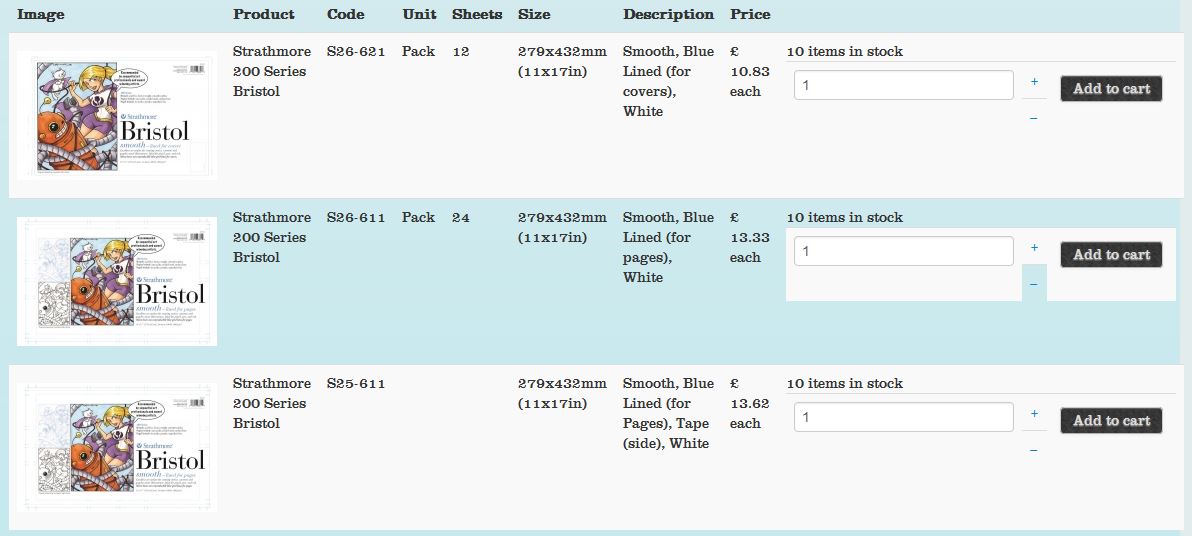
I have done several re-installs, upgrades (including upgrading Joomla from 3.1.0 to 3.2.1) and changed quite a few settings since initial evaluation. I am about to code a custom version of show_block_characteristics.php to behave as I need but thought it worth asking is there anything obvious that I should have done to make this table responsive, and should it behave as I describe as I can't see how it could possibly have worked originally.
Many thanks,
Ian
-- HikaShop version -- :HikaShop Business: 2.2.3
-- Joomla version -- : 3.2.1
-- PHP version -- : 5.3.1
-- Browser(s) name and version -- : Firefox 26
-- Error-message(debug-mod must be tuned on) -- : none
When I fist evaluated Hikashop I am sure that when I displayed product variants as a list the results appeared as a table but then collapsed to a column on smaller screens. Now I have developed much of the site I find this doesn't work anymore and in fact the variants table (class="hikashop_variants_table" generated by show_block_characteristics.php) doesn't scale lower than 1175px wide (see screenshot).
Examining the css with firebug the table width is set to 100%
I have done several re-installs, upgrades (including upgrading Joomla from 3.1.0 to 3.2.1) and changed quite a few settings since initial evaluation. I am about to code a custom version of show_block_characteristics.php to behave as I need but thought it worth asking is there anything obvious that I should have done to make this table responsive, and should it behave as I describe as I can't see how it could possibly have worked originally.
Many thanks,
Ian
Last edit: 12 years 8 months ago by iedwards.
Please Log in or Create an account to join the conversation.

12 years 8 months ago #140399
by nicolas
Replied by nicolas on topic Responsive display of variants list
There is indeed that CSS
in the frontend CSS file of HikaShop which adapts the variants listing to small devices. It should still be the case unless the CSS has been removed, or that the HTML of the listing has been altered.
Code:
@media
only screen and (max-width: 760px),
(min-device-width: 768px) and (max-device-width: 1024px) {
/* Force table to not be like tables anymore */
table.hikashop_variants_table, table.hikashop_variants_table thead.hikashop_variants_table_thead, table.hikashop_variants_table tbody.hikashop_variants_table_tbody, table.hikashop_variants_table th.hikashop_variants_table_th, table.hikashop_variants_table td.hikashop_variants_table_td, table.hikashop_variants_table tr.hikashop_variants_table_tbody_tr, table.hikashop_variants_table tr.hikashop_variants_table_thead_tr {
display: block;
}
/* Hide table headers (but not display: none;, for accessibility) */
table.hikashop_variants_table thead.hikashop_variants_table_thead tr.hikashop_variants_table_thead_tr {
position: absolute;
top: -9999px;
left: -9999px;
}
table.hikashop_variants_table tr.hikashop_variants_table_thead_tr,table.hikashop_variants_table tr.hikashop_variants_table_tbody_tr { border: 1px solid #ccc; }
table.hikashop_variants_table td.hikashop_variants_table_td {
/* Behave like a "row" */
border: none;
border-bottom: 1px solid #eee;
position: relative;
padding-left: 30%;
}
table.hikashop_variants_table td.hikashop_variants_table_td:before {
/* Now like a table header */
position: absolute;
/* Top/left values mimic padding */
top: 6px;
left: 6px;
width: 25%;
padding-right: 10px;
white-space: nowrap;
}
/*
Label the data
*/
table.hikashop_variants_table td.hikashop_variants_table_td:before { content: attr(data-label); }
}
The following user(s) said Thank You: iedwards
Please Log in or Create an account to join the conversation.
12 years 8 months ago #140422
by iedwards
Replied by iedwards on topic Responsive display of variants list
Thank you Nicolas, that is exactly what I was looking for.
Ian
Ian
Please Log in or Create an account to join the conversation.
10 years 7 months ago #229286
by alevogel
Replied by alevogel on topic Responsive display of variants list
Hello
I didn't manage to get the variants responsive, e.g.:
shop.pogo.dog/index.php/halsbaender-aus-...1-halsband-snowflake
on iPhone > the variants dropdown list is too wide. I tried copying the code below into my custom fronted css – it didn't help. Is there any other solution?
Alexandra
I didn't manage to get the variants responsive, e.g.:
shop.pogo.dog/index.php/halsbaender-aus-...1-halsband-snowflake
on iPhone > the variants dropdown list is too wide. I tried copying the code below into my custom fronted css – it didn't help. Is there any other solution?
Alexandra
Please Log in or Create an account to join the conversation.
10 years 7 months ago - 10 years 7 months ago #229309
by EnerW
Replied by EnerW on topic Responsive display of variants list
Could you just at below css to the end of your frontend custom css file, it should just fit.
It will change this page layout as well: shop.pogo.dog/index.php/halsbaender-aus-...7-filz-mit-stickerei
@media all and (max-width: 479px)
{
.hikashop_submodules {
margin-left: -15px;
}
.hikashop_product.hikashop_product_column_1.hikashop_product_row_1 {
width: 100% !important;
}
.hikashop_product.hikashop_product_column_2.hikashop_product_row_1 {
width: 100% !important;
}
.hikashop_product_left_part {
width: 100% !important;
}
.hikashop_product_right_part {
width: 100%;
}
.hikashop_product_name > a {
font-size: 25px;
}
a.hikashop_cart_button, a.hikashop_compare_button, .hikashop_cart_input_button {
font-size: 12px !important;
}
.hikashop_product_characteristics {
font-size: 12px;
margin-left: -15px;
}
.chzn-container.chzn-container-single.chzn-container-single-nosearch {
width: auto !important;
}
.chzn-single > span {
font-size: 12px !important;}
}
Regards, Rene
It will change this page layout as well: shop.pogo.dog/index.php/halsbaender-aus-...7-filz-mit-stickerei
@media all and (max-width: 479px)
{
.hikashop_submodules {
margin-left: -15px;
}
.hikashop_product.hikashop_product_column_1.hikashop_product_row_1 {
width: 100% !important;
}
.hikashop_product.hikashop_product_column_2.hikashop_product_row_1 {
width: 100% !important;
}
.hikashop_product_left_part {
width: 100% !important;
}
.hikashop_product_right_part {
width: 100%;
}
.hikashop_product_name > a {
font-size: 25px;
}
a.hikashop_cart_button, a.hikashop_compare_button, .hikashop_cart_input_button {
font-size: 12px !important;
}
.hikashop_product_characteristics {
font-size: 12px;
margin-left: -15px;
}
.chzn-container.chzn-container-single.chzn-container-single-nosearch {
width: auto !important;
}
.chzn-single > span {
font-size: 12px !important;}
}
Regards, Rene
Last edit: 10 years 7 months ago by EnerW.
The following user(s) said Thank You: alevogel
Please Log in or Create an account to join the conversation.
10 years 7 months ago #229341
by alevogel
Replied by alevogel on topic Responsive display of variants list
Works perfect – thank you.
Alexandra
Alexandra
Please Log in or Create an account to join the conversation.
10 years 7 months ago #229379
by EnerW
Replied by EnerW on topic Responsive display of variants list
Hi Alexandra,
I see that you have actually 2 columns and 2 rows on this page: shop.pogo.dog/index.php/halsbaender-aus-...7-filz-mit-stickerei
So it would make sense to add them as well to the css, just add them below the row_1 declaration.
.hikashop_product.hikashop_product_column_1.hikashop_product_row_2 {
width: 100% !important;
}
.hikashop_product.hikashop_product_column_2.hikashop_product_row_2 {
width: 100% !important;
}
I see that you have actually 2 columns and 2 rows on this page: shop.pogo.dog/index.php/halsbaender-aus-...7-filz-mit-stickerei
So it would make sense to add them as well to the css, just add them below the row_1 declaration.
.hikashop_product.hikashop_product_column_1.hikashop_product_row_2 {
width: 100% !important;
}
.hikashop_product.hikashop_product_column_2.hikashop_product_row_2 {
width: 100% !important;
}
Please Log in or Create an account to join the conversation.
Time to create page: 0.231 seconds