

- Posts: 155
- Thank you received: 4
Responsive add to card button
12 years 6 months ago #149591
by Cattelan
Responsive add to card button was created by Cattelan
Hallo
I made a responsive template for my site but i ge still problems with the add to cart button. Please look here:
www.ilmondodiwit.com/shop/gioielli.html On the smart phone the get out of the size
Anybody could give me a hint?
Thanks for your attention and reply
I made a responsive template for my site but i ge still problems with the add to cart button. Please look here:
www.ilmondodiwit.com/shop/gioielli.html On the smart phone the get out of the size
Anybody could give me a hint?
Thanks for your attention and reply
Please Log in or Create an account to join the conversation.

Less
More
- Posts: 12953
- Thank you received: 1778
12 years 6 months ago #149596
by Mohamed Thelji
Replied by Mohamed Thelji on topic Responsive add to card button
Hello,
Firstly, can you show the problem that you are having through some screenshots so that I can directly test it through your website ?
Thank you.
Firstly, can you show the problem that you are having through some screenshots so that I can directly test it through your website ?
Thank you.
Please Log in or Create an account to join the conversation.
12 years 6 months ago #149639
by Cattelan
Replied by Cattelan on topic Responsive add to card button
Thanks for your reply.
Maybe you went on the site when i switched off the template , sorry.
Here is the screenshot
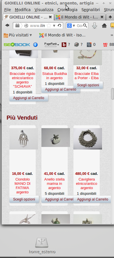
the images and the buttons don't change like they should. i leave switched on the template all day.
Thanks again for your interest
Maybe you went on the site when i switched off the template , sorry.
Here is the screenshot
the images and the buttons don't change like they should. i leave switched on the template all day.
Thanks again for your interest
Please Log in or Create an account to join the conversation.
12 years 6 months ago #149697
by Cattelan
Replied by Cattelan on topic Responsive add to card button
up
Please Log in or Create an account to join the conversation.
Less
More
- Posts: 12953
- Thank you received: 1778
12 years 6 months ago #149646
by Mohamed Thelji
Replied by Mohamed Thelji on topic Responsive add to card button
Hi,
I think that a solution can be to use Media queries through your CSS file to resize your add to cart button regarding your window size, here is a thread where you'll find an example :
I think that a solution can be to use Media queries through your CSS file to resize your add to cart button regarding your window size, here is a thread where you'll find an example :
You can do the modifications in the frontend css file via the menu Configuration > Display > CSS
Use the @media tags to change the width of the columns when the width of the page is less than xx.
ex:
@media (max-width: 767px) {
.hikashop_products .row-fluid .span4 { width: 49% !important;}
}
Here is some documentation about the layout customization:
www.hikashop.com/support/documentation/1...ize-the-display.html
The following user(s) said Thank You: Cattelan
Please Log in or Create an account to join the conversation.
12 years 6 months ago #149825
by Cattelan
Replied by Cattelan on topic Responsive add to card button
THX forma tour reply. I'll try And come back
Please Log in or Create an account to join the conversation.
12 years 6 months ago #149848
by Cattelan
Replied by Cattelan on topic Responsive add to card button
couldn't get it work
Please Log in or Create an account to join the conversation.

12 years 6 months ago #149854
by nicolas
Replied by nicolas on topic Responsive add to card button
That was just an example provided by Mohamed. In your case, it should be:
@media (max-width: 767px) {
.hikashop_product { width: 49% !important;}
}
I would invite you to learn CSS and read the documentation link of Mohamed to be able to do these kin of simple CSS customizations yourself.
@media (max-width: 767px) {
.hikashop_product { width: 49% !important;}
}
I would invite you to learn CSS and read the documentation link of Mohamed to be able to do these kin of simple CSS customizations yourself.
Please Log in or Create an account to join the conversation.
Time to create page: 0.220 seconds