Hello,
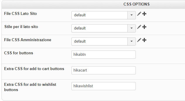
Why don't you use the frontend default.css, in order to get the Css responsive command(@media), to finally add it in your custom frontend css ?
For this switch your frontend css, reproduce phone or else resolution, and use your navigator inspector tool (right-click on your responsive html elements)
this will allow you to see and copy paste, the
required command, for this look for Css
@media command.
Note that if you pass
on the css command your inspector tool will give you the
file line (see the red arrow)
Then edit your custom frontend css.
Hope this will help you.
Regards


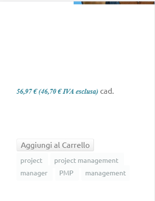
 HIKASHOP ESSENTIAL 49,95€The basic version. With the main features for a little shop.
 HIKAMARKETAdd-on Create a multivendor platform. Enable many vendors on your website.
 HIKASERIALAdd-on Sale e-tickets, vouchers, gift certificates, serial numbers and more!
 MARKETPLACEPlugins, modules and other kinds of integrations for HikaShop
 HIKAAUCTION 40€Add-on Create auctions and let your customers bid for products.
 ACCESS THE CHECKOUTClick here to access the payment area


")

