

- Posts: 31
- Thank you received: 0
How can I make Yootheme Aurora responsive on mobil
11 years 3 months ago #204537
by bigchumpy
How can I make Yootheme Aurora responsive on mobil was created by bigchumpy
-- HikaShop version -- : HikaShop [1504301217]
-- Joomla version -- : 3.X
-- PHP version -- : not sure
-- Browser(s) name and version -- : Chrome
On the desktop, the 2 columns in the products category appear fine, but do not change with the mobile phone. How can this be corrected?
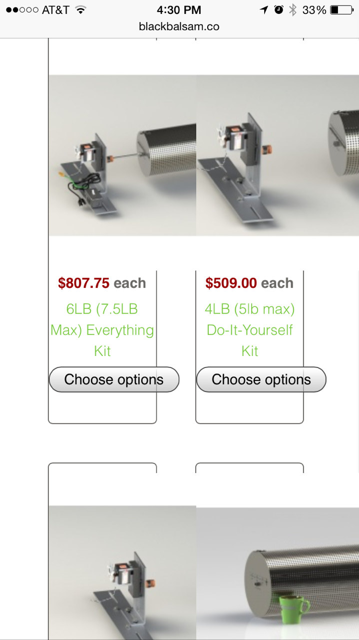
Thanks
-- Joomla version -- : 3.X
-- PHP version -- : not sure
-- Browser(s) name and version -- : Chrome
On the desktop, the 2 columns in the products category appear fine, but do not change with the mobile phone. How can this be corrected?
Thanks
Please Log in or Create an account to join the conversation.

11 years 3 months ago #204540
by Jerome
Jerome - Obsidev.com
HikaMarket & HikaSerial developer / HikaShop core dev team.
Replied by Jerome on topic How can I make Yootheme Aurora responsive on mobil
Hi,
Generally for responsive ; we recommend to activate the "bootstrap design" in HikaShop but it requires a template which is compatible with bootstrap 2.
And I don't know how the Aurora template from Yootheme is working ; best will be to ask them.
Regards,
Generally for responsive ; we recommend to activate the "bootstrap design" in HikaShop but it requires a template which is compatible with bootstrap 2.
And I don't know how the Aurora template from Yootheme is working ; best will be to ask them.
Regards,
Jerome - Obsidev.com
HikaMarket & HikaSerial developer / HikaShop core dev team.
Please Log in or Create an account to join the conversation.
11 years 3 months ago #204610
by bigchumpy
Replied by bigchumpy on topic How can I make Yootheme Aurora responsive on mobil
Jerome, many thanks for the response. Inside the Aurora template it does indicate "Disable bootstrap" don't know if it's bootstrap 2 though. Where can I find this "activate bootstrap design " in Hika? Spend 15 minutes looking for it and I don't see it anywhere.
Thanks
Shane
Thanks
Shane
Please Log in or Create an account to join the conversation.
11 years 3 months ago #204611
by bigchumpy
Replied by bigchumpy on topic How can I make Yootheme Aurora responsive on mobil
Sorry...just found it.
System-Configuration-Display
Thanks All
Shane
System-Configuration-Display
Thanks All
Shane
Please Log in or Create an account to join the conversation.
Time to create page: 0.159 seconds