

- Posts: 80
- Thank you received: 0
Product listing layout
9 years 1 month ago #276666
by idimarco
Product listing layout was created by idimarco
-- url of the page with the problem -- :
www.mangialarossa.com/index.php/en/shop
-- HikaShop version -- : HikaShop Essential 3.1.1 [1707230940]
-- Joomla version -- : 3.7.5
-- PHP version -- : 7.0.17
-- Browser(s) name and version -- : Firefox
Hi,
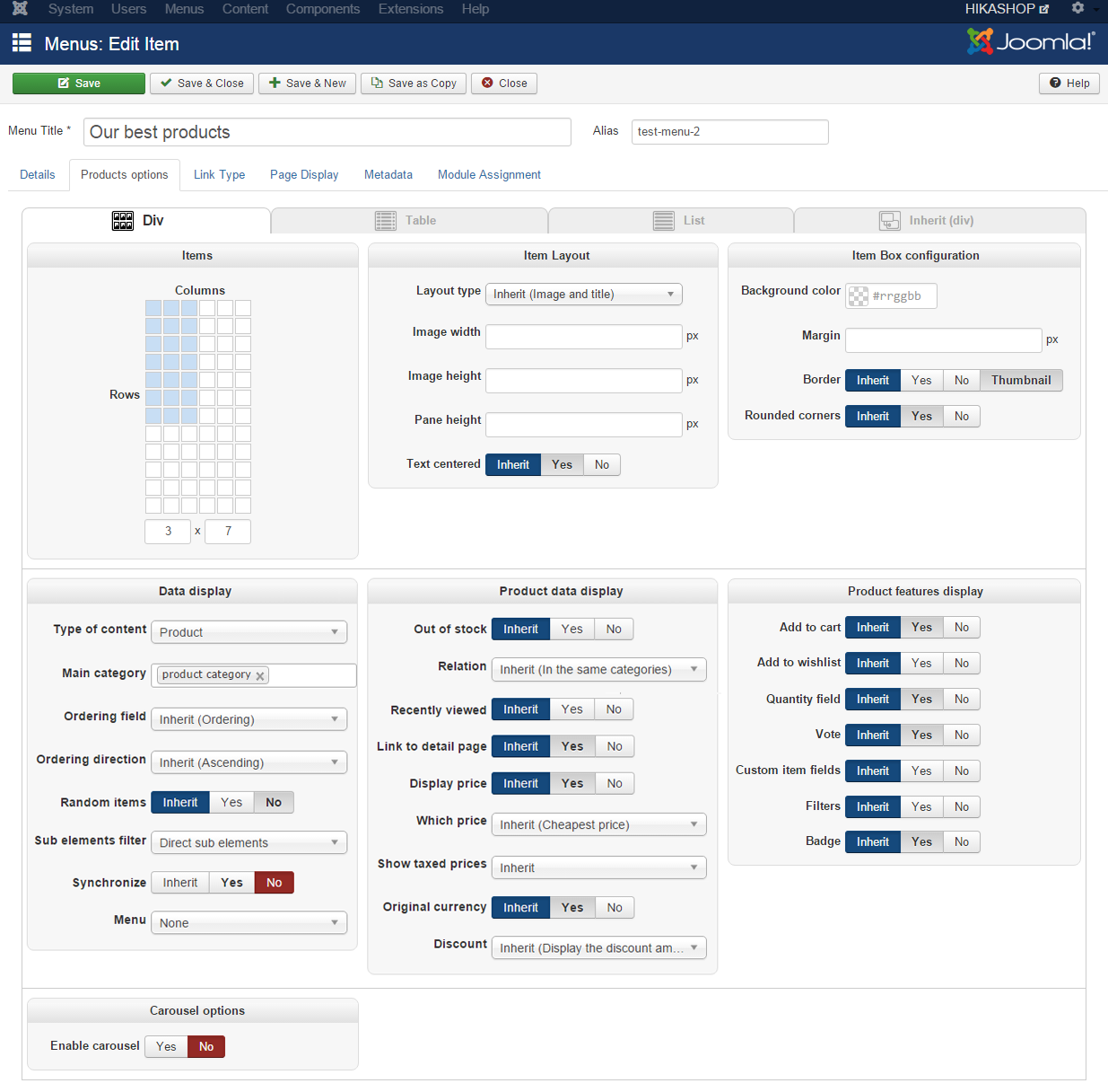
I would like to have the product listing page showing in 3 colons (products grouped by categories). The current configuration in Hikashop is in the attachments. What is wrong? Why do I still see products in 5 colons?
Thanks
Imma
-- HikaShop version -- : HikaShop Essential 3.1.1 [1707230940]
-- Joomla version -- : 3.7.5
-- PHP version -- : 7.0.17
-- Browser(s) name and version -- : Firefox
Hi,
I would like to have the product listing page showing in 3 colons (products grouped by categories). The current configuration in Hikashop is in the attachments. What is wrong? Why do I still see products in 5 colons?
Thanks
Imma
Please Log in or Create an account to join the conversation.

9 years 1 month ago #276688
by nicolas
Replied by nicolas on topic Product listing layout
Hi,
In your second screenshot, I see that you're looking at the default number of columns setting, which is used to set the default value when you create new HikaShop content module instances.
The setting that controls the number of columns once the module is created can be found directly under the "HikaShop options" tab of your module:
www.hikashop.com/images/stories/tutorial...u_item/Modules24.png
In your second screenshot, I see that you're looking at the default number of columns setting, which is used to set the default value when you create new HikaShop content module instances.
The setting that controls the number of columns once the module is created can be found directly under the "HikaShop options" tab of your module:
www.hikashop.com/images/stories/tutorial...u_item/Modules24.png
Please Log in or Create an account to join the conversation.
9 years 1 month ago #276755
by idimarco
Replied by idimarco on topic Product listing layout
Hi Nicolas,
in Products listing menu, I set to 3 columns but still is not working. What is wrong in configuration I attached?
Thanks
in Products listing menu, I set to 3 columns but still is not working. What is wrong in configuration I attached?
Thanks
Please Log in or Create an account to join the conversation.
9 years 1 month ago #276777
by nicolas
Replied by nicolas on topic Product listing layout
Hi,
On the link you gave, the products listing is generated by the menu item with the id 194 :
monosnap.com/file/yQhguDfSEtwYuiG6RaibpySGiIWjXA
So please make sure that you're looking at the settings of the menu item with that id in your Joomla menu manager.
Also, try saving these settings once to make sure that the data in the database for these settings is correct.
Also, clear any cache you might have configured on your Joomla website as otherwise, you might be looking at a page generated before you changed the number of columns of the menu item.
If that still doesn't help, all I can think that's left is to switch to the default template of Joomla and check if the listing has the correct number of columns. It might be that your template has view overrides of Joomla which force the display of the listing in 5 columns regardless of how the menu item is configured.
On the link you gave, the products listing is generated by the menu item with the id 194 :
monosnap.com/file/yQhguDfSEtwYuiG6RaibpySGiIWjXA
So please make sure that you're looking at the settings of the menu item with that id in your Joomla menu manager.
Also, try saving these settings once to make sure that the data in the database for these settings is correct.
Also, clear any cache you might have configured on your Joomla website as otherwise, you might be looking at a page generated before you changed the number of columns of the menu item.
If that still doesn't help, all I can think that's left is to switch to the default template of Joomla and check if the listing has the correct number of columns. It might be that your template has view overrides of Joomla which force the display of the listing in 5 columns regardless of how the menu item is configured.
Please Log in or Create an account to join the conversation.
9 years 1 month ago #276842
by idimarco
Replied by idimarco on topic Product listing layout
Thanks a lot Nicolas. Your help has been precious. I fixed the problem.
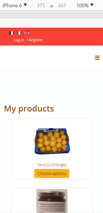
Just one more question: if I open the same page on mobile device, the image for the product 'Tarocco orange marmalade' is a bit larger than the others.
Is there the possibility to have images all the same dimensions?
On PC desktop the page looks fine.
Thanks
Just one more question: if I open the same page on mobile device, the image for the product 'Tarocco orange marmalade' is a bit larger than the others.
Is there the possibility to have images all the same dimensions?
On PC desktop the page looks fine.
Thanks
Please Log in or Create an account to join the conversation.
9 years 1 month ago #276848
by nicolas
Replied by nicolas on topic Product listing layout
Hi,
The issue is the way your template switch between responsive and non responsive display.
Add that CSS and that will counter act that:
The issue is the way your template switch between responsive and non responsive display.
Add that CSS and that will counter act that:
Code:
@media (max-width: 996px){
.hkc-md-4 {
width: 100% !important;
}
}
Please Log in or Create an account to join the conversation.
9 years 1 month ago #277135
by idimarco
Replied by idimarco on topic Product listing layout
Hi
The same problem is on page www.mangialarossa.com/index.php/en/shop/checkout
It looks bad on mobile device while good on Computer desktop.
Should I use the same CSS code above?
Thanks
The same problem is on page www.mangialarossa.com/index.php/en/shop/checkout
It looks bad on mobile device while good on Computer desktop.
Should I use the same CSS code above?
Thanks
Please Log in or Create an account to join the conversation.
9 years 1 month ago #277148
by nicolas
Replied by nicolas on topic Product listing layout
Hi,
That issue with the cart information displaying not properly on the checkout comes from the CSS:
on your website.
It's probably added to the page by your template, but I can't say precisely as you're using JcHoptimize which prevent me from seeing which specific CSS file that CSS comes from. But usually it's the template doing that so you'll have to remove that bit of CSS from the template and it will display properly.
That issue with the cart information displaying not properly on the checkout comes from the CSS:
Code:
.table>tbody>tr>td, .table>tbody>tr>th, .table>tfoot>tr>td, .table>tfoot>tr>th, .table>thead>tr>td, .table>thead>tr>th {
padding: 8px;
line-height: 1.42857143;
vertical-align: top;
border-top: 1px solid #ddd;
}
It's probably added to the page by your template, but I can't say precisely as you're using JcHoptimize which prevent me from seeing which specific CSS file that CSS comes from. But usually it's the template doing that so you'll have to remove that bit of CSS from the template and it will display properly.
Please Log in or Create an account to join the conversation.
9 years 1 month ago #277216
by idimarco
Replied by idimarco on topic Product listing layout
Hi Nicolas,
I tried to find the location of that CSS in both CSS file of my Helix 3 template and in CSS file of HikaShop. Unfortunately I was not able to find it in order to remove it.
I disabled JCH Optimise plugin. Can that helps you see where that CSS comes from?
Thanks a lot!
Imma
I tried to find the location of that CSS in both CSS file of my Helix 3 template and in CSS file of HikaShop. Unfortunately I was not able to find it in order to remove it.
I disabled JCH Optimise plugin. Can that helps you see where that CSS comes from?
Thanks a lot!
Imma
Please Log in or Create an account to join the conversation.
9 years 1 month ago #277219
by nicolas
Replied by nicolas on topic Product listing layout
Hi,
Yes, it helps.
It comes from the file www.mangialarossa.com/cache/com_template...202418ee726b0482.css
So it's something beloging to your template.
Apparently, you still have some caching on your template CSS so you would have to deactivate that to know the exact file from which that is generated.
The best though would be to contact your template provider as we don't know how the template is made and thus can't say what's the best action there to avoid the problem.
Yes, it helps.
It comes from the file www.mangialarossa.com/cache/com_template...202418ee726b0482.css
So it's something beloging to your template.
Apparently, you still have some caching on your template CSS so you would have to deactivate that to know the exact file from which that is generated.
The best though would be to contact your template provider as we don't know how the template is made and thus can't say what's the best action there to avoid the problem.
Please Log in or Create an account to join the conversation.
9 years 1 month ago #277408
by idimarco
Replied by idimarco on topic Product listing layout
Hi Nicolas
Thanks for your advice. The template provider helped me to find location for that CSS. Now the page www.mangialarossa.com/index.php/en/shop/checkout
looks better on mobile phone but still the there is something strange. Any additional CSS to deactivate?
Thanks
Thanks for your advice. The template provider helped me to find location for that CSS. Now the page www.mangialarossa.com/index.php/en/shop/checkout
looks better on mobile phone but still the there is something strange. Any additional CSS to deactivate?
Thanks
Please Log in or Create an account to join the conversation.

Less
More
- Posts: 12953
- Thank you received: 1778
9 years 1 month ago #277412
by Mohamed Thelji
Replied by Mohamed Thelji on topic Product listing layout
Hello,
If you find another issue on your shop, feel free to contact us through our forum.
If you find another issue on your shop, feel free to contact us through our forum.
Please Log in or Create an account to join the conversation.
9 years 1 month ago #277628
by idimarco
Replied by idimarco on topic Product listing layout
Hi,
The page layout for www.mangialarossa.com/index.php/en/shop/checkout
still looks bad on mobile only. What CSS string should I change? The page looks nice on desktop.
Thanks
Imma
The page layout for www.mangialarossa.com/index.php/en/shop/checkout
still looks bad on mobile only. What CSS string should I change? The page looks nice on desktop.
Thanks
Imma
Please Log in or Create an account to join the conversation.

9 years 1 month ago - 9 years 1 month ago #277633
by Philip
Replied by Philip on topic Product listing layout
Hello,
I won't be able to tell which line you have to modified because I don't know what disturb you when you said :
I had a look on your website (via inspect phone emulator) and nothing shock me, there stuff to arrange for sure but nothing more in mind...
Can you precise your idea ?
Note : See this tutorial , in order to understand how to manage your front end Css file.
Regards
I won't be able to tell which line you have to modified because I don't know what disturb you when you said :
"still looks bad on mobile only"
I had a look on your website (via inspect phone emulator) and nothing shock me, there stuff to arrange for sure but nothing more in mind...
Can you precise your idea ?
Note : See this tutorial , in order to understand how to manage your front end Css file.
Regards
Last edit: 9 years 1 month ago by Philip.
Please Log in or Create an account to join the conversation.
9 years 1 month ago #277739
by idimarco
Replied by idimarco on topic Product listing layout
Hi Philip
If you click on "choose option" button and on the following page on "add to cart" button, the page
www.mangialarossa.com/index.php/en/shop/checkout
is bad on layout on mobile only. In particular, on mobile I see the cart summary, i.e. the following cart titles, mixed up with their corresponding € amount:
Total (exclud VAT)
VAT (%)
Total incl. taxes
I would like to have € amounts moved on the right a bit.
This problem is only on mobile.
May I solve the issue?
Thanks
If you click on "choose option" button and on the following page on "add to cart" button, the page
www.mangialarossa.com/index.php/en/shop/checkout
is bad on layout on mobile only. In particular, on mobile I see the cart summary, i.e. the following cart titles, mixed up with their corresponding € amount:
Total (exclud VAT)
VAT (%)
Total incl. taxes
I would like to have € amounts moved on the right a bit.
This problem is only on mobile.
May I solve the issue?
Thanks
Please Log in or Create an account to join the conversation.
9 years 4 weeks ago - 9 years 1 month ago #277756
by Philip
Replied by Philip on topic Product listing layout
Hello,
You have to know that of course with HikaShop come a css structure, it have to fit most of common needs, but of course sometime you have to refine some Css command to adapt it to your specific needs, here your text part is quite long.
But I can see that you have already custom your frontend css file, as I can read "frontend_custom.css".
I think that "padding-left" command is your solution, and you have to edit it in @media part.
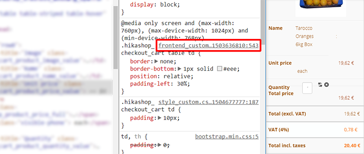
Hope you succeed to achieve what you need.
Regards
You have to know that of course with HikaShop come a css structure, it have to fit most of common needs, but of course sometime you have to refine some Css command to adapt it to your specific needs, here your text part is quite long.
But I can see that you have already custom your frontend css file, as I can read "frontend_custom.css".
I think that "padding-left" command is your solution, and you have to edit it in @media part.
Hope you succeed to achieve what you need.
Regards
Last edit: 9 years 1 month ago by Philip.
Please Log in or Create an account to join the conversation.
9 years 4 weeks ago #277811
by idimarco
Replied by idimarco on topic Product listing layout
Thanks a lot. I fixed the issue for
Total (exclud VAT)
VAT (%)
Total incl. taxes
However, I have the same issue on mobile for the "quantity" text and field. I tried to where it is located but I did not see the. What it the command to fix it and where is located?
Thanks a lot
Imma
Total (exclud VAT)
VAT (%)
Total incl. taxes
However, I have the same issue on mobile for the "quantity" text and field. I tried to where it is located but I did not see the. What it the command to fix it and where is located?
Thanks a lot
Imma
Please Log in or Create an account to join the conversation.
9 years 4 weeks ago - 9 years 4 weeks ago #277843
by Philip
Replied by Philip on topic Product listing layout
Hello,
I will explain you how to proceed to get the concerned css file.
- Go to your page and right-clic while you target the point to correct
- Select inspector, inspect tool (depends from your used navigator)
- A new window will open with a view on the html and the css
- In the Css part you will be able to see css command grouped by css file name
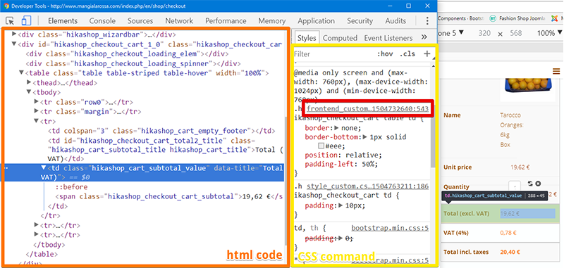
As you can see side to the Css file name, you have the command line, here in this example
frontend_custom...xxxxxxx: 543
I invite you to fully understand this tool quite usefull to customize your css.
You can see with this screenshot that you have again a padding-left command that maybe you can change.
Regards
I will explain you how to proceed to get the concerned css file.
- Go to your page and right-clic while you target the point to correct
- Select inspector, inspect tool (depends from your used navigator)
- A new window will open with a view on the html and the css
- In the Css part you will be able to see css command grouped by css file name
As you can see side to the Css file name, you have the command line, here in this example
frontend_custom...xxxxxxx: 543
I invite you to fully understand this tool quite usefull to customize your css.
You can see with this screenshot that you have again a padding-left command that maybe you can change.
Regards
Last edit: 9 years 4 weeks ago by Philip.
Please Log in or Create an account to join the conversation.
9 years 3 weeks ago #278005
by idimarco
Replied by idimarco on topic Product listing layout
Hi,
Thanks for your instructions. However I was able to edit only partially.
My final problem on mobile view is about the margin of quantity field box on page www.mangialarossa.com/index.php/en/cart . On mobile, the quantity field box is overlapping the table line "total price". I would like to increase the margin but I can not find where the CSS string to edit is located. Could you please help me?
Thanks
Imma
Thanks for your instructions. However I was able to edit only partially.
My final problem on mobile view is about the margin of quantity field box on page www.mangialarossa.com/index.php/en/cart . On mobile, the quantity field box is overlapping the table line "total price". I would like to increase the margin but I can not find where the CSS string to edit is located. Could you please help me?
Thanks
Imma
Please Log in or Create an account to join the conversation.
9 years 3 weeks ago - 9 years 3 weeks ago #278113
by Philip
Replied by Philip on topic Product listing layout
Hello,
I think you can use a Css height command on your required td that display your quantity.
But you have to know that right know the way your quantity is displayed isn't as it by default in HikaShop css file or css style :
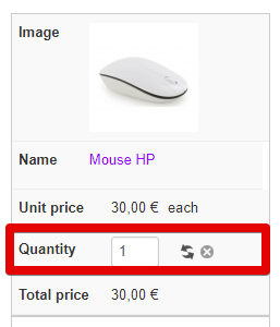
When I analyzed your Css code, the root issue about this come from your custom in the style css.
More precisely, I see inside the td that you have some float command, and this kind of command can break your container (here, the td).
You can try with a default style css, in order to see by yourself.
Regards
I think you can use a Css height command on your required td that display your quantity.
But you have to know that right know the way your quantity is displayed isn't as it by default in HikaShop css file or css style :
When I analyzed your Css code, the root issue about this come from your custom in the style css.
More precisely, I see inside the td that you have some float command, and this kind of command can break your container (here, the td).
You can try with a default style css, in order to see by yourself.
Regards
Last edit: 9 years 3 weeks ago by Philip.
The following user(s) said Thank You: idimarco
Please Log in or Create an account to join the conversation.
Time to create page: 0.307 seconds