

- Posts: 637
- Thank you received: 26
Products
8 years 11 months ago #281559
by Lumiga
Kind regards,
Lumiga
-- HikaShop version -- : 3.2.1
-- Joomla version -- : 3.8.1
-- PHP version -- : 7
Hi Hikashop team,
When I use category listing div, to show all the products they are not all side by side on specific screen sizes.
For example see these two screenshots. So when names of the products have different lenghts and become longer than one line the products are not showing side by side.
See screenshot:
It looks like that the issue only showup when the column on the right have 1 line and products on the same line have a two lines productname.
Is there a way to fix this issue?
Hope to hear from you.
P.S. You have to resize your browser to reproduce the issue.
Example 1
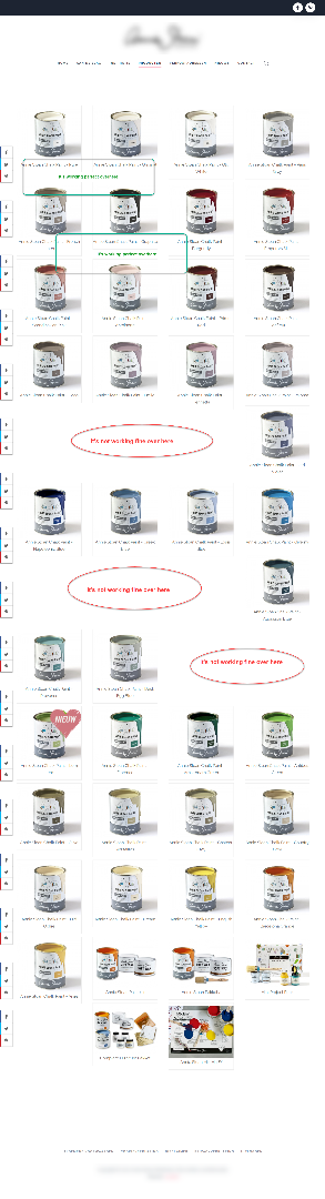
Example 2

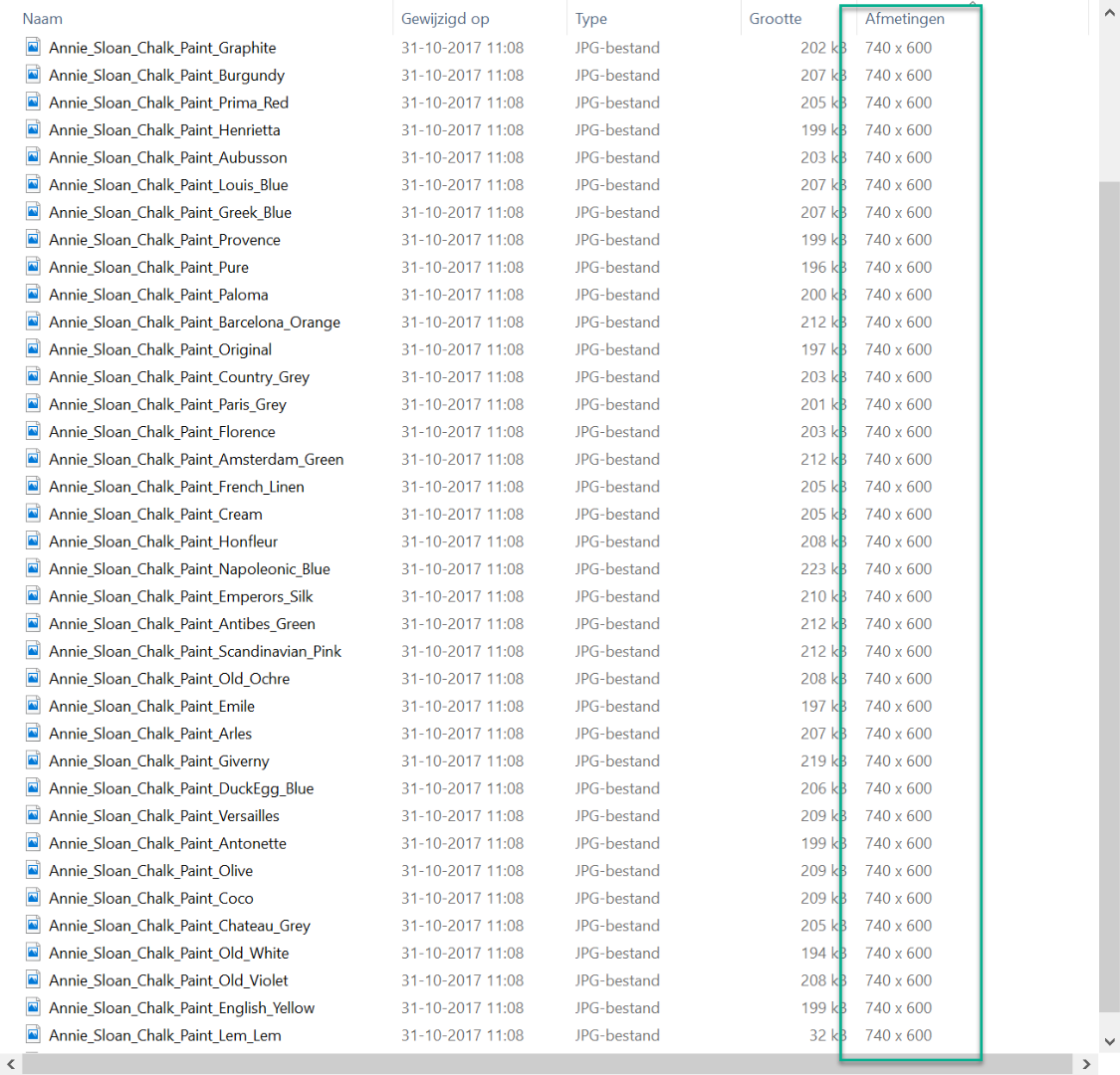
All the images have the same dimensions, see here:
-- Joomla version -- : 3.8.1
-- PHP version -- : 7
Hi Hikashop team,
When I use category listing div, to show all the products they are not all side by side on specific screen sizes.
For example see these two screenshots. So when names of the products have different lenghts and become longer than one line the products are not showing side by side.
See screenshot:
It looks like that the issue only showup when the column on the right have 1 line and products on the same line have a two lines productname.
Is there a way to fix this issue?
Hope to hear from you.
P.S. You have to resize your browser to reproduce the issue.
Example 1
Example 2
All the images have the same dimensions, see here:
Kind regards,
Lumiga
Please Log in or Create an account to join the conversation.

8 years 11 months ago #281564
by nicolas
Hi,
You need to force the height of the product blocks with CSS so that they all have the same height. Then it will align them properly.
You need to force the height of the product blocks with CSS so that they all have the same height. Then it will align them properly.
The following user(s) said Thank You: Lumiga
Please Log in or Create an account to join the conversation.
8 years 11 months ago #281618
by Lumiga
Kind regards,
Lumiga
Hi Nicolas,
It was a lot of work to find out which height I needed but eventually it works now.
Thank you very much for your help.
Kind regards,
Lumiga
This is the code now:
It was a lot of work to find out which height I needed but eventually it works now.
Thank you very much for your help.
Kind regards,
Lumiga
This is the code now:
Code:
@media only screen and (max-width: 3840px) {
#hikashop_category_information_module_ div.hikashop_container {
text-align: center;
height: 210px;
font-size: 14px;
line-height: 1.5;
}}
@media only screen and (max-width: 1920px) {
#hikashop_category_information_module_ div.hikashop_container {
text-align: center;
height: 250px;
}}
@media screen and (max-width: 1280px) and (min-width: 1251x) {
#hikashop_category_information_module_ div.hikashop_container {
text-align: center;
height: 260px;
}}
@media screen and (max-width: 1250px) and (min-width: 1151px) {
#hikashop_category_information_module_ div.hikashop_container {
text-align: center;
height: 250px;
}}
@media screen and (max-width: 1150px) and (min-width: 1025px) {
#hikashop_category_information_module_ div.hikashop_container {
text-align: center;
height: 230px;
}}
@media screen and (max-width: 1024px) and (min-width: 951px) {
#hikashop_category_information_module_ div.hikashop_container {
text-align: center;
height: 260px;
}}
@media screen and (max-width: 950px) and (min-width: 851px) {
#hikashop_category_information_module_ div.hikashop_container {
text-align: center;
height: 250px;
}}
@media screen and (max-width: 850px) and (min-width: 775px) {
#hikashop_category_information_module_ div.hikashop_container {
text-align: center;
height: 240px;
}}
@media screen and (max-width: 774px) and (min-width: 700px) {
#hikashop_category_information_module_ div.hikashop_container {
text-align: center;
height: 220px;
}}
@media screen and (max-width: 699px) and (min-width: 641px) {
#hikashop_category_information_module_ div.hikashop_container {
text-align: center;
height: 200px;
}}
@media screen and (max-width: 640px) and (min-width: 576px) {
#hikashop_category_information_module_ div.hikashop_container {
text-align: center;
height: 250px;
font-size: 13px;
line-height: 1.5;
}}
@media screen and (max-width: 575px) and (min-width: 501px) {
#hikashop_category_information_module_ div.hikashop_container {
text-align: center;
height: 225px;
font-size: 12px;
line-height: 1.5;
}}
@media screen and (max-width: 500px) and (min-width: 460px) {
#hikashop_category_information_module_ div.hikashop_container {
text-align: center;
height: 200px;
font-size: 12px;
line-height: 1.5;
}}
@media screen and (max-width: 459px) and (min-width: 391px) {
#hikashop_category_information_module_ div.hikashop_container {
text-align: center;
height: 180px;
font-size: 12px;
line-height: 1.5;
}}
@media screen and (max-width: 390px) and (min-width: 10px) {
#hikashop_category_information_module_ div.hikashop_container {
text-align: center;
height: 100%;
font-size: 12px;
line-height: 1.5;
}}
Kind regards,
Lumiga
The following user(s) said Thank You: Jerome
Please Log in or Create an account to join the conversation.
Time to create page: 0.177 seconds