

- Posts: 42
- Thank you received: 2
Display of secondary images on phone
6 years 3 months ago - 6 years 3 months ago #322594
by aisweb
Display of secondary images on phone was created by aisweb
-- url of the page with the problem -- :
vixenfire.com.au/index.php/hikashop-menu.../category_pathway-86
-- HikaShop version -- : 4.3.0
-- Joomla version -- : 3.9.19
-- PHP version -- : 7.3
-- Browser(s) name and version -- : FF 77.0.1
-- Error-message(debug-mod must be tuned on) -- : no error
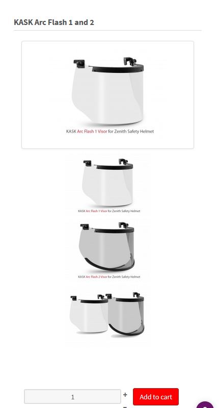
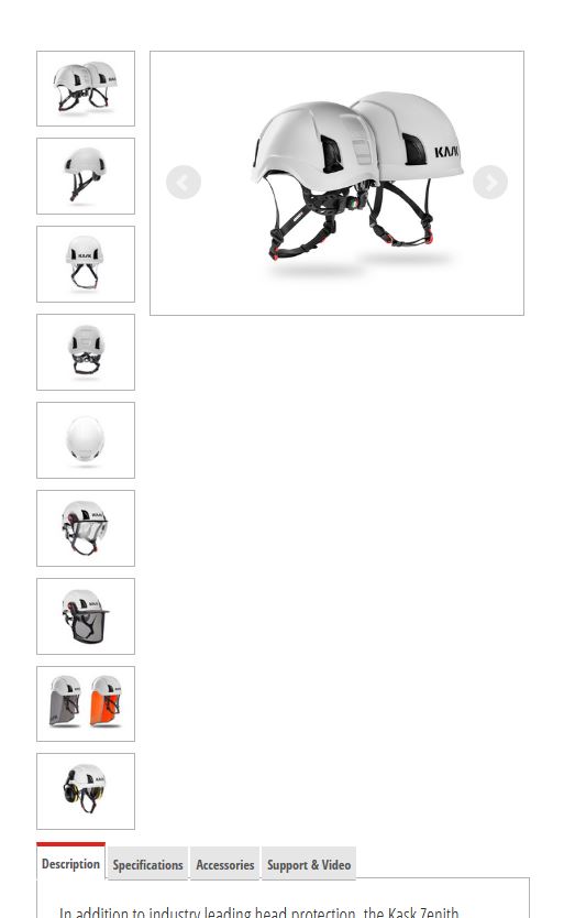
My client asks if secondary images, on phones, can be smaller, thumbnails, rather than large images in a vertical column.
Screenshots will explain better
Currently:
A different website displays like this:
Thanks for your advice.
Paul
-- HikaShop version -- : 4.3.0
-- Joomla version -- : 3.9.19
-- PHP version -- : 7.3
-- Browser(s) name and version -- : FF 77.0.1
-- Error-message(debug-mod must be tuned on) -- : no error
My client asks if secondary images, on phones, can be smaller, thumbnails, rather than large images in a vertical column.
Screenshots will explain better
Currently:
A different website displays like this:
Thanks for your advice.
Paul
Last edit: 6 years 3 months ago by aisweb.
Please Log in or Create an account to join the conversation.

6 years 3 months ago #322605
by nicolas
Replied by nicolas on topic Display of secondary images on phone
Hi,
Well, it's a CSS customization issue.
You've added that CSS in the frontend CSS of HikaShop:
img.hikashop_child_image {
margin: 2px;
height: 125px !important;
}
in order to force the thumbnails to be 125px. But with that size, they are too big to sit on one row on mobile devices.
So you need to reduce that height to 70px for example for mobile devices.
For example, you can add such CSS at the end of the frontend CSS:
Well, it's a CSS customization issue.
You've added that CSS in the frontend CSS of HikaShop:
img.hikashop_child_image {
margin: 2px;
height: 125px !important;
}
in order to force the thumbnails to be 125px. But with that size, they are too big to sit on one row on mobile devices.
So you need to reduce that height to 70px for example for mobile devices.
For example, you can add such CSS at the end of the frontend CSS:
Code:
@media only screen and (max-width: 650px) {
img.hikashop_child_image {
margin: 2px;
height: 70px !important;
}
}
Please Log in or Create an account to join the conversation.
6 years 3 months ago #322641
by aisweb
Replied by aisweb on topic Display of secondary images on phone
Perfect.
Thank you again Nicolas, great support.
Thank you again Nicolas, great support.
Please Log in or Create an account to join the conversation.
Time to create page: 0.063 seconds