

- Posts: 40
- Thank you received: 0
problems with outlining add-to-cart button
10 months 1 day ago #369974
by W13ear
problems with outlining add-to-cart button was created by W13ear
-- HikaShop version -- : 6.1.1
-- Joomla version -- : 5.3.4
-- PHP version -- : 8.4.x
-- Browser(s) name and version -- : any
-- Error-message(debug-mod must be tuned on) -- : none
Hi,
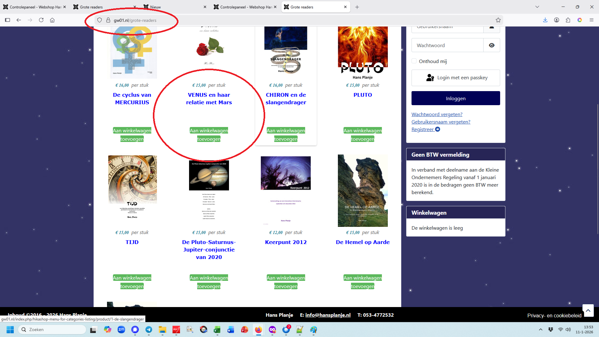
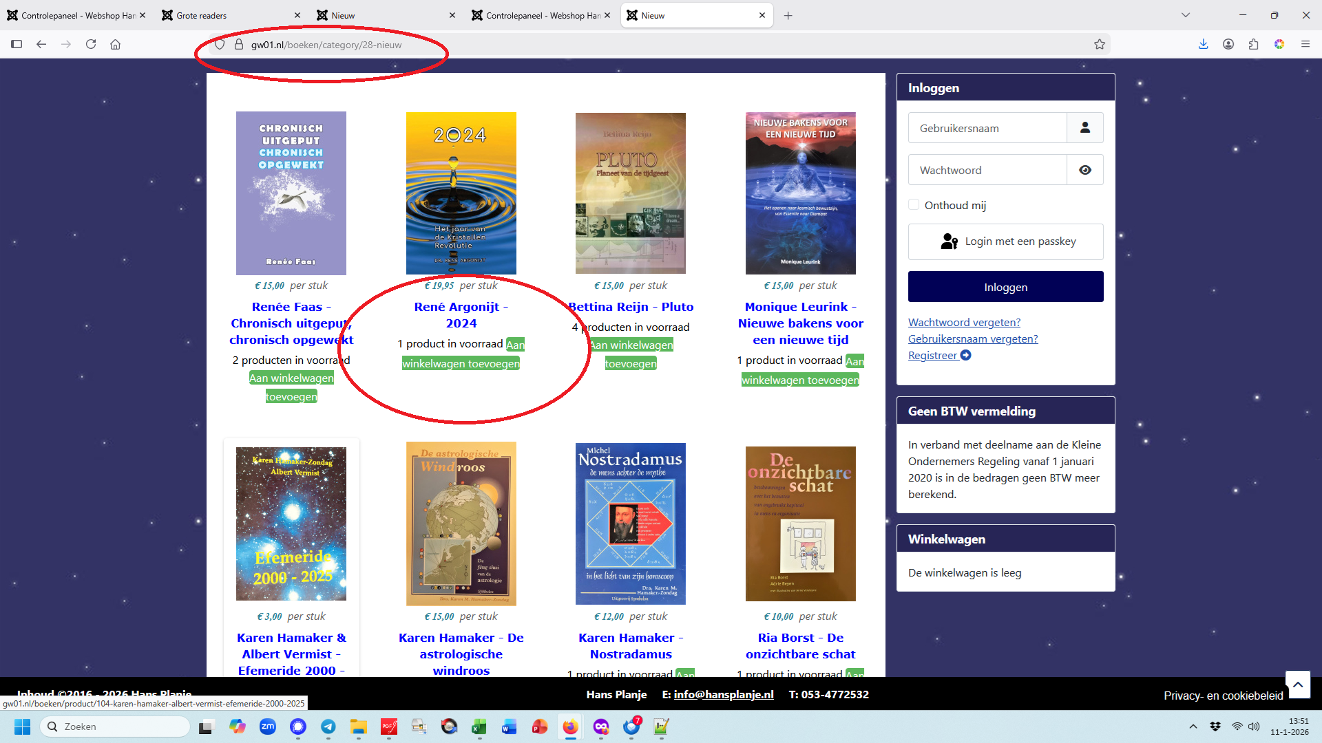
I have a problem with outlining the button on a specific page (category) in my hikashop store.
See the attachements for the differences on two pages on the same website.
On the page readers the outlining is like it should be,
on the page books the outlining fails to show it correctly.
Hope you can help me here.
-- Joomla version -- : 5.3.4
-- PHP version -- : 8.4.x
-- Browser(s) name and version -- : any
-- Error-message(debug-mod must be tuned on) -- : none
Hi,
I have a problem with outlining the button on a specific page (category) in my hikashop store.
See the attachements for the differences on two pages on the same website.
On the page readers the outlining is like it should be,
on the page books the outlining fails to show it correctly.
Hope you can help me here.
Please Log in or Create an account to join the conversation.

10 months 1 day ago #369978
by nicolas
Replied by nicolas on topic problems with outlining add-to-cart button
Hi,
I checked both pages on your website and I can see that since you took the screenshots, you switched to a 3 columns layout in order to give more space for each product of the listing, which seems to prevent the issue with the add to cart button.
Another solution could be to add a bit of custom CSS to your Joomla template in order to allow for more width usage on desktop and laptop screens. Here is a starting point:
forum.joomla.org/viewtopic.php?t=1000149
Another solution is to add CSS with white-space for the add to cart buttons to forbid the potential line return between the words:
developer.mozilla.org/en-US/docs/Web/CSS...operties/white-space
This is potentially the best.
I checked both pages on your website and I can see that since you took the screenshots, you switched to a 3 columns layout in order to give more space for each product of the listing, which seems to prevent the issue with the add to cart button.
Another solution could be to add a bit of custom CSS to your Joomla template in order to allow for more width usage on desktop and laptop screens. Here is a starting point:
forum.joomla.org/viewtopic.php?t=1000149
Another solution is to add CSS with white-space for the add to cart buttons to forbid the potential line return between the words:
developer.mozilla.org/en-US/docs/Web/CSS...operties/white-space
This is potentially the best.
Please Log in or Create an account to join the conversation.
6 months 2 weeks ago #371663
by W13ear
Replied by W13ear on topic problems with outlining add-to-cart button
Hi Nicolas,
I have tried each option, none of them worked.
Hope you can give me another solution.
I have tried each option, none of them worked.
Hope you can give me another solution.
Please Log in or Create an account to join the conversation.
6 months 2 weeks ago #371667
by nicolas
Replied by nicolas on topic problems with outlining add-to-cart button
Hi,
What do you mean by none of them worked ?
They have to work. If they don't, it means that you're not using the correct CSS code.
I had a deeper look at your website. For example, to make the main area + sidebar take the full width available, you can add such CSS code in media/templates/site/cassiopeia/css/user.css:
Similarly, preventing the line return on add to cart buttons can be done by adding such CSS code as I was explaining :
Both solutions do what they are supposed to do. I've tested them both on your website via my browser's developer tools.
What do you mean by none of them worked ?
They have to work. If they don't, it means that you're not using the correct CSS code.
I had a deeper look at your website. For example, to make the main area + sidebar take the full width available, you can add such CSS code in media/templates/site/cassiopeia/css/user.css:
Code:
/* Expand the main content area to the left edge */
.site-grid .grid-child.container-component {
grid-column-start: full-start !important;
}
/* Expand the sidebar area to the right edge */
.site-grid .grid-child.container-sidebar-right {
grid-column-end: full-end !important;
}
Similarly, preventing the line return on add to cart buttons can be done by adding such CSS code as I was explaining :
Code:
.hikacart {
white-space: nowrap !important;
}
Both solutions do what they are supposed to do. I've tested them both on your website via my browser's developer tools.
The following user(s) said Thank You: W13ear
Please Log in or Create an account to join the conversation.
Time to create page: 0.053 seconds