

- Posts: 18
- Thank you received: 1
Checkout Layout Issue at iPad Mini Resolution
10 years 10 months ago #220755
by ralfmason
Checkout Layout Issue at iPad Mini Resolution was created by ralfmason
-- HikaShop version -- : 2.6.0
-- Joomla version -- : 3.4.5
-- PHP version -- : 5.4.37
-- Browser(s) name and version -- : Chrome Version 46.0.2490.86 m
-- Error-message(debug-mod must be tuned on) -- : No error
Hi,
I have setup my website using HikaShop and the T3 (bootstrap 2) template. Everything seems to be working well apart from one problem with degradation of the layout on the checkout page at particular resolutions (mini-tablet portrait, such as iPad mini). Please see the attached image.
It is not clear what is causing this issue but it seems possible that some of the styles within the Login and Registration modules might be causing an issue.
Please can you help.
-- Joomla version -- : 3.4.5
-- PHP version -- : 5.4.37
-- Browser(s) name and version -- : Chrome Version 46.0.2490.86 m
-- Error-message(debug-mod must be tuned on) -- : No error
Hi,
I have setup my website using HikaShop and the T3 (bootstrap 2) template. Everything seems to be working well apart from one problem with degradation of the layout on the checkout page at particular resolutions (mini-tablet portrait, such as iPad mini). Please see the attached image.
It is not clear what is causing this issue but it seems possible that some of the styles within the Login and Registration modules might be causing an issue.
Please can you help.
Please Log in or Create an account to join the conversation.

10 years 10 months ago #220777
by Xavier
Replied by Xavier on topic Checkout Layout Issue at iPad Mini Resolution
Hi,
Is the option "enable bootstrap" enabled in Configuration > Display > General display options ?
Is the option "enable bootstrap" enabled in Configuration > Display > General display options ?
Please Log in or Create an account to join the conversation.
10 years 10 months ago #220885
by ralfmason
Replied by ralfmason on topic Checkout Layout Issue at iPad Mini Resolution
Hi Xavier, yes the "enable bootstrap" option is enabled.
Please Log in or Create an account to join the conversation.

10 years 10 months ago - 10 years 10 months ago #221232
by Philip
Replied by Philip on topic Checkout Layout Issue at iPad Mini Resolution
Hello,
It appears that some Css code can solve this, are you able to custome your css code yourself?
If you know Css code, folllow this step to custom your css code:
Components -> HikaShop -> Configuration
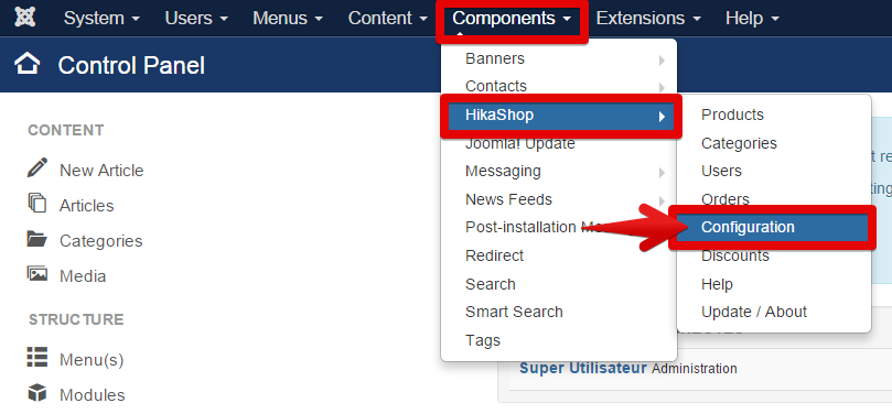
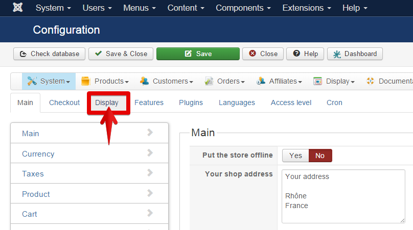
Click on Display tab
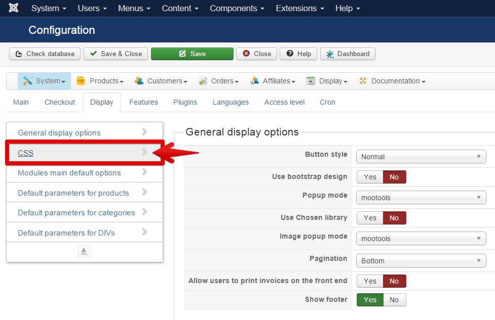
Select Css
In Css part : select custom for your front-end CSS file
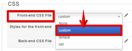
And click on the little pen to edit your code
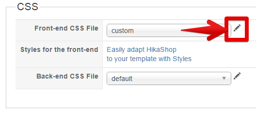
Don't write in the middle of your css code, put your new code at the end of your file
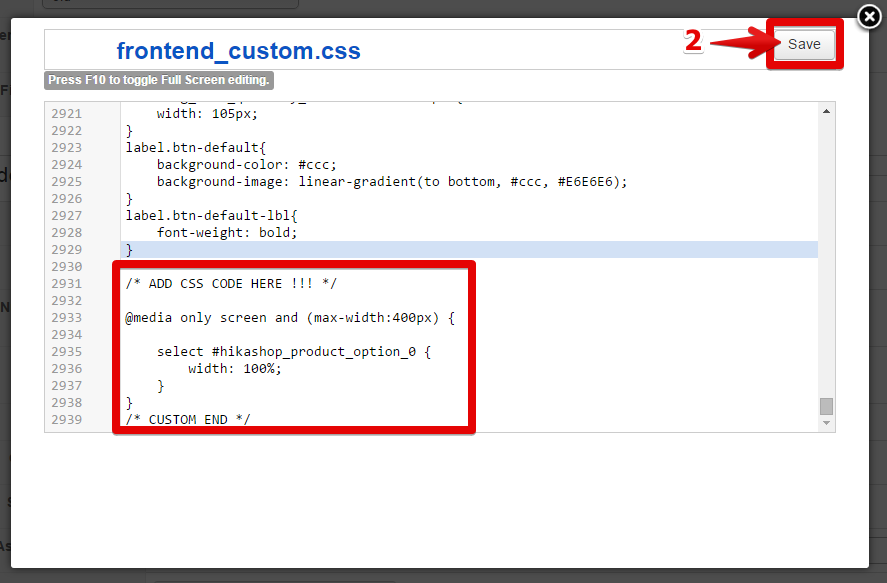
On the example screen, you can see :
@media only screen and (max-width: 400px) {
your selector for your two elements {
certainly a margin-right order can be useful
}
}
@media command able you to define css rules only under 400px width screen, and so replace it with same width where troubles appears.
Hope that will help you
Regards,
It appears that some Css code can solve this, are you able to custome your css code yourself?
If you know Css code, folllow this step to custom your css code:
Components -> HikaShop -> Configuration
Click on Display tab
Select Css
In Css part : select custom for your front-end CSS file
And click on the little pen to edit your code
Don't write in the middle of your css code, put your new code at the end of your file
On the example screen, you can see :
@media only screen and (max-width: 400px) {
your selector for your two elements {
certainly a margin-right order can be useful
}
}
@media command able you to define css rules only under 400px width screen, and so replace it with same width where troubles appears.
Hope that will help you
Regards,
Last edit: 10 years 10 months ago by Philip.
The following user(s) said Thank You: ralfmason
Please Log in or Create an account to join the conversation.
10 years 10 months ago #221476
by ralfmason
Replied by ralfmason on topic Checkout Layout Issue at iPad Mini Resolution
Hi Philippe,
Yes that worked. The code I had to use to get acceptable behaviour across the different resolutions was:
@media only screen and (max-width:768px)
{
#hikashop_checkout_login_left_part, #hikashop_checkout_login_right_part{
width: 100%;
}
.t3-content {
width: 100%;
}
.t3-sidebar {
width: 100%;
}
}
Thanks for your help.
It did occur to me that the other solution was to hide the two side bar modules (basket and newsletter) on the check-out page but I couldn't see a way to do this in the HikaShop configuration.
Thanks
Ralf
Yes that worked. The code I had to use to get acceptable behaviour across the different resolutions was:
@media only screen and (max-width:768px)
{
#hikashop_checkout_login_left_part, #hikashop_checkout_login_right_part{
width: 100%;
}
.t3-content {
width: 100%;
}
.t3-sidebar {
width: 100%;
}
}
Thanks for your help.
It did occur to me that the other solution was to hide the two side bar modules (basket and newsletter) on the check-out page but I couldn't see a way to do this in the HikaShop configuration.
Thanks
Ralf
Please Log in or Create an account to join the conversation.
Time to create page: 0.207 seconds