

- Posts: 27
- Thank you received: 0
add product in cart - mobile resolution
9 years 6 days ago - 9 years 6 days ago #281453
by bf360
add product in cart - mobile resolution was created by bf360
-- url of the page with the problem -- :
212.237.23.252
-- HikaShop version -- : 3.2.1
-- Joomla version -- : 3.7.2
-- PHP version -- : 5.6.30
Hi! i've a problem in the view (on mobile) where customers can add product in cart (example 212.237.23.252/index.php/it/component/hikashop/product/cid-3 ). The area where is social icon, image product and price are not responsive...there is a way to solve it?
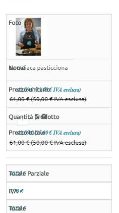
The same issue on the checkout...the area that contain auth/registration and the product on cart, is not responsive...
regards
Roberto
-- HikaShop version -- : 3.2.1
-- Joomla version -- : 3.7.2
-- PHP version -- : 5.6.30
Hi! i've a problem in the view (on mobile) where customers can add product in cart (example 212.237.23.252/index.php/it/component/hikashop/product/cid-3 ). The area where is social icon, image product and price are not responsive...there is a way to solve it?
The same issue on the checkout...the area that contain auth/registration and the product on cart, is not responsive...
regards
Roberto
Last edit: 9 years 6 days ago by bf360.
Please Log in or Create an account to join the conversation.

9 years 5 days ago #281459
by Jerome
Jerome - Obsidev.com
HikaMarket & HikaSerial developer / HikaShop core dev team.
Replied by Jerome on topic add product in cart - mobile resolution
Hello,
You're not using the "frontend" CSS file but you're using a "style custom" CSS.
Your CSS do not include responsive rules regarding the images.
You might want to add rules to make the image width (or max-width) to 100% to bypass the fixed width you have configured in the HikaShop image settings.
Regards,
You're not using the "frontend" CSS file but you're using a "style custom" CSS.
Your CSS do not include responsive rules regarding the images.
You might want to add rules to make the image width (or max-width) to 100% to bypass the fixed width you have configured in the HikaShop image settings.
Regards,
Jerome - Obsidev.com
HikaMarket & HikaSerial developer / HikaShop core dev team.
Please Log in or Create an account to join the conversation.
9 years 5 days ago - 9 years 5 days ago #281531
by bf360
Replied by bf360 on topic add product in cart - mobile resolution
Hello! sorry but I do not have much experience in css customization...yep i'im using a style custom css created using the function "+" in global conf->view->css option.
In this way i saw that the custom file is equal to frontend CSS file: so i had modify only product price style and button price. in fact if I use the default style the problem persists (i had I've reset the default style so you can check it out if you want)
how do as you said "add rules to make the image width (or max-width) to 100% to bypass the fixed width you have configured in the HikaShop image settings" ?
Regards
Roberto
In this way i saw that the custom file is equal to frontend CSS file: so i had modify only product price style and button price. in fact if I use the default style the problem persists (i had I've reset the default style so you can check it out if you want)
how do as you said "add rules to make the image width (or max-width) to 100% to bypass the fixed width you have configured in the HikaShop image settings" ?
Regards
Roberto
Last edit: 9 years 5 days ago by bf360.
Please Log in or Create an account to join the conversation.

9 years 5 days ago - 9 years 5 days ago #281553
by Philip
Replied by Philip on topic add product in cart - mobile resolution
Hello,
Why don't you use the frontend default.css, in order to get the Css responsive command(@media), to finally add it in your custom frontend css ?
For this switch your frontend css, reproduce phone or else resolution, and use your navigator inspector tool (right-click on your responsive html elements)
image missing https://cdn.pbrd.co/images/GRtQMhW.png
this will allow you to see and copy paste, the required command, for this look for Css @media command.
Note that if you pass on the css command your inspector tool will give you the file line (see the red arrow)
Then edit your custom frontend css.
Hope this will help you.
Regards
Why don't you use the frontend default.css, in order to get the Css responsive command(@media), to finally add it in your custom frontend css ?
For this switch your frontend css, reproduce phone or else resolution, and use your navigator inspector tool (right-click on your responsive html elements)
image missing https://cdn.pbrd.co/images/GRtQMhW.png
this will allow you to see and copy paste, the required command, for this look for Css @media command.
Note that if you pass on the css command your inspector tool will give you the file line (see the red arrow)
Then edit your custom frontend css.
Hope this will help you.
Regards
Last edit: 9 years 5 days ago by Philip.
Please Log in or Create an account to join the conversation.
9 years 3 days ago #281747
by bf360
Replied by bf360 on topic add product in cart - mobile resolution
Hi Philip! thanks for your clear and detailed explanation!!! Unfortunately, even using default css, mobile view is corrupt...That's why I was trying to fix it with a custom css. I attach the view using default css

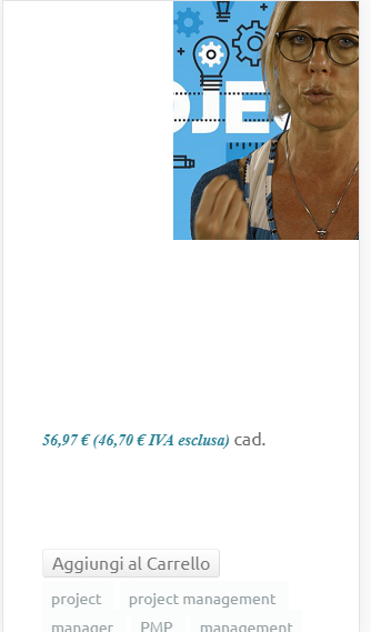
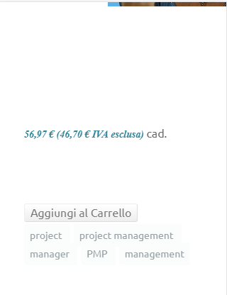
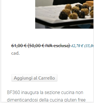
as you can see, the product image is out of view, the social icon appear not very well...for the product that have a discount the label "original price + new price" go over the screen (img 4)
Regards
Rob
as you can see, the product image is out of view, the social icon appear not very well...for the product that have a discount the label "original price + new price" go over the screen (img 4)
Regards
Rob
Please Log in or Create an account to join the conversation.
9 years 3 days ago #281750
by bf360
Replied by bf360 on topic add product in cart - mobile resolution
...and here the issue on checkout
Please Log in or Create an account to join the conversation.
9 years 3 days ago - 9 years 3 days ago #281761
by Philip
Replied by Philip on topic add product in cart - mobile resolution
Hello,
Do you try to use the default template like ProtoStar, to see if that solve your issue ?
This kind of display isn't what HikaShop have to manage responsive display...
Maybe you can provide an Url link with default frontend css file selected, in order to process ourself some tests in order to better understand what's going on.
Awaiting news from you.
Regards
Do you try to use the default template like ProtoStar, to see if that solve your issue ?
This kind of display isn't what HikaShop have to manage responsive display...
Maybe you can provide an Url link with default frontend css file selected, in order to process ourself some tests in order to better understand what's going on.
Awaiting news from you.
Regards
Last edit: 9 years 3 days ago by Philip.
Please Log in or Create an account to join the conversation.
9 years 2 days ago - 9 years 2 days ago #281849
by bf360
Replied by bf360 on topic add product in cart - mobile resolution
Hi! i do not try change template in Protostar, because i go in production soon with this site and i would not break all 
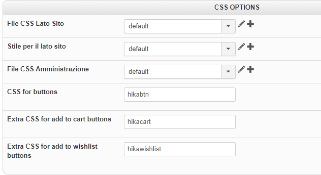
You can visit 212.237.23.252/index.php/it/component/hikashop/product/cid-3 ...now hikashop is set with default frontend
 .
also you can try adding to the cart to see the behavior at checkout
Thanks
Regards
You can visit 212.237.23.252/index.php/it/component/hikashop/product/cid-3 ...now hikashop is set with default frontend
also you can try adding to the cart to see the behavior at checkout
Thanks
Regards
Last edit: 9 years 2 days ago by bf360.
Please Log in or Create an account to join the conversation.

Less
More
- Posts: 12953
- Thank you received: 1778
9 years 2 days ago #281871
by Mohamed Thelji
Replied by Mohamed Thelji on topic add product in cart - mobile resolution
Hello,
When I try it on a local website using one of Joomla default templates it's displaying correctly for mobile devices.
As Philip said, you should actually try it with one of Joomla default templates to see if it's coming from your template. Else you can directly use some CSS code like media queries :
When I try it on a local website using one of Joomla default templates it's displaying correctly for mobile devices.
As Philip said, you should actually try it with one of Joomla default templates to see if it's coming from your template. Else you can directly use some CSS code like media queries :
You can do the modifications in the frontend css file via the menu Configuration > Display > CSS
Use the @media tags to change the width of the columns when the width of the page is less than xx.
ex:
@media (min-width: 992px)
.hkc-md-4 {
width: 33.33333333%;
}
Here is some documentation about the layout customization:
www.hikashop.com/support/documentation/1...ize-the-display.html
Please Log in or Create an account to join the conversation.
Time to create page: 0.234 seconds