

- Posts: 28
- Thank you received: 0
2 column products in mobile display
7 years 8 months ago #304623
by ashx88
2 column products in mobile display was created by ashx88
Hi,
I have selected 3 products in a row for the normal desktop view. On mobile it breaks into 1 column displaying 1 product, I would like to display 2 columns for mobile view.
Have used the code from the threads below but the codes are not working for me.
www.hikashop.com/forum/product-category-...mber-of-columns.html
www.hikashop.com/forum/search.html?query...ldforums=1&catids=26
How do I achieve the display of 2 column products in mobile? Thank you.
I have selected 3 products in a row for the normal desktop view. On mobile it breaks into 1 column displaying 1 product, I would like to display 2 columns for mobile view.
Have used the code from the threads below but the codes are not working for me.
www.hikashop.com/forum/product-category-...mber-of-columns.html
www.hikashop.com/forum/search.html?query...ldforums=1&catids=26
How do I achieve the display of 2 column products in mobile? Thank you.
Please Log in or Create an account to join the conversation.
7 years 8 months ago - 7 years 8 months ago #304636
by Philip
Replied by Philip on topic 2 column products in mobile display
Hello,
To achived what you need there will be several css command to add in your frontend css file.
First have a look on this tutorial , then you have to get the required @media (media queries) to add your custom code.
For start and as example this kind of code may do the trick :
Where @media define on which device width the css command must be applied, and note that above it's pseudo code, you have to get the required html class by using the inspector tool to get your required html class.

Hope this will help you to achieved what you need.
Regards
To achived what you need there will be several css command to add in your frontend css file.
First have a look on this tutorial , then you have to get the required @media (media queries) to add your custom code.
For start and as example this kind of code may do the trick :
Code:
@media only screen and (max-width: 600px), (max-device-width: 600px) and (min-device-width: 600px) {
.hikashop_column_product_container {
width: 49%;
display: inline-block;
vertical-align: top;
}
}
Hope this will help you to achieved what you need.
Regards
Last edit: 7 years 8 months ago by Philip.
Please Log in or Create an account to join the conversation.
7 years 5 months ago - 7 years 5 months ago #306996
by davec
Replied by davec on topic 2 column products in mobile display
I have managed to achieve this using the following code on a 3 column layout. This takes into account devices up to 960px. This allows for 2 columns on tablet devices and larger screen mobiles. Other adjustments may be required.
Dave
Code:
@media only screen
and (max-device-width : 961px)
{
.hkc-md-4 {width:49%;float:left;}
.hikashop_product_image_subdiv {width:auto!important;}
.hikashop_product_image {height:auto!important;}
}
Dave
Last edit: 7 years 5 months ago by davec.
The following user(s) said Thank You: nicolas
Please Log in or Create an account to join the conversation.
5 years 10 months ago #328298
by bepo
Replied by bepo on topic 2 column products in mobile display
Hallo ,
I can't get this option ( I am to stupid for this ) with the view of 2 colums on mobile devices for categories and product listing ( I am not a web designer and know little of coding and css ) what I have to add in the frontend css file I have the starter version (
www.robert-dabo.from.hr
) coud you please help me.
In the picture is the viev on mobile of product listing in one colum, but I want it to be in 2 colums ( for categories and product listings )
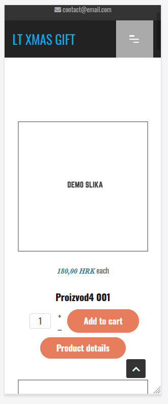
I can't get this option ( I am to stupid for this
) with the view of 2 colums on mobile devices for categories and product listing ( I am not a web designer and know little of coding and css ) what I have to add in the frontend css file I have the starter version (
www.robert-dabo.from.hr
) coud you please help me.In the picture is the viev on mobile of product listing in one colum, but I want it to be in 2 colums ( for categories and product listings )
Please Log in or Create an account to join the conversation.
5 years 10 months ago - 5 years 10 months ago #328314
by Philip
Replied by Philip on topic 2 column products in mobile display
Hello,
To achived what you need there will be just one css command to add in your frontend css file.
First have a look on this tutorial , then you have to get the required @media (media queries) to add your custom code.
Learn more about the Css @media queries in this documentation on the W3school website .
Then, follow the example of in Davec's message, here to modify your element width, with this kind of command :
Hope this will help you to achieved what you needs.
Regards
To achived what you need there will be just one css command to add in your frontend css file.
First have a look on this tutorial , then you have to get the required @media (media queries) to add your custom code.
Learn more about the Css @media queries in this documentation on the W3school website .
Then, follow the example of in Davec's message, here to modify your element width, with this kind of command :
Code:
.context_page_class .targeted_html_element {
width: 49%;
}
Regards
Last edit: 5 years 10 months ago by Philip.
Please Log in or Create an account to join the conversation.
Time to create page: 0.065 seconds