|
|

Description
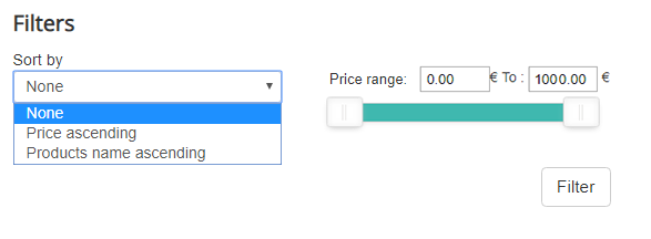
This screen enables you to create or edit your filters. In HikaShop, you will be able to manage filters for the customer products listing. That way, if he wants to see products with specific attributes, he can select some filters and reduce the products displayed on the listing to the products he is interested in. For example, in a computer shop he might want to select the quantity of RAM, or which kind of processor he would like in his computer. That will also allow you to display a sorting selector so that the customer can select how the listing should be sorted.
Filters are only available in the Business edition of HikaShop.
Global Information
Filters can be found in Display>Filters. Additional options for filters display can be found in the Display tab of the configuration of HikaShop.
To display your filters, you have to make sure your module/listing has the "filters" display option set to Yes.
Also note that you can also display your filters as a module by configuring the HikaShop Filter module via the Joomla module manager. In your filter module, don't forget to set the id of a HikaShop category listing menu (you need to create that menu beforehand) in the menu option. If you use categories, the menu won't display products but only the categories on the search results page by default. You will have to change the "sub elements filter" option of the associated module of your category listing menu to "all sub elements" so that it displays all the products and not only the products directly linked to the parent category of your menu.
And if you want to hide the filters at the top of the products listing, you can turn off the "filters" display option of your products listing menu item on the options page of your menu item that you can find via the Joomla menu manager when you edit the menu item.
Toolbar
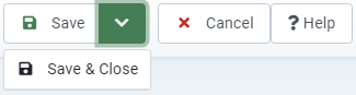
- Save & Close : Save the filter and return to the filters Management screen.
- Save : Apply the modifications to the filter and stay on the same screen.
- Cancel : Return to the previous screen without saving the modifications.
- Help : This button enables you to turn ON/OFF the help section, this screen will appear or disappear.
Set the main information
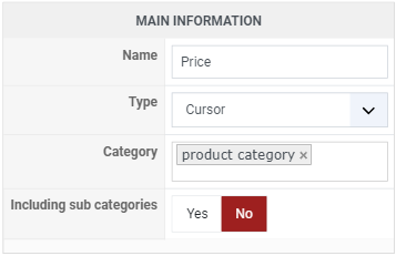
- Name : Here you have to define the name of your filter.
- Type : Select the type of your filter, many choices are available like text, dropdown, cursor, etc.Here you can see the different types of filters available:

- Name : The name of the filter, which your customers see above it unless you place its title elsewhere.
- Type : What the filter looks like and how it works: radio buttons, checkboxes, a single or a multiple dropdown, a cursor, a list, a text search or an in stock checkbox. Each type brings its own options in the Options area below.
- Displayed in the categories : Select the categories where you want the filter to display. If no category is selected, the filter will always be displayed on products listings. You usually want to leave this setting empty.
- Including sub categories : If you have sub categories inside the category you selected in the previous option, turning on that option will allow the filter to also be displayed when displaying products in sub categories of that category.
- Note that the "Including sub categories" setting above has no effect on the parent category of a category filter: such a filter only filters the products linked directly to the categories it offers.
Extra Information
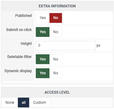
- Published : If a filter is published it means that it will be used by the system, otherwise, it won't be taken into account.
- Submit on click : If you enable this option, you don't need to click on the "Filter" button. The filter will be applied automatically on click.
- Height : Set the height of your filter.
- Deletable filter : If that option is turned on, when a filter has been used, there is a delete icon next to it in order to cancel the filter.
- Dynamic display : That option enables you to change the options of the filters according to the previously selected filters. For example, if all your products are computers with 4Go Ram and 250Go hard disks, if you select 4Go in the first filter, the second will show only the 250Go option and not the other values.
- Access level : You can restrict that filter from being displayed to some Joomla groups of users.
Options
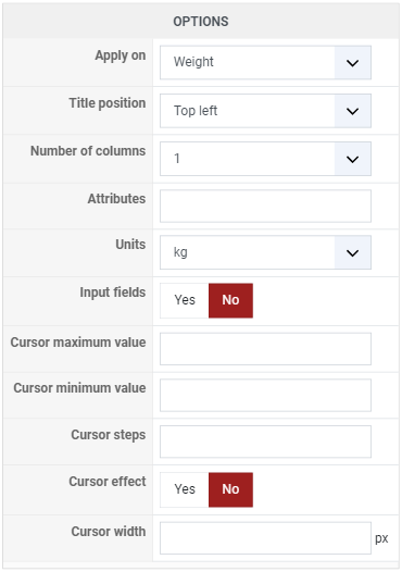
- Apply on : You can choose here, the type of information managed by your filter. It can be a list of the data columns of your products, custom fields, the price, the categories, the characteristics, the manufacturers, ...
- Size : The width of the field, in characters, for the filter types which are an input.
- Title position : Choose the position of the title of the filter. You can place it on the top, left, right, at the bottom or inside your filter.
- Number of columns : You can choose the size (width) of each filter. It can be used for cursors to be more precise while setting an interval.
- Inline button : Puts the filter button on the same line as the filter itself instead of under it.
- Display product counts : Writes next to each value how many products carry it, so that your customers see what a choice will give them before making it.
- Maximum text size : The width of the search box of a text filter.
- Search processing : How the words typed in a text filter are used: all of them, any of them, or the sentence as it is.
- Autocomplete suggestions : Suggests products as your customer types in a text filter.
- Autocomplete style : How those suggestions are shown: the names alone, cards with the image and the price, or the values which match.
- Logic : Whether a customer choosing several values sees the products carrying all of them, which narrows the listing, or any of them, which widens it.
- Maximum length : The longest a search may be, in characters.
- Minimum length : The shortest a search may be before the filter searches at all, which avoids listing the whole shop on one letter.
- Words to ignore : Words the search leaves out, separated by commas: the articles and prepositions of your language, which match everything and mean nothing.
- Attributes : HTML attributes added to the field of the filter, autocomplete="off" for example.
- Currencies : For a price filter, the currencies it offers.
- Characteristics : For a characteristic filter, which characteristic it filters on.
- Sort : The order the values of the filter are listed in.
- Information : For a filter on the details of a product, which detail it filters on, its weight or its dimensions for instance.
- Units : The unit that detail is read in, one for the dimensions and one for the weight.
- Custom fields : For a filter on a custom field, which field it filters on.
- Values : The values the filter offers, when you would rather write them yourself than let HikaShop read them from your products.
- Input fields : For a cursor, whether the customer can also type the two ends of the range instead of only dragging it.
- Format for the cursors label : How the value under a cursor is written. Write {value} where the number goes, which is how a unit or a currency is added to it.
- Cursor maximum value : The top end of the cursor. Left empty, HikaShop reads it from your products.
- Cursor minimum value : The bottom end of it, read from your products in the same way when it is empty.
- Cursor steps : How much one notch of the cursor moves the value.
- Cursor effect : How the cursor behaves as it is dragged.
- Cursor width : The width of the cursor itself.
- Parent category of the values : For a filter whose "Apply on" is set to the categories, the category whose direct sub categories the filter offers as its choices. It has nothing to do with the categories the filter is displayed in, which are set in the main information above.
Other options are available according to the selected type. You can find the complete options list there.
Display
Additional options are available in the Features tab of the configuration of HikaShop. These options are global options of the whole filters zone.
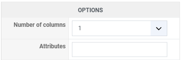
- Number of columns : Here you can set the number of columns for your filters, if you want 4 filters by row, for more visibility, it's possible.
- Limit : With limit, you can define the number of filters shown.
- Height : To define the height of each row of filters.
- Show filter button : If you disable this option, the "Filter" button will not be visible. In that case, you should activate the option "Submit on click" on the different filters you created, otherwise the filters won't do anything.
- Show reset button : This option will display a reset button emptying all filters.
- Display fieldset : Display or not the fieldset around the filters.
- Filter button position : You can change the position of the filter button, you can place it on the left or right of the filters, or next to the last field with the option "Inside".
Detailed Possibilities
- Text : If you choose this option, a text field will be displayed.
- Apply on: Define on which field the search will be done. Note that filters on price won't search for variants' price so if your products have no price, nothing will be displayed. We suggest to set a price to yours main products in this case.
- Search Processing : Every word will distinctly search each word typed (but they both have to appear somewhere), complete expression will search for the whole expression, any word will search for each word with or without the others. Finally the search operators features allow our customers to use quotes for a complete expression search (like "red balloon"), plus for a every word search (red+balloon) and spaces for an any word search (red balloon)
- Maximum length : You can here define a maximum length for the typed expression
- Radio Button : This filter will display radio buttons with the values you specified or specific information
- Apply on: This option define on which data the filter will be executed. Changing it may display additional information.
- Inline button : change the button display and put the radio button in a line
- Currencies : If you selected "price" in the "apply on" option you must select a currency
- Values : Here you can set the different values of your radio buttons. If the "Defined limits" is set to No, it will display theses values this way: "from X to Y" and "superior to Y" and "inferior to X"
- Defined limits : This option will make the radio buttons display the exact values you specified without anything else
- Categories/Characteristics : This option will be displayed if you choose category or characteristic in the "apply on" option. It will display the different values of your characteristics or the sub-categories of the selected category
- Sort : If you chose the "sort" option in "apply on", this field will allow you to pick up the data on which the sort have to be done. Since it's a multiselect, you can pick "price" and "weight" if you want to display "ascending price", "ascending weight", "descending price", "descending weight".
- Custom Fields : allow you to pick up a custom field. You then have to add values so it will filter on these custom field.
- Check box : Display check boxes. The options available for this filter type are the same as for the radio button.
- Single Dropdown : This filter type display a single dropdown. The options available are the same as for the buttons except you can define a specific size.
- Multiple Dropdown : This filter type displays a multiple dropdown. The options available are the same as for the Single dropdown
- Cursor : This filter type will display a cursor which allow simple and quick filtering on your product data.
- Apply on: Choose here on which data of product you want the cursor to be applied.
- Cursor number : You can there choose how many cursors you want to display. One will make the filtering to go from 0 to the given value. Two allow a more precise selection from X to Y. Three allow from X to Y and Z to MAX (or 0 to Z) and Four allow from X to Y and Z to W.
- Maximum and Minimum value: Allow you to specify a maximum and minimum value instead of 0 and the maximum automatically found.
- Cursor step: If you want the cursor to go from 5 to 5, set 5 here.
- Cursor effect: Display a smooth effect when clicking on a cursor
- Cursor width : You can here define the exact width of the cursor bar.
- List : Display the select information in a simple list. This filter type works the same way as the dropdown and buttons
- Attributes : You can there write and set HTML attributes which will be applied to your filter
- In stock Checkbox : Display a simple checkbox. If this box is checked, only in stock product will be displayed.
- Advanced date picker : A calendar your customers pick one date in, which filters your products on a date custom field. It comes from the date picker plugin, which ships with HikaShop, so the type appears once that plugin is published in your plugins manager.
- Field : Which date custom field of your products the calendar filters on.
- Inline display : Shows the calendar open on the page instead of a field which opens it when clicked.
- Number of months : How many months the calendar shows side by side.
- Margin days : A number of days around the chosen date which are also treated as matching, and the checkbox below offers that tolerance to your customers rather than always applying it.
- Date range picker : The same calendar, for a stay rather than a date: your customer picks an arrival and a departure and sees the products available for the whole range. This is what a booking shop filters on.
- Field : Which date custom field of your products the range is matched against.
- Inline display : As above, the calendar open on the page rather than behind a field.
- Number of months : How many months are shown side by side, which is usually two for a range so that a stay across two months can be picked without paging.
-
On their own, the two date filters narrow a listing to the products whose date field matches what the customer picked. They become a booking system with the Booking plugin, which counts how many times each date, or each night of a range, has already been taken and refuses the ones which are full. The listing then shows what is actually available on the chosen dates rather than every product carrying a date field, the calendar on the product page colours each day by what is left, and the dates your customer picked in the filter are already filled in when they open the product.
- Travelers (price per category) : One quantity box per category you sell at, adults, children, infants and so on, which keeps the products able to take that many people. It comes from the Price per category plugin, which sells one product at several prices side by side, and appears in this list once that plugin is installed and published.
Example
To conclude this documentation, here is a small tutorial on how to create a filter which display a cursor of prices next to a dropdown allowing to sort by price and name.
First of all you have to go in Display>Filters, then create a new filter by clicking on "New". Configure your first filter like this:
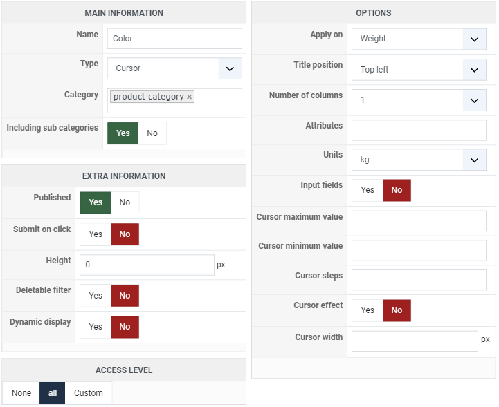
As you can see we selected the type cursor for this one, it will display a nice Jquery cursor allowing user to define a range of price for the product displayed, including discounted products. The filter will be applied on price since it's the selected option and we set a maximum and minimum value for it. You can notice that cursor effect is activated to give a smooth scroll when you click on the cursor bar.
Second filter has to be configured this way:
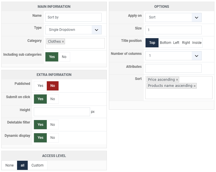
This one will display a sort dropdown where you'll be able to choose between "price ascending", "price descending", "name ascending" and "name descending". You can see that the sort field allow you to add as much data as you want. Two new entries will be displayed for each data.
To conclude this, here is the result: