Check Out Area Is Running Out of Defined Area

  • Posts: 8
  • Thank you received: 0
13 years 1 month ago #8152

When you 'proceed to checkout' the total line at the bottom of the form runs longer than the defined 'main column' area. It's being defined by "p" in the css. But for some reason, even though the "p" is defined to be only 510px this area doesn't fit unless I change that to 380px. Then of course the rest of my posts in the rest of the site are 130px to narrow.

Any insight?

Here's the URL:
www.brennhill.com/newsite/index.php?opti...l=checkout&Itemid=56

Cheers, and thanks in advance for your help!

Please Log in or Create an account to join the conversation.

  • Posts: 81361
  • Thank you received: 13037
  • MODERATOR
13 years 1 month ago #8160

The easiest solution will be to set the option "force a menu on the checkout" in the config of hikashop so that the cart isn't displayed on the checkout but only in the store.

Please Log in or Create an account to join the conversation.

  • Posts: 8
  • Thank you received: 0
13 years 1 month ago #8213

First off thanks for the quick response, it's so nice to have this kind of support for such a great component and have it free!

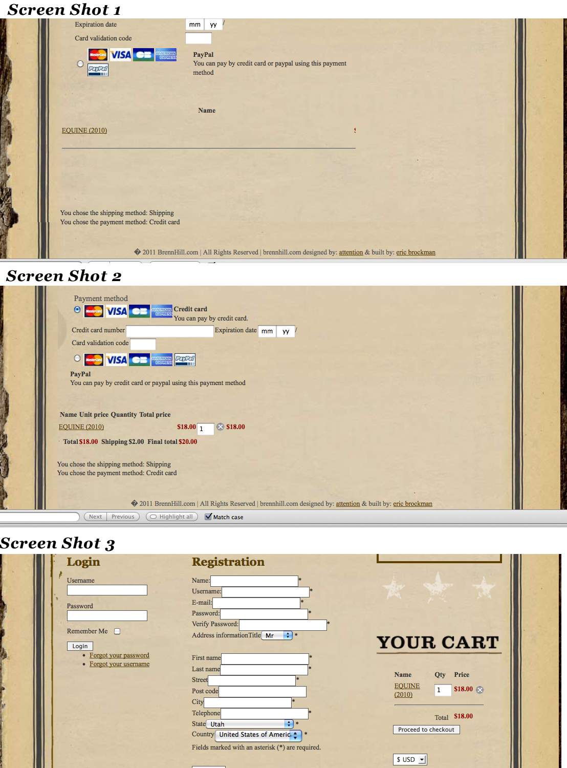
Unfortunately though, that does not work because even without the cart module there, the space the store is in is still defined as being narrower than then the space that it is taking up. So now there is no modules in the right hand column, but still that part of the store is being cut off.

Is there a non-easiest way that will allow me to keep the integrity of the design (with the cart), but just redefine the space allotted for that section of the store?

thanks again,

Please Log in or Create an account to join the conversation.

  • Posts: 8
  • Thank you received: 0
13 years 1 month ago #8214

Also, the 'state' & 'country' drop down menues are running outside of that area as well. Other than that so far this component is great!

Please Log in or Create an account to join the conversation.

  • Posts: 81361
  • Thank you received: 13037
  • MODERATOR
13 years 1 month ago #8218

You can edit the CSS of hikashop in the config under the tab display to adapt it to your template.

For example, you can do that:

replace the CSS code:
.hikashop_checkout_login_left_part {
width: 350px;
float: left;
}

by:
.hikashop_checkout_login_left_part {
width: 160px;
float: left;
}

and add the CSS code:
#address_country{ width:200px}

and add the CSS code:
#hikashop_checkout_cart p{ width:380px }


You should try to learn to use firebug. It's an addon of firefox which enables you to easily tweak the CSS on the fly on your website and then know in which CSS file to make your modifications: www.tutorial9.net/tutorials/web-tutorial...opment-with-firebug/

Please Log in or Create an account to join the conversation.

  • Posts: 8
  • Thank you received: 0
13 years 1 month ago #8336

Thanks for the tip, I use firebug, but never knew that it accessed component css as well, I thought it just went into the main template css file for the site - good to know.

Anyways, sorry to be a bother, but I've been screwing around with the css all day and still can't figure a way to bring these few items at the bottom of the page in to the defined area without screwing up the rest of the page.

Unfortunately I don't know much about PHP yet so it's difficult for me to change the index files that control the architecture of the page.

Please Log in or Create an account to join the conversation.

  • Posts: 81361
  • Thank you received: 13037
  • MODERATOR
13 years 1 month ago #8346

Could you some some screenshots of what you want to do because I don't see what you're talking about ?

Please Log in or Create an account to join the conversation.

  • Posts: 8
  • Thank you received: 0
13 years 1 month ago #8391

Okay sure, if I add items to the cart and then proceed to the checkout for area, the spacing for the cart at the bottom is all screwy - screen shot 1

If I left justify those items, the spacing is still screwy, but you can at least see everything - screen shot 2

But if I left justify those items, it screws up the whole right side of the form - screen shot 3.

Hope that helps.

Attachments:

Please Log in or Create an account to join the conversation.

  • Posts: 81361
  • Thank you received: 13037
  • MODERATOR
13 years 1 month ago #8407

Please try that CSS:

#hikashop_checkout_cart p{ width: 380px !important; }

Please Log in or Create an account to join the conversation.

  • Posts: 8
  • Thank you received: 0
13 years 1 month ago #8417

Beautiful, thanks so much for helping out a new comer to the world of programming.
I'll be sure to leave a 5 star rating and comment on how great the component and support is for this extension in the JED.

Great work.
cheers,

Please Log in or Create an account to join the conversation.

Time to create page: 0.071 seconds
Powered by Kunena Forum