Hi
when yo usay change the resolution you use the wrong word to explain what occur .
RESOLUTION
change the resolution is only available on ( speak about what i test ) on android OS ( tablet or mobile ) with a rooted device and android software . Now i think we ca nchange the resolution to lower ( 300 hdi ppi to 72 ppi desktop screen ).
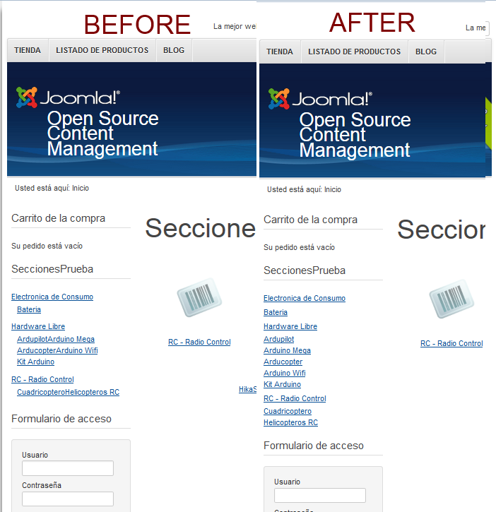
I think you want to write when i change the width of the browser ... the width of the menu change so the location of the items of the menu change.
ZOOM and RESOLUTION are not the same ( apply differently to text / image )
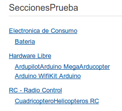
0) the menu width is dynamic and is 25 % even don't test if min or max exist
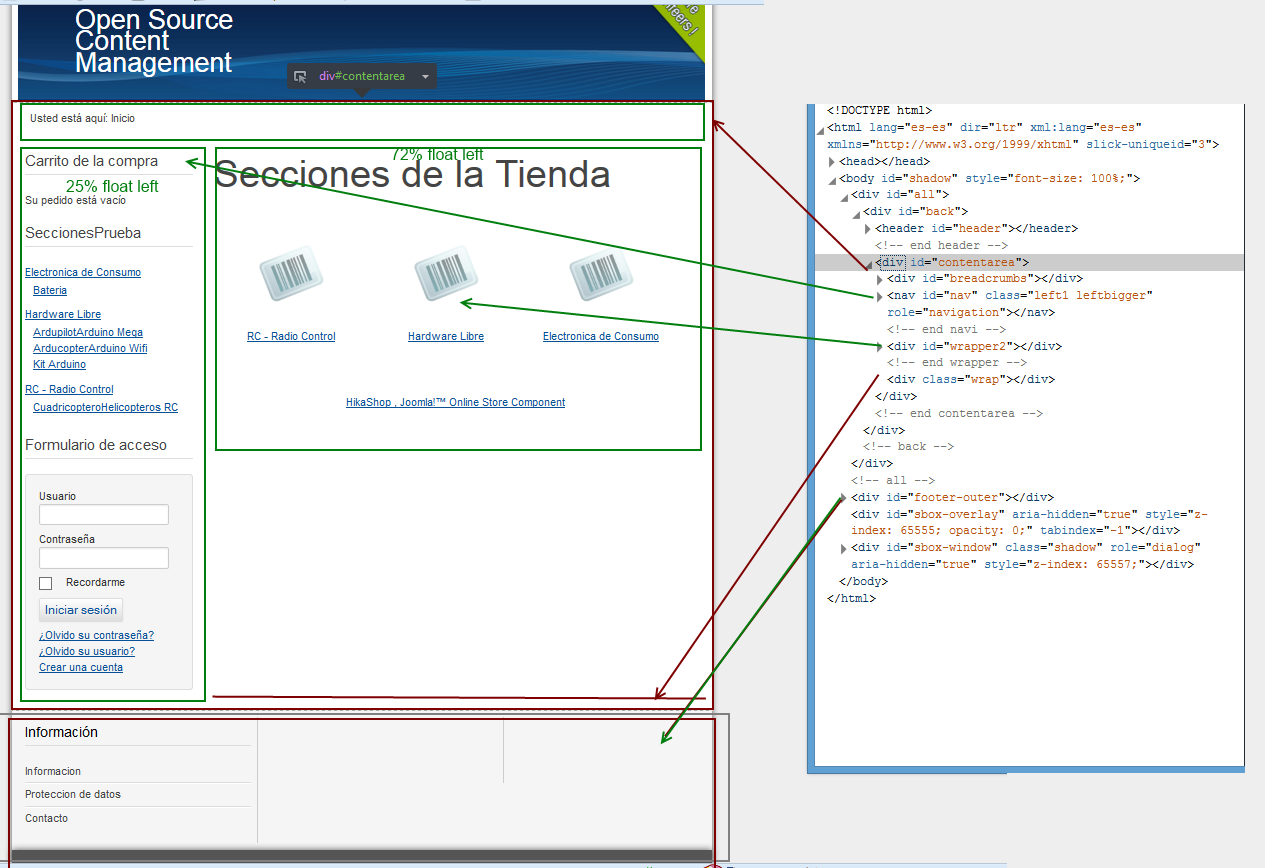
see the capture screen layout with annotation
1) for align all items refer to the same vertical line
beez3/css/layout.css line 66
body ul, body ol { padding: 0 0 0 12px; }
the 12 px create the mess on the menu create using ul li a
2) for make items appear on by line
<li class="hikashop_category_list_item">
.hikashop_category_list_item, .hikashop_product_list_item {float: left;}
this make all the items menu align to the left .
remove this and there ll be one item per line menu item
3) => 1) 2) apply ll give left alignement see the capture screen
This change can create others problems so it some clue not the solution
hope this ll help you .


 HIKASHOP ESSENTIAL 60€The basic version. With the main features for a little shop.
 HIKAMARKETAdd-on Create a multivendor platform. Enable many vendors on your website.
 HIKASERIALAdd-on Sale e-tickets, vouchers, gift certificates, serial numbers and more!
 MARKETPLACEPlugins, modules and other kinds of integrations for HikaShop

