-- url of the page with the problem -- :
goldfieldfireworks.com/index.php/our-fireworks
-- HikaShop version -- : 4.6.1
-- Joomla version -- : 4.2.2
-- PHP version -- : 7.4.29
-- Browser(s) name and version -- : 105.1.0 (Android)
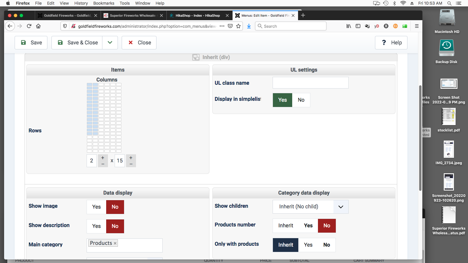
I have a menu item showing a Category listing, and I have set it to show 2 columns of categories. See the first screen shot for the menu settings.
On most devices the category listing looks fine. (see the 2nd screen shot, a phone with a large screen).
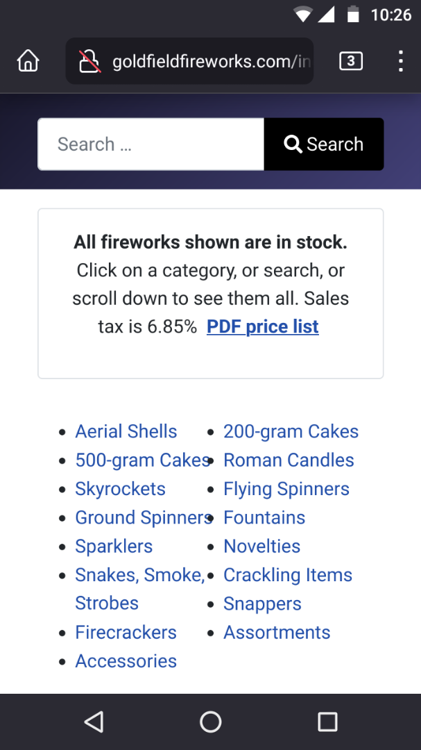
But on a phone with a small screen, the categories are too crowded together (see the 3rd screen shot).
(I am using the Cassiopeia template, the default with Joomla 4, and the Layout is set to "Fluid."
I guess this doesn't matter, but the Hikashop configuration legacy setting "Use bootstrap v2 design" is OFF.)
What I would like is for the category listing to switch to 1 column instead of 2 columns, if the screen size is small. Remain as 2 columns on all other devices. So that, for example, on the small screen phone in the third screen shot, it's only 1 column of categories.
Is there any way to do this?
Thank you.


 HIKASHOP ESSENTIAL 60€The basic version. With the main features for a little shop.
 HIKAMARKETAdd-on Create a multivendor platform. Enable many vendors on your website.
 HIKASERIALAdd-on Sale e-tickets, vouchers, gift certificates, serial numbers and more!
 MARKETPLACEPlugins, modules and other kinds of integrations for HikaShop

