-- url of the page with the problem -- :
fireworksland.com/hikashop-menu-for-categories-listing/
-- HikaShop version -- : HikaShop Essential 2.3.1
-- Joomla version -- : 3.3.1
-- PHP version -- : 5.3.28
-- Browser(s) name and version -- : Safari 7.0.4 Mac, Firefox 30.0 Mac, Safari on iOS 6.1.6
-- Error-message(debug-mod must be tuned on) -- : Error_message
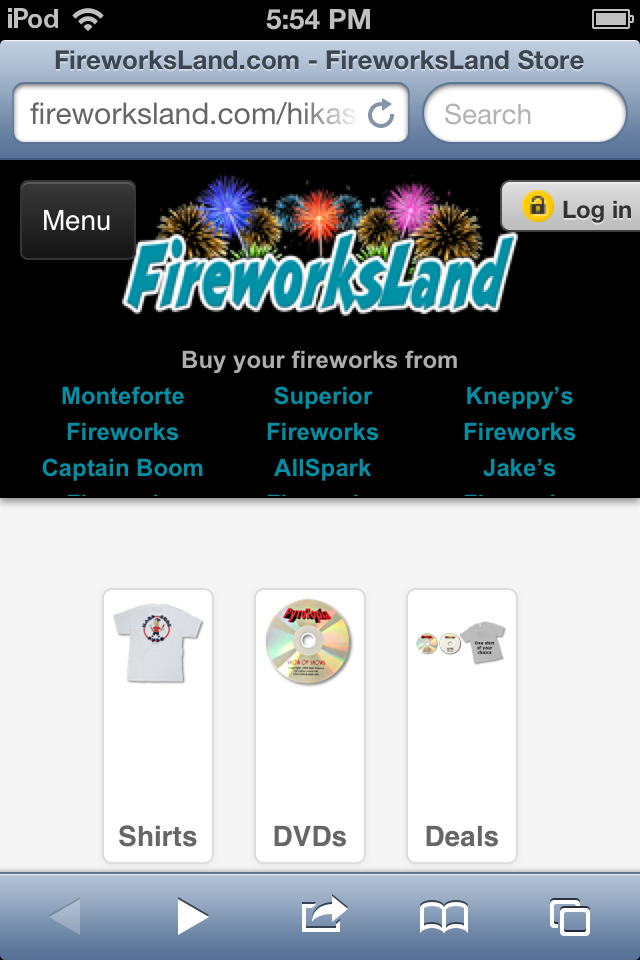
This is just a question about the display of categories on small devices such as phones and iPod Touch. I am attaching a screen shot of the category view as it appears on my iPod Touch 4th Generation, which has a screen with of 640 pixels. The issue is the large white space between the category image and the category name below it.
When I view this page in Firefox or Safari on my Mac, and change the window size, I notice that the <div> that contains the image and text stays the same height no matter what the window width is.
As I make the window narrower, at the breakpoint of 768 width, the template changes to the mobile view, but the <div> and image do not change size.
At some smaller breakpoint (I'm not sure what the exact width is) the display of the categories changes. The images start to get smaller and smaller as the window gets narrower. However the <div> that contains the image and text does not change its height.
When you get to a narrow window, the image is tiny but the <div> is still the same height, so there is a lot of white space between the image and the text.
Is there any change to the CSS that could make the <div> scale down in height, when the image is also scaled down?
Thank you for your help.


 HIKASHOP ESSENTIAL 60€The basic version. With the main features for a little shop.
 HIKAMARKETAdd-on Create a multivendor platform. Enable many vendors on your website.
 HIKASERIALAdd-on Sale e-tickets, vouchers, gift certificates, serial numbers and more!
 MARKETPLACEPlugins, modules and other kinds of integrations for HikaShop

