overlapping images responsive view

  • Posts: 386
  • Thank you received: 7
  • Hikashop Business
4 years 5 months ago #312852

-- url of the page with the problem -- : 01.bluepoint-concept.nl
-- HikaShop version -- : 4.2.2
-- Joomla version -- : 3.9.12
-- PHP version -- : 7.xx
-- Error-message(debug-mod must be tuned on) -- : overlapping images responsive view

Hello,

Images and columns doen't scale when viewing it on ipad or mobile devices.. They overlap. How can we adjust this? what is the solution to have this working correctly?
Please see attachement.


We have read a lot threads about the @media rules.. but none of them are responding?
Pleas help..

Thanks.

Attachments:

Please Log in or Create an account to join the conversation.

  • Posts: 4508
  • Thank you received: 610
  • MODERATOR
4 years 5 months ago #312859

Hello,

We aren't sure this will solve your issue, but can you try to update your HikaShop version.
In the last build, we have add some specific css command for Safari navigator.

Hope this will solve your issue.
Regards

Last edit: 4 years 5 months ago by Philip.

Please Log in or Create an account to join the conversation.

  • Posts: 386
  • Thank you received: 7
  • Hikashop Business
4 years 5 months ago #312891

Hello,

We have the latest version hikashop Business 4.2.2.
That won't solve the issue then..

Regards,

Mark

Please Log in or Create an account to join the conversation.

  • Posts: 81504
  • Thank you received: 13062
  • MODERATOR
4 years 5 months ago #312897

Hi,

You already have the 4.2.2 but you have an old build of the 4.2.2. Since then, we've added some CSS to help with the display of listings with Safari as it was reported to us a few days ago.
So download again the install package on our website and install it again on yours and it will add the patches for better display on Safari. Then, please try again and see how it goes.

Please Log in or Create an account to join the conversation.

  • Posts: 386
  • Thank you received: 7
  • Hikashop Business
4 years 5 months ago #312905

I have downloaded the package and installed again.. This is now how it looks like on ipad modus.. Not neatly and the image goes out of the box..

Attachments:

Please Log in or Create an account to join the conversation.

  • Posts: 4508
  • Thank you received: 610
  • MODERATOR
4 years 5 months ago #312906

Hello,

Can you process some tests, like this :
- Try with a default template like ProtoStar
- Switch for your hikashop frontend css (by default) :


Awaiting news from you to move forward on your subject
Regards

Last edit: 4 years 5 months ago by Philip.

Please Log in or Create an account to join the conversation.

  • Posts: 386
  • Thank you received: 7
  • Hikashop Business
4 years 5 months ago #312921

Hello Philip,

I tried your tests.. but then it looks even worse..
See attachments..

Attachments:

Please Log in or Create an account to join the conversation.

  • Posts: 2143
  • Thank you received: 747
4 years 5 months ago #312923

Hi,

Let me try to solve the mystery:
First, it has nothing to do with the "Safari bug". Actually, it happens in any browser.

If you look up the browser console, you'll find that it comes from CSS as follows:


and


This is inserted as a <style> tag in the <head> section:


And it's generated by the following code at the bottom of any views using the product image, like in your case "listing_img_title":
if(isset($this->rows[0]) && $this->rows[0]->product_id == $this->row->product_id) {
	$css = '';
	if((int)$this->image->main_thumbnail_y>0){
		$css .= '
#'.$mainDivName.' .hikashop_product_image { height:'.(int)$this->image->main_thumbnail_y.'px; }';
	}
	if((int)$this->image->main_thumbnail_x>0){
		$css .= '
#'.$mainDivName.' .hikashop_product_image_subdiv { width:'.(int)$this->image->main_thumbnail_x.'px; }';
	}
	$doc = JFactory::getDocument();
	$doc->addStyleDeclaration($css);
}


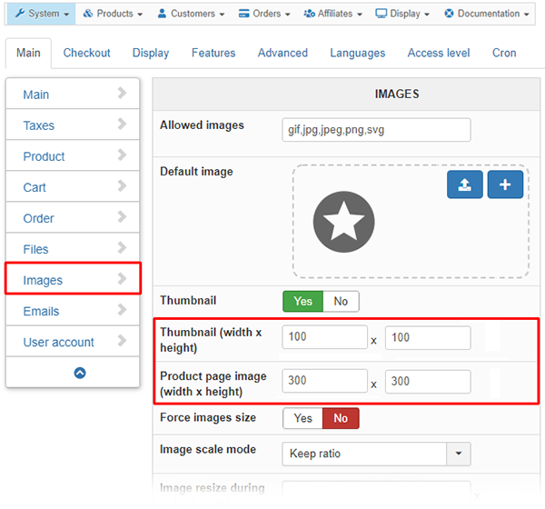
Obviously, this "fixes" the container sizes depending on the settings in the HikaShop main configuration for images, basically "killing" responsiveness.
So, first thing to do: play with those settings, though it might not help. (Which is why I myself comment the above code out in a view override.)
Or override this CSS in your custom frontend CSS.

In this particular case, even if you did any of the above, your Joomla template is missing classic CSS for responsive images and similar content, such as
audio, canvas, img, svg, video {
    max-width: 100%;
    height: auto;
    box-sizing: border-box;
}
So, you may want to add that, too (on template level?) and, for webp images in this case, also add a selector "picture > *".

Amen. :)


Need help with customisations of layouts, style or other site development? PM me!
(Don't forget to turn on "E-mail notification of new messages" )
Attachments:
Last edit: 4 years 5 months ago by lousyfool.
The following user(s) said Thank You: Philip

Please Log in or Create an account to join the conversation.

  • Posts: 4508
  • Thank you received: 610
  • MODERATOR
4 years 5 months ago #312934

Hello,

Yes, @BluepointWebdesign try to process some tests by define different size here :


And, @lousyfool is right you can adapt your css command with your own css command directly in your frontend.
Regards

Last edit: 4 years 5 months ago by Philip.

Please Log in or Create an account to join the conversation.

Time to create page: 0.122 seconds
Powered by Kunena Forum