.hkc-xs-12, .hkc-xs-11, .hkc-xs-10, .hkc-xs-9, .hkc-xs-8, .hkc-xs-7, .hkc-xs-6, .hkc-xs-5, .hkc-xs-4, .hkc-xs-3, .hkc-xs-2, .hkc-xs-1,
.hkc-sm-12, .hkc-sm-11, .hkc-sm-10, .hkc-sm-9, .hkc-sm-8, .hkc-sm-7, .hkc-sm-6, .hkc-sm-5, .hkc-sm-4, .hkc-sm-3, .hkc-sm-2, .hkc-sm-1,
.hkc-md-12, .hkc-md-11, .hkc-md-10, .hkc-md-9, .hkc-md-8, .hkc-md-7, .hkc-md-6, .hkc-md-5, .hkc-md-4, .hkc-md-3, .hkc-md-2, .hkc-md-1,
.hkc-lg-12, .hkc-lg-11, .hkc-lg-10, .hkc-lg-9, .hkc-lg-8, .hkc-lg-7, .hkc-lg-6, .hkc-lg-5, .hkc-lg-4, .hkc-lg-3, .hkc-lg-2, .hkc-lg-1,
.hkc-xl-12, .hkc-xl-11, .hkc-xl-10, .hkc-xl-9, .hkc-xl-8, .hkc-xl-7, .hkc-xl-6, .hkc-xl-5, .hkc-xl-4, .hkc-xl-3, .hkc-xl-2, .hkc-xl-1{
width: 100%;
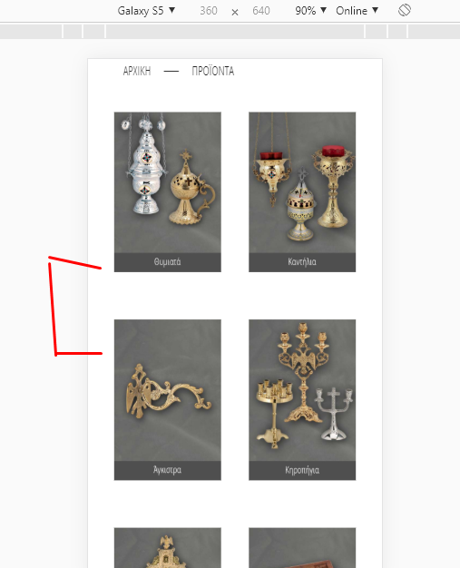
}it's this code which changes from X columns to 1 column on small resolutions.
If you change that code to 50%, then you'll keep two columns on small resolutions.
so that it does it only on category listings.
Note that you can't put that code elsewhere, otherwise, it will overwrite the code for the display in more columns (the CSS just after in that file with the @media tags). Or you would have to copy as well the whole @media CSS code area after that too.
Note also that since you can't do an override of that CSS file, you'll loose the modifications you make in it when you update your HikaShop.


 HIKASHOP ESSENTIAL 60€The basic version. With the main features for a little shop.
 HIKAMARKETAdd-on Create a multivendor platform. Enable many vendors on your website.
 HIKASERIALAdd-on Sale e-tickets, vouchers, gift certificates, serial numbers and more!
 MARKETPLACEPlugins, modules and other kinds of integrations for HikaShop


