-- HikaShop version -- : 3.5.1
-- Joomla version -- : 3.8.11
-- PHP version -- : 7
-- Browser(s) name and version -- : Chrome
So after some toying around, I've finally got the User Control Panel working, and I made some changes to make the Wishlist buttons display appropriately...but I have an odd issue on mobile that does not show up on a Desktop browser.
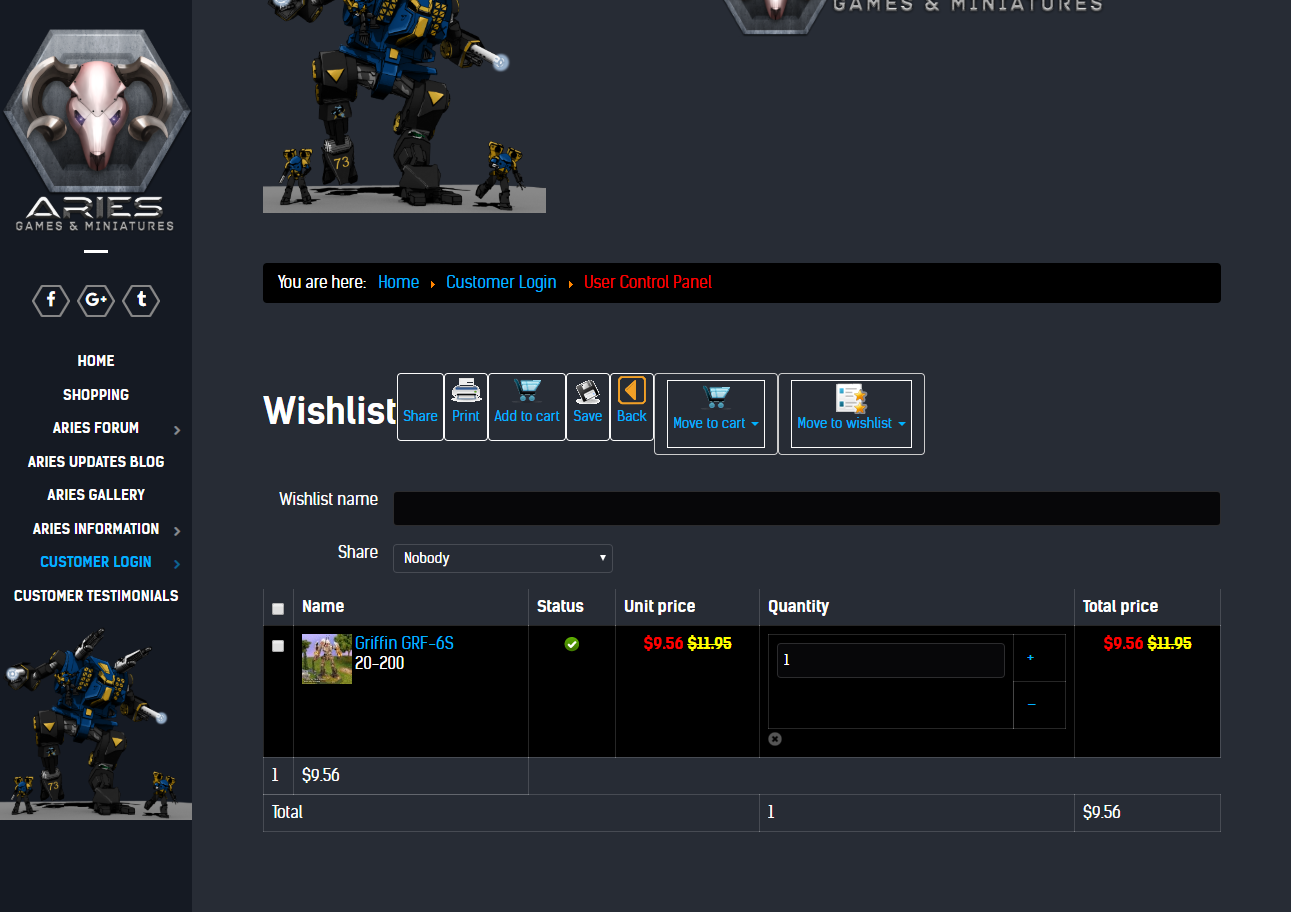
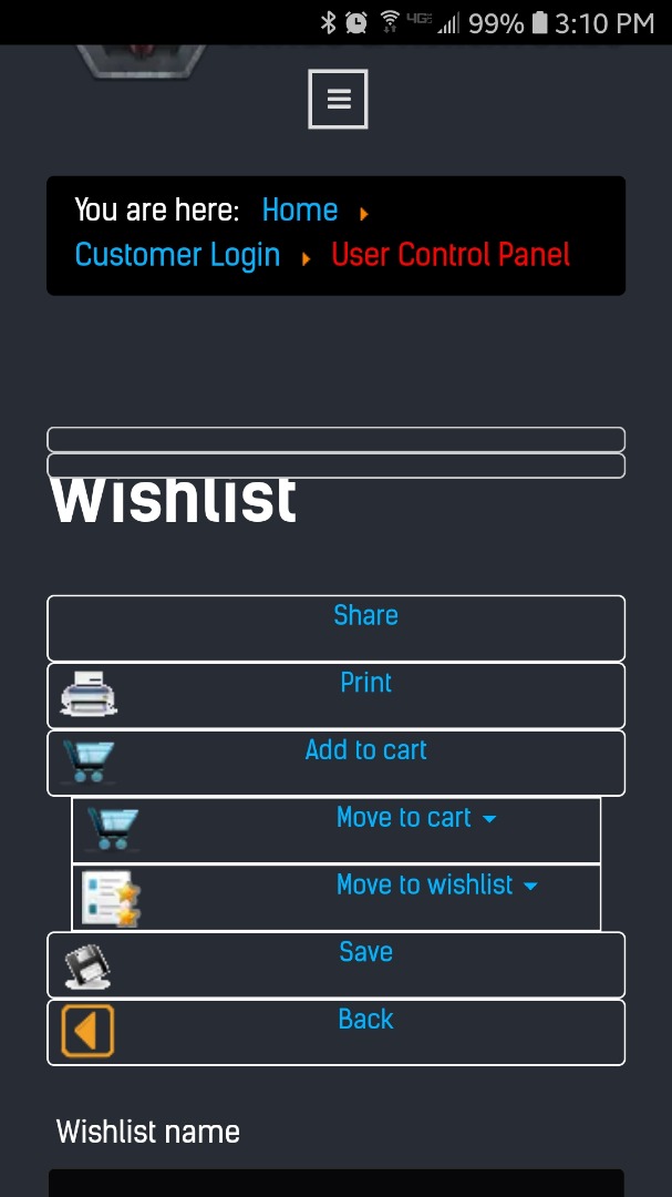
Here are the screen shots...
Desktop...
Mobile...
Now, first off...I can see there are 2 Cart buttons...one is add to cart, the other is Move to cart. This seems redundant. Why are there 2 buttons that essentially do the same thing?
Secondly, I'm already in the wishlist, why would I want to move something in my wishlist to my wishlist? I know you can move to a new wishlist using that button...but again, it seems like a redundant button, either that...or incorrectly displayed & named.
Now...in the desktop screen, I can see the "Move to cart" and the "Move to wishlist" buttons have an extra border aaround them. This is where I think my issue is...
On the mobile screen, those two buttons do not have an extra border around them...but what I THINK are those two extra borders...are above the word wishlist on the mobile screen.
Any thoughts here? Before someone gives a reply back stating this is due to my custom template...I tried clearing these out and using just the standard template and they are there as well...so this is an inherent problem that is not caused by my template as I also checked with RocketTheme and they confirmed this.
 HIKASHOP ESSENTIAL 60€The basic version. With the main features for a little shop.
 HIKAMARKETAdd-on Create a multivendor platform. Enable many vendors on your website.
 HIKASERIALAdd-on Sale e-tickets, vouchers, gift certificates, serial numbers and more!
 MARKETPLACEPlugins, modules and other kinds of integrations for HikaShop


