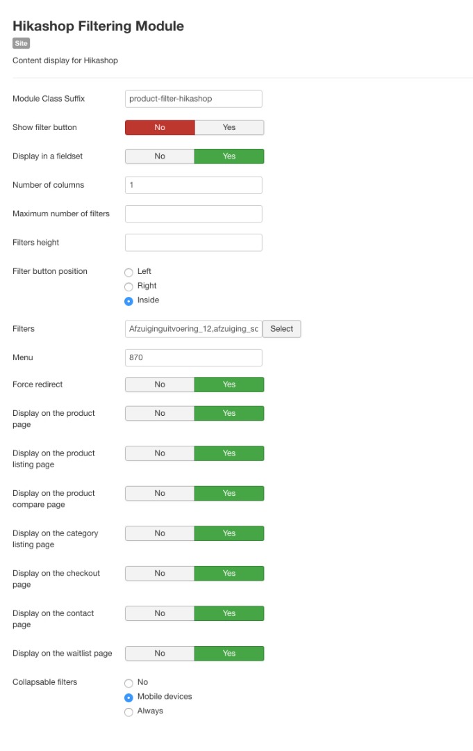
Collapsible filter not working on mobile landscape

  • Posts: 94
  • Thank you received: 2
  • Hikashop Business
4 years 9 months ago #308583

-- HikaShop version -- : 4.1.0
-- Joomla version -- : 3.9.10
-- PHP version -- : 7.1.29
-- Browser(s) name and version -- : All
-- Error-message(debug-mod must be tuned on) -- : No error

Where can I configure from which width the collapsible filter must start to work? Now it's not working on a iPhone 6 in landscape view (and I want that!). In the module there are no settings for this, only no / mobile / always.

Thanks in advance

Please Log in or Create an account to join the conversation.

  • Posts: 81481
  • Thank you received: 13062
  • MODERATOR
4 years 9 months ago #308584

Hi,

The width at which the filter area changes for mobile is done with CSS. If you want to change that value because your template/website structure, you need to add your our CSS.
By default you have this in HikaShop:

@media only screen and (max-width: 640px) {
	.hikashop_filter_collapsable_title_mobile {
		display: block;
	}
	.hikashop_filter_fieldset_mobile h3 {
		display: none;
	}
	div.hikashop_filter_collapsable_content_mobile {
		display: none;
	}
}
So in your own CSS, you would have to add something like that:
@media only screen and (min-width: 640px) and (max-width: XXXpx) {
	.hikashop_filter_collapsable_title_mobile {
		display: none;
	}
	.hikashop_filter_fieldset_mobile h3 {
		display: block;
	}
	div.hikashop_filter_collapsable_content_mobile {
		display: block;
	}
}
where XXX would be the value in pixel at which point you want the switch to happen.
This CSS should preferably be added to your template custom CSS, but you can also add it as a HikaShop CSS override:
www.hikashop.com/support/documentation/1...ize-the-display.html

The following user(s) said Thank You: RustyHika

Please Log in or Create an account to join the conversation.

  • Posts: 94
  • Thank you received: 2
  • Hikashop Business
4 years 8 months ago #309027

Hi Nicolas,

Tried to implement the suggested code into the custom CSS (large-mobile-range and desktop-range), but it doesn't work. What can be done?My breakpoints are:
// 75rem
@include breakpoint(large-desktop-range)

// 60rem to 74.938rem
@include breakpoint(desktop-range)

// 48rem to 59.938rem
@include breakpoint(tablet-range)

// 30rem to 47.938rem
@include breakpoint(large-mobile-range)

// max 30rem
@include breakpoint(small-mobile-range)

Please Log in or Create an account to join the conversation.

  • Posts: 81481
  • Thank you received: 13062
  • MODERATOR
4 years 8 months ago #309033

Hi,

I'm not sure what you mean ?
Did you try the exact code I gave ?
Did you change the XXX to the value in pixel that you want for the switch ?
Where did you add it ?
And what is the link with the CSS @include lines you posted in your message ?

Please Log in or Create an account to join the conversation.

  • Posts: 94
  • Thank you received: 2
  • Hikashop Business
4 years 8 months ago #309059

Hi Nicolas,

I tried exactly your code with a max of 1600px to check:

@media only screen and (min-width: 640px) and (max-width: 1600px) {
.hikashop_filter_collapsable_title_mobile {
display: none;
}
.hikashop_filter_fieldset_mobile h3 {
display: block;
}
div.hikashop_filter_collapsable_content_mobile {
display: block;
}
}

And tried the 3 selectors within the media queries included on custom CSS from a Rocket Theme (Gantry5) template, hence the @include! Unfortunately on iPhones 6, 7 and 8 (and plus) landscape view, the collapsible filter is not shown.

Please Log in or Create an account to join the conversation.

  • Posts: 4502
  • Thank you received: 610
  • MODERATOR
4 years 8 months ago #309102

Hello,

Can we see the context and so for this, can you provide :
- An url link with the issue
- A screenshot of your filter module configuration

Awaiting news from you to move forward on your subject.
Regards

Last edit: 4 years 8 months ago by Philip.

Please Log in or Create an account to join the conversation.

  • Posts: 94
  • Thank you received: 2
  • Hikashop Business
4 years 8 months ago #309106

This message contains confidential information


Attachments:

Please Log in or Create an account to join the conversation.

  • Posts: 4502
  • Thank you received: 610
  • MODERATOR
4 years 8 months ago #309126

Hello,

I think I get it, first, you have to remove the previous custom css (in order to go back to default HikaShop css) then you have to edit your frontend file css with this command :

@media only screen and (max-width: 640px) {
	.hikashop_filter_collapsable_title_mobile {
		display: block;
	}
	.hikashop_filter_fieldset_mobile h3 {
		display: none;
	}
	div.hikashop_filter_collapsable_content_mobile {
		display: none;
	}
}

Add this code at the end of your css file, see this tutorial to see how to proceed.
On our side, we will correct this for next HikaShop release.

Can you try to do this and tell us if that solve your issue.
Regards

Last edit: 4 years 8 months ago by Philip.

Please Log in or Create an account to join the conversation.

  • Posts: 94
  • Thank you received: 2
  • Hikashop Business
4 years 8 months ago #309153

Hi Philipe,

I think you mean (max-width: 760px), instead of the already placed 640px? Put that in the front-end CSS and this works!
Thanks!!

Please Log in or Create an account to join the conversation.

Time to create page: 0.094 seconds
Powered by Kunena Forum