Product images look really bad on mobile. Why?

  • Posts: 317
  • Thank you received: 20
  • Hikashop Business
1 year 1 month ago #350168

-- url of the page with the problem -- : www.javelincommunications.com/build-your-dream-stanchion
-- HikaShop version -- : 4.7.1
-- Joomla version -- : 3.10.11

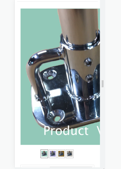
Here is a screenshot of the problem.


We see that the image is not being centered and bounded by the container as it should. The question is why? And can it be fixed?
What is the alternative?
Hide product images from mobile view? Would not be good.
Resize images so that are all 300px wide? Would look dinky on desktop view.
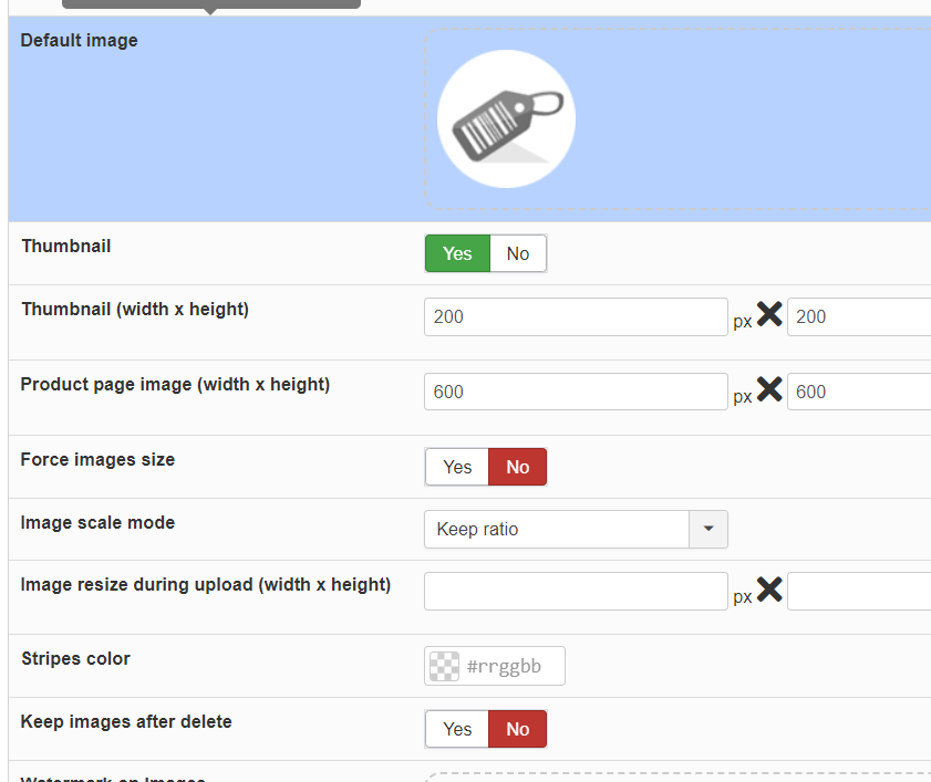
Here are our main image settings.


I have played around with custom.css and nothing seems to work. Thought maybe I could address the issue with a media query. No dice.
Since Hikashop has been around a long time, it must be mobile, all bugs have been worked out, and I must be doing something wrong. Please take a look and let me know?
Thank you!
-Jim Gribble

Attachments:
Last edit: 1 year 1 month ago by jgribble.

Please Log in or Create an account to join the conversation.

  • Posts: 317
  • Thank you received: 20
  • Hikashop Business
1 year 1 month ago #350173

I did notice what I think may be a clue. When I put any values into the main image height/width, it throws mobile view out of whack. Mobile looks good only when you leave those fields blank. Image size then defaults to a width which is hard-coded somewhere I couldn't see. However, we do want to use the main image large, because we want to show off these products' beauty. There's got to be some custom code we can implement to regulate width on mobile view, not matter how large we want to display the main product image. I'm just having trouble identifying the correct divs or combination of divs.
Thank you.
-Jim Gribble

Please Log in or Create an account to join the conversation.

  • Posts: 81540
  • Thank you received: 13071
  • MODERATOR
1 year 1 month ago #350185

Hi,

The system will use the width you tell it to.
If you want to force the width of the image to scale down if there isn't enough width, you need to add a bit of CSS like that:

#hikashop_main_image {
    max-width: 100%;
}

Please Log in or Create an account to join the conversation.

  • Posts: 317
  • Thank you received: 20
  • Hikashop Business
1 year 1 month ago #350190

Ahh yes. I was using .hikashop_main_image, not #hikashop_main_image. So, with the help of a media query like min-width: 1200px, I should be able to achieve what I want.
Thank you again,
-Jim G.

Please Log in or Create an account to join the conversation.

  • Posts: 317
  • Thank you received: 20
  • Hikashop Business
1 year 1 month ago #350191

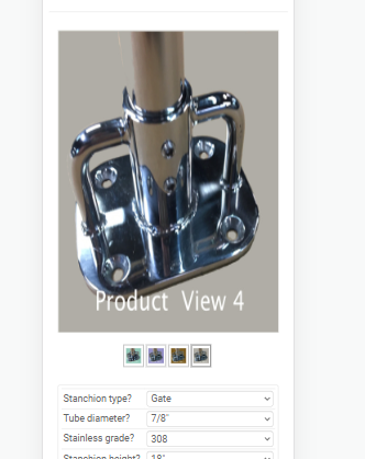
Your code works, but only for main image. On mobile, as we toggle through the images, the images become stretched vertically. There seems to be some kind of subdiv in play, which only partially responds to the code.


I played around with trying to edit that subdiv but couldn't get it to work.
It only limits the image width; vertical proportionality is allowed to grow.
What do you suggest?
This client is an ultra-competitive niche and we have to get mobile bullet-proof.
-Jim Gribble

Attachments:

Please Log in or Create an account to join the conversation.

  • Posts: 4519
  • Thank you received: 612
  • MODERATOR
1 year 1 month ago #350196

Hello,

Then, the most direct is to add specific command to manage small screen case (start with 600px width)

@media only screen and (max-width:600px) {
    div#hikashop_image_main_thumb_div {
        height: 365px !important;
    }
    #hikashop_main_image {
        max-width: 100%;
        width: 345px;
        height: 345px;
    }
}
Note : Learn more about the "@media" here .

Hope this will help to adjust your display.
Regards

Last edit: 1 year 1 month ago by Philip.

Please Log in or Create an account to join the conversation.

  • Posts: 317
  • Thank you received: 20
  • Hikashop Business
1 year 1 month ago #350201

Looks very promising. Thanks. I like using the hard values. "main_thumb_div" had me stumped. But it seems this will do the job nicely.
-Jim Gribble

Please Log in or Create an account to join the conversation.

  • Posts: 317
  • Thank you received: 20
  • Hikashop Business
1 year 1 month ago #350202

I presented our demo to the client today. They were thrilled and we are moving foward. Thanks for all the tips and tricks along the way.
www.javelincommunications.com/build-your-dream-stanchion
-Jim Gribble

The following user(s) said Thank You: Philip

Please Log in or Create an account to join the conversation.

  • Posts: 317
  • Thank you received: 20
  • Hikashop Business
1 year 1 month ago #350224

Philippe,
This code is an improverment. At least all images are the same size on mobile. However ALL are now stretched vertically. I have tried to tweak it without success. Do you have a further suggestion? My source images are square. Is image aspect ratio critical?
See here www.javelincommunications.com/build-your-dream-stanchion
Thank you,
-Jim Gribble
Here again is the code.
@media only screen and (max-width:600px) {
div#hikashop_image_main_thumb_div {
height: 365px !important;
}
#hikashop_main_image {
max-width: 100%;
width: 345px;
height: 345px;
}
}

Last edit: 1 year 1 month ago by jgribble.

Please Log in or Create an account to join the conversation.

  • Posts: 4519
  • Thank you received: 612
  • MODERATOR
1 year 1 month ago #350230

Hello,

Sorry for this return but we aren't sure to understand your point, when we get to your website we didn't see our custom code...

When we apply the custom code (via our browser) everything seems good mobile AND classic view.
And so, can you tell us a little more about the nature of the problem, and to be sure we understand, why we can't find the custom code in your frontend css file.

Sorry again for this return.
Regards

Last edit: 1 year 1 month ago by Philip.

Please Log in or Create an account to join the conversation.

  • Posts: 317
  • Thank you received: 20
  • Hikashop Business
1 year 1 month ago #350240

Phillipe,
Thank you. I had put the code at the bottom of the custom.css file. I tried moving it to the top of the file and that seems to have fixed it. Normally we add edits to the very bottom of the file; but I have found in a few cases that that causes issues. It's nowi showing almost exactly as I want it to.
Your help is much appreciated..
Add this code to the defajult css in the future? Really handy.
-Jim Gribble

The following user(s) said Thank You: Philip

Please Log in or Create an account to join the conversation.

  • Posts: 4519
  • Thank you received: 612
  • MODERATOR
1 year 1 month ago #350257

Hello,

Thanks for your return, and for adding this code in our futur package, we can really do this because there are specific size commands, and so won't fit everybody display.

Regards

Please Log in or Create an account to join the conversation.

  • Posts: 317
  • Thank you received: 20
  • Hikashop Business
1 year 1 month ago #350261

I get it, thank you. Maybe though add something about this to your documentation?
-Jim Gribble

Please Log in or Create an account to join the conversation.

  • Posts: 4519
  • Thank you received: 612
  • MODERATOR
1 year 1 month ago #350263

Hello,

You have already some documentation , and concrete example .
Regards

Last edit: 1 year 1 month ago by Philip.

Please Log in or Create an account to join the conversation.

  • Posts: 317
  • Thank you received: 20
  • Hikashop Business
1 year 1 month ago #350269

Yes thanks again, the documentation is very good indeed. It is a lot to absorb; especially since the last time I used Hikashop was five years ago.
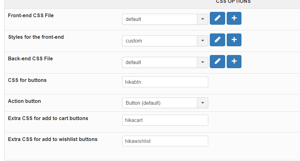
I am making all my CSS customizations here in the "styles for front-end" file; and I have "front-end CSS file" set to "default;" and am leaving that one alone.


-Jim Gribble

Attachments:
Last edit: 1 year 1 month ago by jgribble.

Please Log in or Create an account to join the conversation.

Time to create page: 0.094 seconds
Powered by Kunena Forum