
- Details
- Written by: Administrator
- Category: HikaShop
- Hits: 81119
|
|

Description
This screen enables you to manage all your custom fields. In HikaShop, you will be able to manage custom fields for the customer information, his addresses information, categories information, products information, article information and orders information.
- With the address custom fields, you will be able to personalize the information you can gather from your customers for each of their addresses. There are already custom fields available for the address so that you can easily tweak them for your needs. This is available in all versions of HikaShop.
- With the user custom fields (both essential and business edition only), you will be able to personalize the information you can gather from your customers when they register while on the checkout process. For example, if you want to know their birthday, you can add a custom field for that. Then, thanks to the integration with AcyMailing, you will be able to send automatic emails to them based on their birthday.
- With the category custom fields (both essential and business edition only), you will be able to personalize the information for your categories. Your potential customers will be able to see those on the products and categories listings if you choose to display them there..
- With the product custom fields (both essential and business edition only), you will be able to personalize the information for your products. Your potential customers will be able to see those on the product page. Also, with the filtering module, which will be available in a later release, your customers will be able to filter your products using filters based on those custom fields.
- With the item custom fields (business edition only), you will be able to personalize the information you can gather from your customers when they order something on your store. The custom fields will appear on the products page where you will be able to ask the user information related to the product he wants to buy. It's useful when you sell personalized goods like for example a shirts selling website where the customers can upload an image to be printed on the shirts.
- With the order custom fields (business edition only), you will be able to personalize the information you can also gather from your customers when they order something on your store. But the difference with the previous type of custom field is that these fields appear on the checkout in the fields view. For example, You can ask them information about the delivery or the payment or a "comments to the shop" field. Then, you will find this information on the order details and/or the orders listing on the back end.
- With the contact custom fields (business edition only), you will be able to add extra fields to the product contact form (the "Contact us about this product" page). Unlike other custom field types, contact fields do not create a column in the database. The values entered by the customer are included in the contact email sent to the shop administrator.
- With the entry custom fields (business edition only), you can configure an entry registration form (to an event for example). We have a tutorial on this specifically here.
You can find the custom fields listing via the menu Display->Custom fields in your HikaShop backend.
Listing Page Toolbar

- New : Enables you to create a new custom field.
- Edit : Select a custom field and then click on this button in order to edit its information.
- Delete : Select one or several custom fields and click on this button in order to completely delete them. You can't delete core custom fields which are the custom fields there by default. You can however unpublish them. When you delete a custom field, the column in the table is removed along with all the data in it.
- Help : This button enables you to turn ON/OFF the help section, this screen will appear or disappear.
- Control panel : You can go back to the control panel using this button.
Column Headers
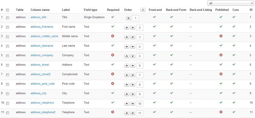
-
# : An indexing number automatically assigned for ease of reference.
- Checkbox : Check this box to select one or more items. To select all items, check the box in the column heading. After one or more boxes are checked, click on the delete button in order to delete the selected custom fields.
- Table : The type of custom fields. It will be either address, user, product or order. It is more precisely the name of the table where the custom field column is added.
- Column name : The name of the column in the table. You should avoid as much as possible special characters for the column name.
- Label : The label of the field. You can translate it via JoomFish. Note that core custom fields should be translated via the translation file of HikaShop so that everyone can benefit of the translations. In the translation file you will find them by searching for the English label which will be uppercase and spaces replaced with _. For example, you will find "Middle name" with the key MIDDLE_NAME in the translation file. You can edit the translation files of HikaShop in the configuration page of HikaShop, under the tab languages.
- Field type : The type of the custom field. That will enable you to decide how you want to show your custom field (as a dropdown, or as an input box or as a text area, etc). Based on that you might have additional options when editing the fields.
- Required : This will define whether the field needs to be filled in forms. If required, the system won't allow the creation or the change of an address (or a product or a user) as long as the field is not filled.
- Order : The order will define the position of fields on forms.
- Front end : If set to yes, address and user customer fields will be used during the checkout process to ask more information about the customer. Product custom fields will be displayed as specifications on the product page.
- Back end Form : If set to yes, you will be able to change this information on the back end. Usually it should be always yes.
- Back end Listing : If set to yes, the value of the field will be displayed as an additional column on listings on the back end. Note that this only applies to user and product custom fields.
- Published : If a custom field is published it means that it will be used by the system, otherwise, it won't be taken into account.
- ID : This field indicates the ID of the custom field.
Edition PageToolbar

- Save : Save the custom field and return to the custom fields Management screen.
- Apply : Apply the modifications to the custom field and stay on the same screen.
- Cancel : Return to the previous screen without saving the modifications.
- Help : This button enables you to turn ON/OFF the help section, this screen will appear or disappear.
Main
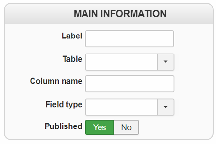
- Label : The label of the field. You can translate it via JoomFish. Note that core custom fields should be translated via the translation file of hikashop so that everyone can benefit of the translations. In the translation file, you will find them by searching for the english label which will be uppercase and spaces replaced with _. For example, you will find "Middle name" with the key MIDDLE_NAME in the translation file. You can edit the translation files of HikaShop in the configuration page of HikaShop, under the tab languages.
- Table : The type of custom fields. It will be either address, user, product or order. It is more precisely the name of the table where the custom field column is added. As you can see, once a custom field is created, you can't change the table where it is located. If you want to do so, you will have to delete it and create a new one.
- Column name : The name of the column in the table. You should avoid as much as possible special characters for the column name. As you can see, once a custom field is created, you can't change its column name. If you want to do so, you will have to delete it and create a new one.
- Field type : The type of the custom field. That will enable you to decide how you want to show your custom field (as a dropdown, or as an input box or as a text area, etc). Based on that, you might have additional options below the Default value option. For example, the telephone field being a text custom field, it has a size option you can change. With HikaShop Business, you have the additional type "file" which will allow you to ask a file to be provided by the user and it will then be available with a link to it.
- Published : If a custom field is published it means that it will be used by the system, otherwise, it won't be taken into account.
- Translations : This area will appear if the "Activate the edition of content in multiple languages" setting is activated under the Languages tab of the HikaShop configuration. When clicking on a flag, you'll get a popup. In it, you'll be able to provide a translation for the label of the custom field. Also, if the custom field has values, you'll be able to provide translations for those values.
Restrictions
Generic
Address
Item & Contact
Entry
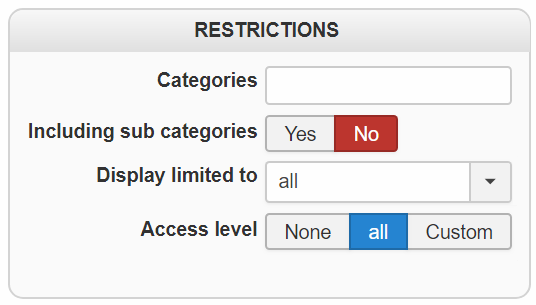
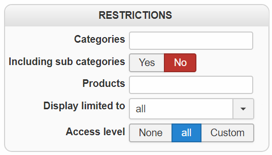
- Categories : If you select one or several categories here, that means that your custom field will only be applied in this (these) category
- Including sub-categories : This options allow your custom field to be applied to child categories, and not only on parent categories
- Products : Limit the custom field to be only applied for one or several specific products.
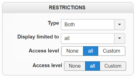
- Access level : Same idea as previous options but by using the Access Control List (ACL), and so you can restrict that custom field from being displayed to some Joomla groups of users. This option is only available in the Business edition of HikaShop.
- Type : (only for Address custom field) This option will allow to choose, if you want to display the custom field in Billing or Shipping address or both.
- Shipping methods : Only for order custom fields. Limits the field to the orders whose shipping method is one of those selected here, so that you can ask something of your customer for one carrier and not for the others.
- Payment methods : Only for order custom fields, and the same for the payment method chosen on the checkout.
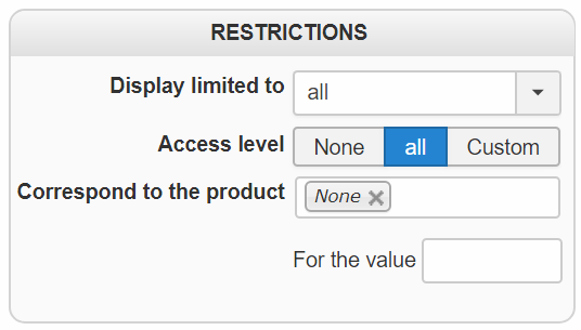
- Display limited to : Here, you can select another custom field of the same table and the corresponding values for which you would like the current custom field to be displayed.
- Correspond to the product :
- For the value : The option is directly linked to the previous one.
Main attributes
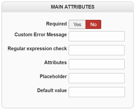
- Required : This will define whether the field needs to be filled in forms. If required, the system won't allow the creation or the change of an address (or a product or a user) as long as the field is not filled.
- Custom Error Message : If the user does not fill a required field, a standard message will be displayed. You can customize your error message in this field.
- Regular expression check : You can enter here a regular expression so that if your custom field is required, the data entered by the user in the field will have to match the regular expression here. For example, you could use the regular expression [0-9]+ to only allow integers in the field.
- Attributes : Here, you can enter attributes that can be added to the field HTML element. So for example, for a custom field of the type "text" you could enter the text: autocomplete="off" in order to deactivate the auto complete feature of the browser for that custom field.
- Placeholder : Here you can enter some text which will appear as placeholder when the custom field is empty. You can use this to guide the user on what he should write in the custom field.
- Inline : For the fields which offer several values, radio buttons and checkboxes, displays the values next to each other on one line instead of one per line.
- Open in new window : For a link custom field, whether the link opens in a new tab of the browser. On by default.
- Default value : Default value for the current field. If you change the field type, you will have to save the change before you will see the corresponding default value option. For example, if you change from a text to a zone type custom field, you will have to save the field before you will see the dropdown with all the countries in it.
- Allow new values : this option will be displayed only for custom fields with values. When that setting is activated, the user will be able to add extra values with a button below the custom field selector, thus avoiding having to edit the custom field beforehand when you need a new value.
Field data
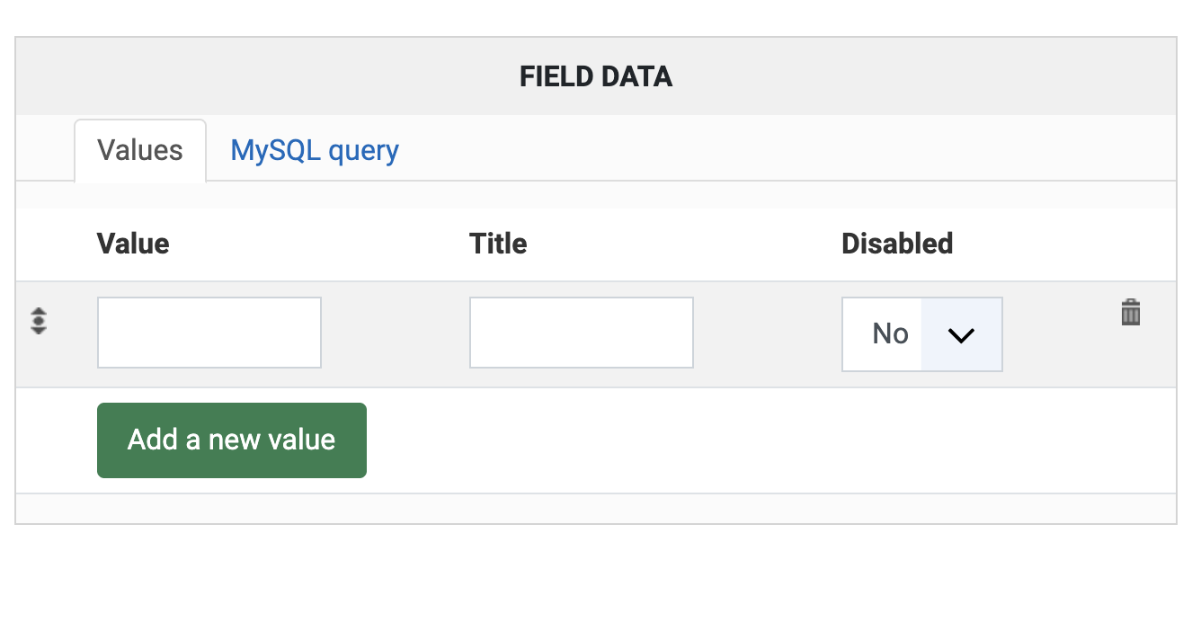
- Values : You can enter here the values which will be available in the selector (dropdown, radio, checkbox). The text under the "Value" column will be stored in the database and the text under the "Title" column is what will be seen by the users.
- MySQL query : Here, you can enter a MySQL query to load the values dynamically from somewhere in the database instead of manually entering the values in the custom field. For example, to have a user selector, you could write the MySQL query: SELECT user_id AS value, user_email AS title FROM #__hikashop_user;
Extra attributes
Generic
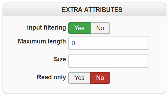
Adress & User
- Columns : The width of a text area custom field, in characters.
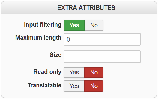
- Input Filtering : If you have a custom field of type "link", "text", "text area" or "WYSIWYG", enabling this option will filter the text entered and avoid XSS vulnerabilities. You normally want that setting enabled for custom fields that can be filled in on the frontend.
- Maximum length : Set the number of character to enter in a custom field of type text or textarea.
- Rows : The height of a text area custom field, in lines.
- Zone : For a zone custom field, which zones the selector offers: the countries, the states, or both.
- Add a 'Please select' value : Adds an empty entry at the top of the selector, so that nothing is chosen for the customer and a required field really has to be answered.
- Group countries by continent : For a zone custom field which offers countries, groups them under their continent in the dropdown instead of one long list.
- Size : Define the number of lines to display in a dropdown.
- Format : How the value of the field is written wherever it is displayed. Write {value} where the value itself goes, and anything around it is kept, which is how a field is shown with a unit or a prefix.
- Format for each file : For an AJAX file custom field, how each file of the field is written when the value is displayed. Use {value} for the file itself.
- Format for each image : The same, for an AJAX image custom field.
- Format : For "advanced date picker" fields, you can configure the format of the dates. Note that invalid or ambiguous formats will lead to errors so please make sure you're using a valid format.
- Custom text : For a custom field of the type "custom text", the text itself. Such a field asks nothing of the customer: it displays that text in the form, which is how you add a note or a title in the middle of the fields.
- Allow : For "advanced date picker" fields, you can allow dates only in the past (for birthday dates for example) or only in the future (for delivery dates for example).
- Read only: Used to lock the value of a text type custom field, the customer can't change its value.
- Translatable : Enable or not the possibility to translate the custom field content.
Extra attributes for AJAX file / image
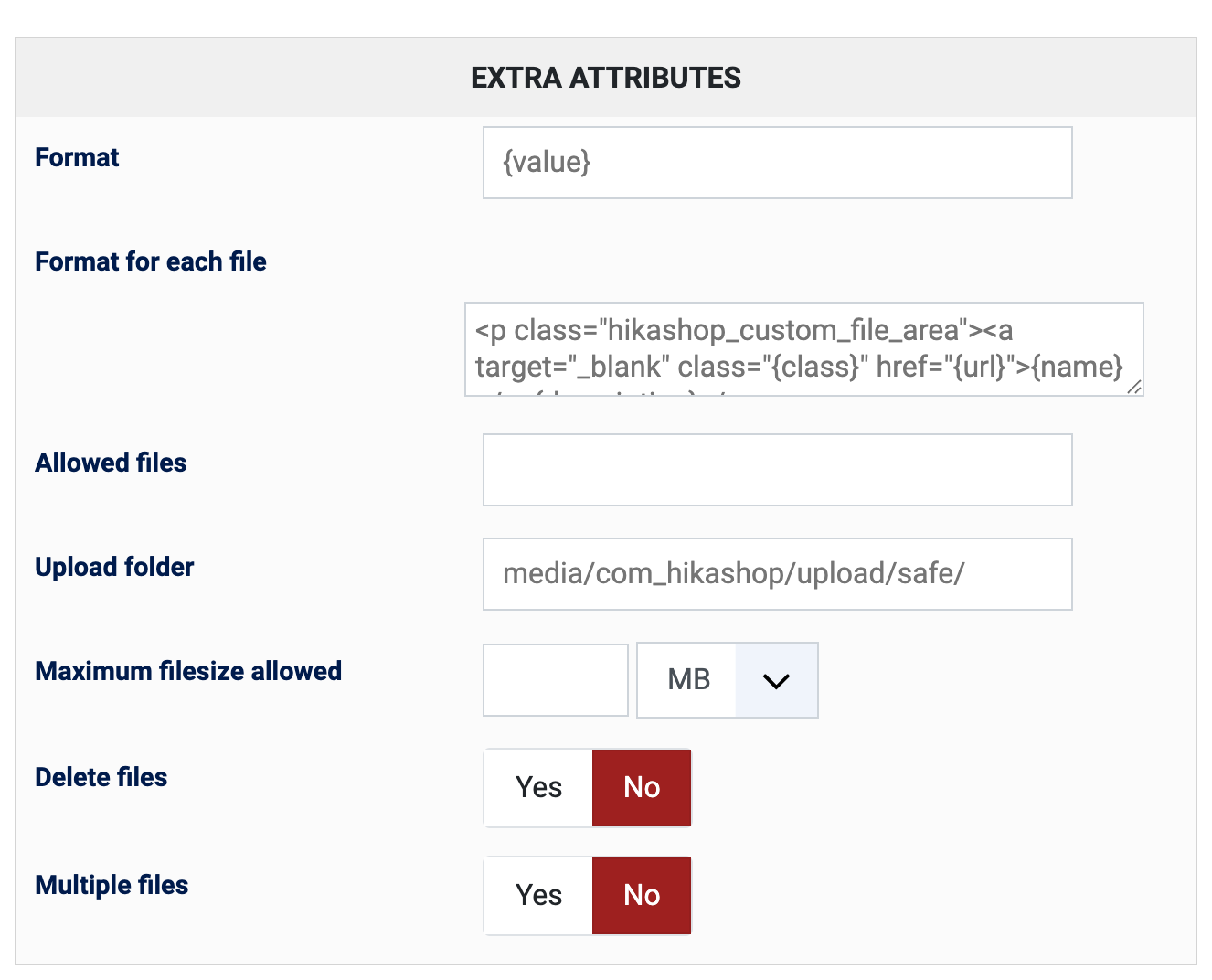
- Allowed files : If left empty, your custom field will only allow the upload of files with the extension listed in corresponding setting of the HikaShop configuration, under the Files section. This setting here can allow you to override that setting for the current custom field.
- Upload folder : If left empty, the custom field will use the upload secure folder configured in the HikaShop configuration. This setting can allow you to upload the files in another folder.
- Maximum filesize allowed : Here you can enter the maximum file size allowed for that custom field.
- Thumbnails dimensions.: For "ajax image" custom fields, you can define here the size of the thumbnail which will be generated when displaying the images of the uploaded images (not in the uploader interface but later on, for example on the listing of orders in the backend for a custom order field where the upload is done on the checkout)
- Maximum dimensions allowed : This allows you to restrict the width and length of the images being uploaded. Bigger images will be automatically resized.
- Delete files : When you delete an element with files uploaded to a custom field of that element, if this option is activated, the system will automatically delete the corresponding files in the upload folder (and their thumbnails if it's an ajax image custom field)
- Multiple files : When activated the user can upload several files to the custom field instead of just one.
Date picker options
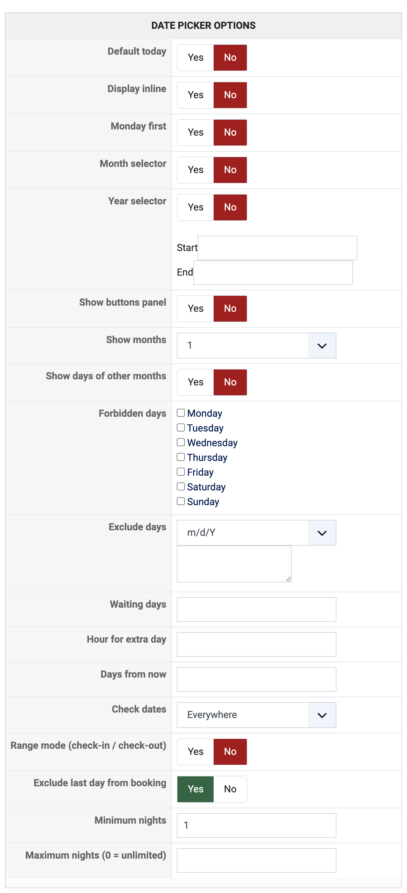
- Default today : If activated, the current day will be preselected as default value.
- Display inline : If activated, the calendar will display directly on the page without an input field. If turned off, an input field will display when a calendar button the customer can click on to open the calendar to select a date.
- Monday first : If turned off, Sunday will be the first day of the week in the calendar.
- Month selector : If activated, a dropdown will be displayed in the calendar to select the month. That way, the customer won't have to click many times on the "next" / "previous" arrows to change the month of the calendar.
- Year selector : If activated, a dropdown will be displayed in the calendar to select the year. That way, the customer won't have to click many times on the "next" / "previous" arrows to change the month and then the year of the calendar. When that option is activated, the input fields below allow you to restrict the selectable range of years.
- Show buttons panel : Adds a "today" and a "done" button to the calendar. It can be useful when the user goes far from the date and wants to easily go back to the current month calendar.
- Show months : Here you can configure the number of months to display the calendar for (without having to move to the next month, etc). By default, it is set to 1 so that you only see 1 month at a time and that's what people normally use.
- Show days of other months : When activated, the calendar will displays the days of the previous month and next month so that each week fills completely their row.
- Forbidden days : Here you can restrict days of the week (for example if you want the user to select a delivery date but you don't want him to select Sundays or Saturdays).
- Exclude days : Here you can exclude specific dates so that the customer cannot select them. This is useful for delivery date selectors when you don't want the customers to select public holidays, for example. Enter one date per line, using the format selected in the "Exclude days format" setting below. You can also use date ranges with a dash (e.g., 1/1-1/3 to exclude January 1st to 3rd).
You can use the wildcard character * in any position to create recurring patterns:- 4/5/* - Exclude April 5th every year (e.g., for a recurring holiday)
- */2/* - Exclude all days in February, every year
- */2/2026 - Exclude all days in February 2026 only
- 4/*/2026 - Exclude all days in April 2026
- 4/*/* - Exclude all days in April, every year
- Exclude days format : Defines the format used for the "Exclude days" dates above. "m/d/Y" means month/day/year (US format), "d/m/Y" means day/month/year (European format). This only affects how you enter dates in the exclude setting, not how the calendar is displayed to the customer.
- Waiting days : This can be useful for delivery date selectors so that you don't allow the user to select a date too close to his purchase so that you have the time to prepare his order and ship it to him.
- Hour for extra day : This works in conjunction with the previous setting. It will add an extra waiting day when the hour of the current day is past a certain point. For example, if set to 14:00 and the customer visits the page at 15:00, one extra waiting day is added.
- Days from now : Limits how far in the future (or past, depending on the "allow" setting) the customer can select a date. For example, setting this to 30 means the customer can only select dates within the next 30 days.
- Check dates : Controls where the date restrictions (waiting days, excluded days, etc.) are enforced. "Everywhere" means both frontend and backend. "Frontend only" means restrictions are only applied on the frontend, allowing administrators to select any date in the backend.
- Range mode (check-in / check-out) : Turns the field into a stay rather than a date: the customer picks an arrival and a departure, and both are stored. Useful for a booking.
- Exclude last day from booking : In range mode, whether the departure day itself counts as booked. Off means the customer leaves that morning and the day is free for the next one, which is how nights are usually counted. On by default.
- Minimum nights : In range mode, the shortest stay the customer may choose.
- Maximum nights (0 = unlimited) : In range mode, the longest one.
Display
Generic
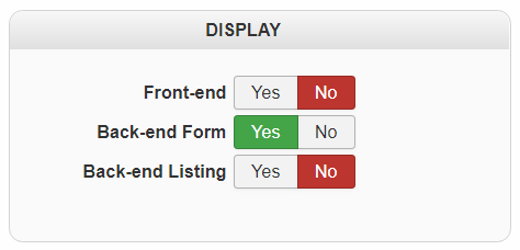
Address
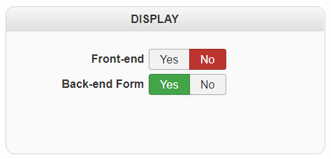
Item
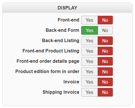
Order
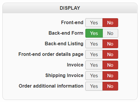
Product
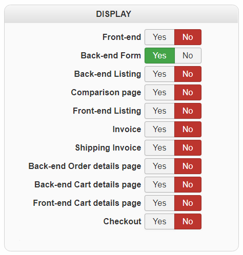
This part will able you to define where you want to display your Custom field, among several options. Note : Available display options will be different from Custom field type you are editing.
- Front-end
- Back-end form
- Back-end Listing
- Front-end Listing
- Front-end Product Listing
- Comparison page
- Front-end order details page
- Product edition form in order
- Invoice
- Shipping invoice
- Order additional information
- Back-end Order details page
- Own tab (tabular layout)
- Back-end Cart details page
- Front-end Cart details page
- Checkout
Preview
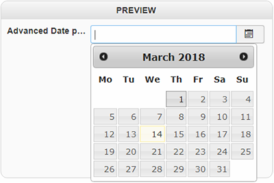
The preview part's aim is to show from the back-end how will be display and even works your custom field. Here, an example for the Advanced date picker :
Extra display options
Display : mail
This part will only be available for Order, Product and Item type.
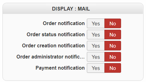
Here you will define where you want display your custom field :
- Order notification
- Order status notification
- Order creation notification
- Order administrator notification
- Payment notification
Display : cart
This part will only be available for Item type.
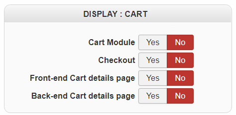
Same idea than previous part, these options will allow you to choose where display your custom field.
- Cart Module
- Checkout
- Cart product edition
- Front-end Cart details page
- Back-end Cart details page
- Details
- Written by: Administrator
- Category: HikaShop
- Hits: 11267
|
|

Description
This screen enables you to edit the custom override of HikaShop views. As you may know, HikaShop is an Open Source software thus all the code can be modified by the end-user. Moreover, it uses the standard Joomla MCV which means that you can override any view of HikaShop within your template. The big advantage of that over directly modifying HikaShop's code is that when you update HikaShop you won't lose any of your modifications and you won't have to reapply them. You can know more about that procedure on the Joomla documentation wiki: http://docs.joomla.org/How_to_override_the_output_from_the_Joomla!_core
We decided to go on step further and provide you with an interface to customize HikaShop's views so that it becomes even easier for you to customize HikaShop to your needs.
Toolbar

- Save : Save the custom view and return to the custom views Management screen.
- Apply : Apply the modifications to the custom view and stay on the same screen.
- Cancel : Return to the previous screen without saving the modifications.
- Help : This button enables you to turn ON/OFF the help section, this screen will appear or disappear.
View
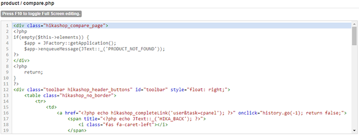
You will be able to edit the code of the view in this text area. Depending on the view, you will have a lot of HTML or a lot of PHP or a mix of both. You might also have some javascript or some CSS here and there. Note that once you save the view, even without changing anything in the code, the override file will be created. You will be able to easily remove it by clicking on the delete button on the listing of views under the "remove customization" column.
Below, you can see the code for one of the address templates. The address templates are quite special as they use a mix of tags and PHP. That will enable you to easily define a different look for the addresses of your shop without being too difficult to modify but at the same time allowing you a lot of flexibility.
Furthermore, for some view files, you'll find an input box at the top where you can change the name of the file. This will allow you to create new layouts (for example for the product page layout selector) by simply changing the name and saving the file.
Finally, if you get an error when saving a view file, the problem probably comes from a security extension of your website or of your hosting. You'll have to contact the developers of that extension or your hosting company so that they can provide a fix. And as an alternative, you can use the Joomla template view override interface
Tutorial
As you'll see, there are many view files you can customize and it can be overwhelming when you first arrive here. So that's why we've written a tutorial to guide you on what file to edit based on what you want to change. You'll find it on this page
- Details
- Written by: Administrator
- Category: HikaShop
- Hits: 36166
|
|
Description
This screen enables you to edit the content module instances. HikaShop introduces a new way of creating and tweaking the front end of your store by integrated with joomla as much as possible. Using a generic content module, which is installed by default in HikaShop, you will be able to create new instances of it, enabling you to display products or categories using lots of options. You will be able to create a module showing related products to the currently displayed product, or products in the same categories. You will be able to display a list of the main product categories of your store in another module so that customers can jump to them directly from wherever in your store. Or you might want to display 5 random products in all the categories and subcategories of the currently displayed category or a default category and its subcategories, if the user is not displaying a category page.
On top of that, you will not only be able to define the content to display, but also the way to display it with options related to the display: using a list type display or a div type, setting a number of columns, displaying prices or not, etc. Finally, you will be able you include those modules in your Joomla template, as any Joomla module, or under the product page (for related products for instance) or under a category or product listing page accessed via a Joomla menu.
You will also be able to configure the cart module which uses the same interfaces as it has a lot of common options with the content module.
Note also that you can customize any view, even the content module views thanks to the views management screen so that if you need a special behavior which is not possible by default, you can always customize the view, even though it will require you to know a bit of PHP and HTML.
Toolbar

- Joomla module options : Go to the Joomla options of the module. It will be handy for positioning the module and set restrictions of access on the module thanks to the standard Joomla module options. If you are creating a new module instance, this button will be hidden.
- Save : Save the content module instance and return to the content module instances Management screen.
- Apply : Apply the modifications to the content module instance and stay on the same screen.
- Cancel : Return to the previous screen without saving the modifications.
- Help : This button enables you to turn ON/OFF the help section, this screen will appear or disappear.
Details
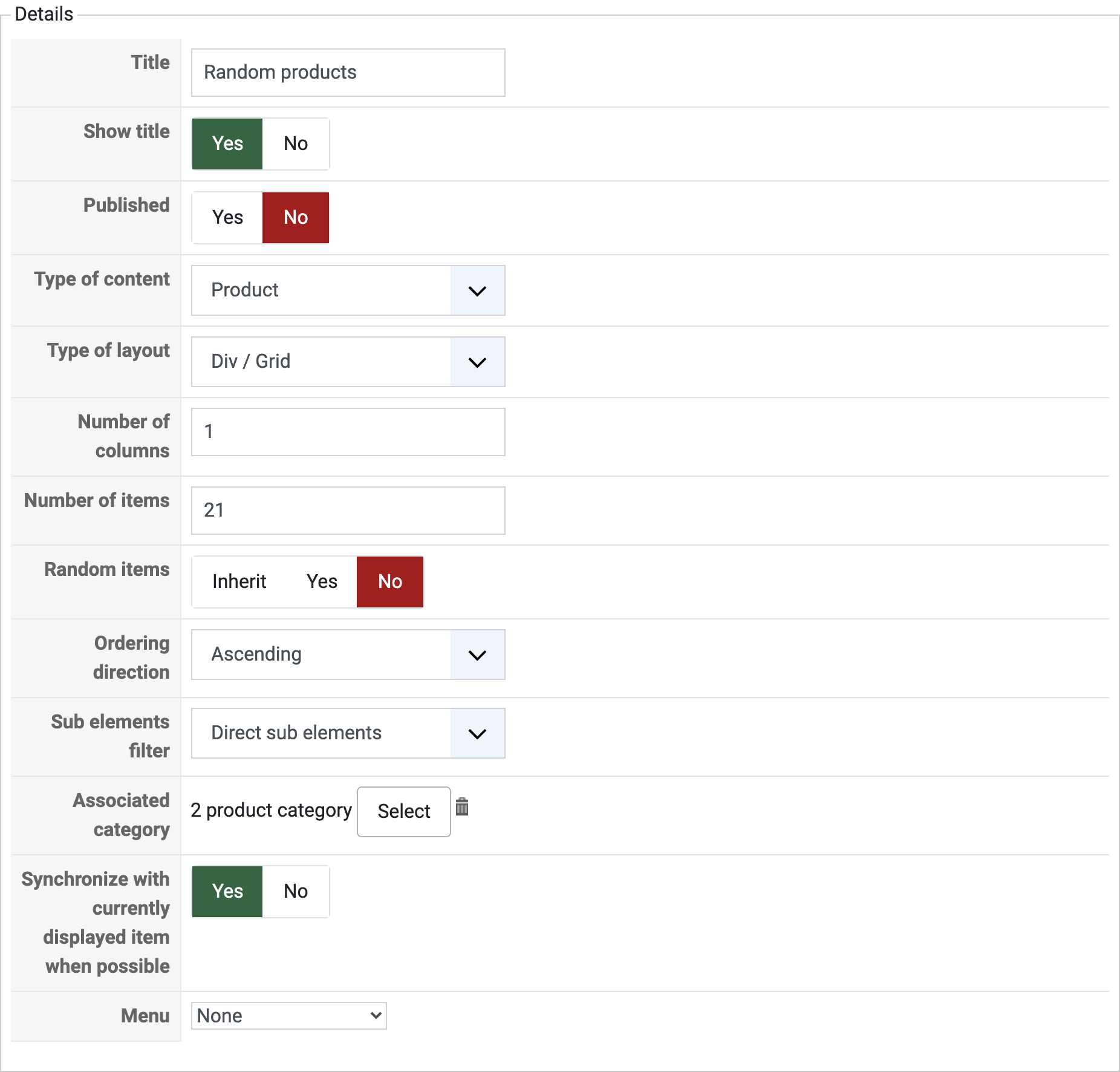
- Title : The title of the module. That is the same option as the one in the Joomla options.
- Show title : You can display the module title or not with this option.
- Published : If a content module instance is published it means that it will be displayed by Joomla on the position you set for it in your template. Note that HikaShop won't take into account this parameter so you can still display module instances which are unpublished at the bottom of your categories or products listing accessed via a menu.
- Type of content : You can select what content to display in the module : products or categories. Based on your choice, different options will be displayed to you on the right part of the screen.
- Type of layout : You can select how to display the content in the module : using DIVs or lists. Based on your choice, different options will be displayed to you on the right part of the screen.
- Number of columns : The numbers of columns in your module to display your content items in. For a left or right module, you will usually set only 1 column. For modules under the main content or with an horizontal display you will want to set several columns.
- Number of items : The maximum number of items to display. If you have three columns set and you limit the items to 6, it means that you will have 2 rows of three items each.
- Random items: The displayed items will be selected randomly.
- Ordering direction : You can set a direction for the ordering. For example, if you are loading categories based on their category_created column, if you set the direction to ascending, you will always get the firstly added sub categories displayed in the module, where if you set the direction to descending, you will always get the latest created categories displayed.
- Sub elements filter : For categories, you can choose to only display direct sub categories of the current category or all sub categories regardless of their depth. For products, you choose to only display products in the current category or in all the sub categories of the current category regardless of their depth.
- Associated category : You can select a static category here. If you synchronize your module this parameter won't be used when the module is displayed on a page where it can synchronize with the category displayed, but it will still use it otherwise. If you don't synchronize your module, it will always use this category as the start point for the data gathering. When you click on the select button, a popup will open to enable you to choose among the categories of your store. You can also click on the delete button to remove the parent category. IF you don't set any, the main "product categories" will be used as starting point of the data load.
- Synchronize with currently displayed item when possible : This option will define in which categories to pick items from.
- For categories, when synchronized :
- On the product page, it will display categories based on the product categories. If the product isn't linked to any category, it will be based on the parent category option.
- On a category listing page, it will be based on the current category.
- On other pages, it will be based on the parent category.
- On the product page, it will display categories based on the product categories. If the product isn't linked to any category, it will be based on the parent category option.
- For products, when synchronized :
- On the product page, it will depend on the option "Content on product page".
- On a category listing page, it will be based on the current category.
- On other pages, it will be based on the parent category.
- For categories or products, when not synchronized, it will always be based on the parent category.
- For categories, when synchronized :
- Menu : By default, the links of a HikaShop content module will go to a page displaying the listing to sub elements (products or categories). This page won't have any content configuration attributed unless you choose here a HikaShop Joomla menu here where you will be able to configure its options and thus add there a listing of products, etc.
If you are editing the cart module, you will find slightly different options :
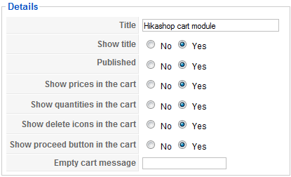
- Title : The title of the module. That is the same option as the one in the Joomla options.
- Show title : You can display the module title or not with this option.
- Published : If the cart module is published it means that it will be displayed by Joomla on the position you set for it in your template.
- Mini cart : Reduces the module to the total amount, without listing the products in it. The settings below, which say what to show for each product, then have nothing to act on. On a wishlist module the same setting reads "Mini wishlist".
- Display image in cart : Shows the picture of each product next to its line in the cart.
- Show proceed button in the cart : Shows the button which takes your customer to the checkout.
- Show products name in the cart : Shows the name of each product. Turned off, the cart is reduced to its quantities and its total, which is what a small module in a corner of the page wants.
- Show quantities in the cart : Shows how many of each product are in the cart.
- Show delete icons in the cart : Lets your customers remove a product from the cart without going to the cart page.
- Show coupon in the cart : Shows the coupon field, so that a code can be entered without leaving the page.
- Show shipping in the cart : Shows the shipping cost on its own line in the totals.
- Empty cart message override : Replaces the message displayed when the cart is empty with your own.
- Itemid for the 'Show the wishlist' button redirect : The menu item the wishlist button leads to, so that the wishlist opens on the page you meant rather than wherever HikaShop can find one.
Those settings say what the cart module lists. The rest of its appearance, the picture of its icon, whether it opens as a drawer and on which side, whether it opens by itself when something is added, the padding around it and whether it shows prices, taxes and payment, belongs to the cart module itself and is set on its own options screen rather than here.
Product options
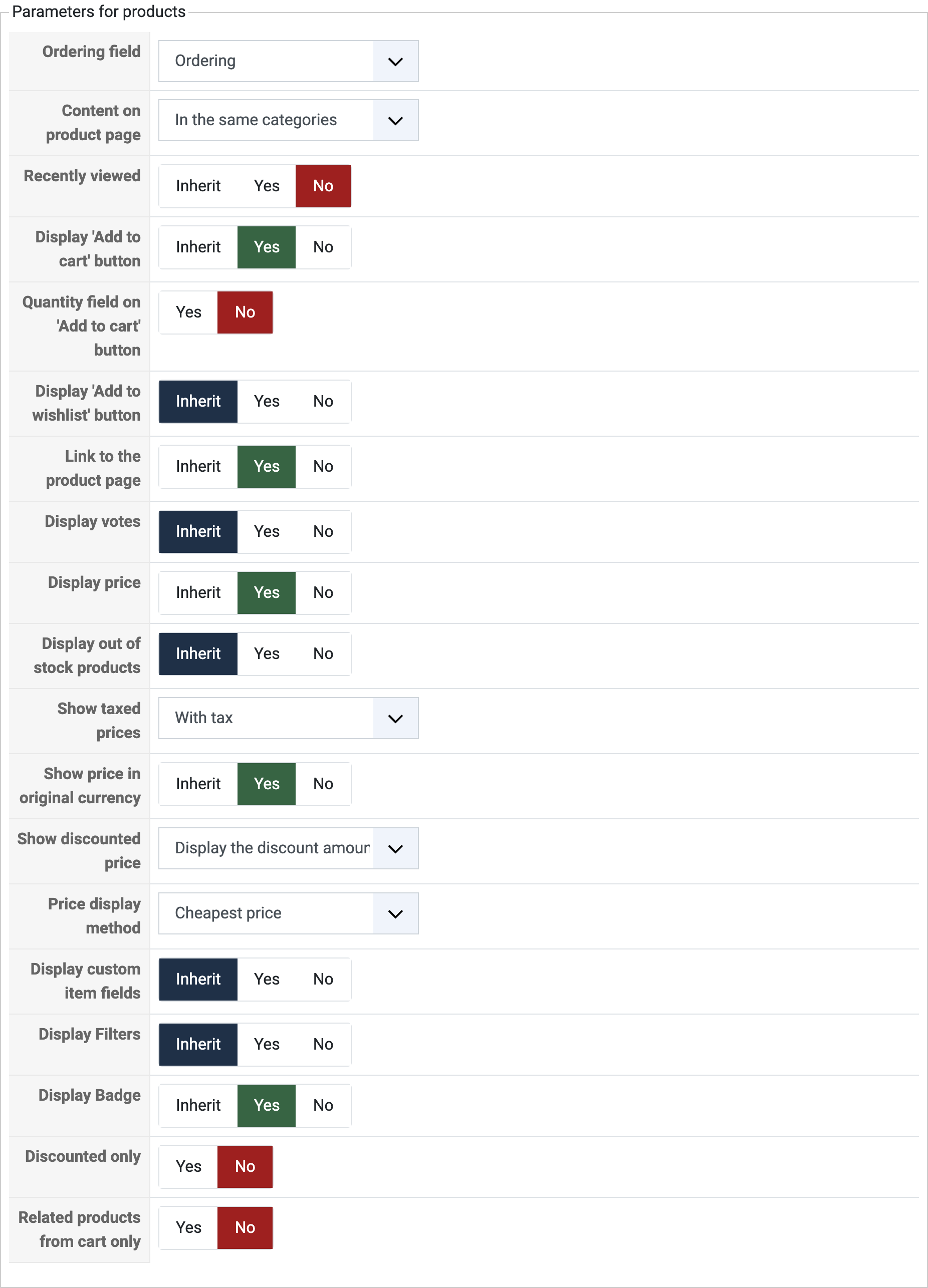
- Ordering field : You can select a field on which the products will be ordered. By default the products will be ordered using the ordering field which enables you to set a specific order of display between all the products directly linked to a category.
- Content on product page : This field will only be useful if you set the synchronization on in the left part of the screen.
- Recently viewed: If you want, you can have your recently viewed products selected in all the products matching the options.
- Display 'Add to cart' button : If you want, you can add an "add to cart" button under each product so that your customers won't have to go to the product details page to add a product to the cart.
- Quantity field on 'Add to cart' button : Adds the quantity box next to the add to cart button, so that a customer can take several without opening the product.
- Display 'Add to wishlist' button : If you want, you can add an "add to wishlist" button under each product so that your customers won't have to go to the product details page to add a product to the wishlist.
- Link to the product page : You can choose to disable the links to the product page (really useful in combination with the option above).
- Display votes: Enable or disable the votes for the products displayed by this module.
- Display price : You can choose to display or not the prices of products in the module.
- Show taxed prices : This option enables you to display either the prices without taxes, or the prices with taxes, or both.
- Show price in original currency : Based on how you configured your store, HikaShop might have to convert prices dynamically. When doing so, it can add the original price to the converted price.
- Show discounted price : If HikaShop needs to apply discounts to the prices displayed in the module, it can also show the price before the discount was applied as an incentive for your customers to buy the products.
- Price display method : When you have several prices in the same currency for the same product, the system needs to decide what to display. That will be the case for prices based on the quantity. Show you will either be able to display the lowest of all the prices, or display the price for buying only one item, or the lowest and highest prices as a range of prices.
- Display out of stock products : Whether the products with no stock left appear in the module at all.
- Display Filters : Shows the filters you configured above the listing the module displays.
- Display Badge : Shows the badges of a product, the "new" or "sale" markers you set on it.
- Discounted only : Keeps the module to the products which carry a discount, which is what a "current offers" module is.
- Related products from cart only : For a module displaying related products, takes them from what is already in the cart rather than from the product being looked at.
- Display custom item fields: Select if you want to display the custom item fields in the products of this module.
If you are editing the cart module, you will find slightly different options :
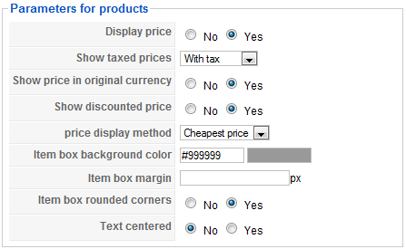
- Display price : You can choose to display or not the prices of products in the module.
- Show taxed prices : This option enables you to display either the prices without taxes, or the prices with taxes, or both.
- Show price in original currency : Based on how you configured your store, HikaShop might have to convert prices dynamically. When doing so, it can add the original price to the converted price.
- Show discounted price : If HikaShop needs to apply discounts to the prices displayed in the module, it can also show the price before the discount was applied as an incentive for your customers to buy the products.
- Price display method : When you have several prices in the same currency for the same product, the system needs to decide what to display. That will be the case for prices based on the quantity. Show you will either be able to display the lowest of all the prices, or display the price for buying only one item, or the lowest and highest prices as a range of prices.
- The option below will be useful only for defining the buttons style of the cart if you set in the configuration to display them as rounded :
- Item box background color : The color of the button.
- Item box margin : The margin of the button.
- Item box border: Display or not a border around your item.
- Item box rounded corners : Set it to yes if you want your button to have rounded corners.
- Text centered : Set it to yes if you want the text inside the button to be centered.
- UL class name : A CSS class added to the list the module writes, for when your template needs one to style it.
- Display in simplelist (ul/li) : Writes the items as a plain list rather than in the grid HikaShop normally builds, which is what a menu-like module wants.
- Item box background color : The color of the button.
Category options
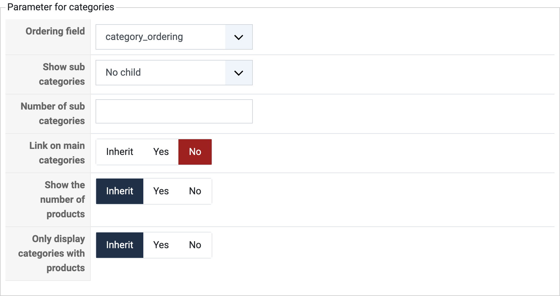
- Ordering field : You can select a field on which the categories will be ordered. By default the categories will be ordered using the category_ordering field which enables you to set a specific order of display between all the sub categories of a category.
- Show sub categories : This field will only be useful if you display categories with a list. It will enable you to display subcategories under each category displayed in the listing.
- Number of sub categories : You will be able to restrict the sub categories to only a certain number in order to avoid having too much of them displayed.
- Link on main categories : This option enables you to activate the links on the main categories displayed by the module when displaying it in list layout with the "show sub categories" option turned on.
- Show the number of products: You can display or not the number of products contained in the categories listing.
- Only display categories with products: Select if you want to show the empty categories.
DIV options
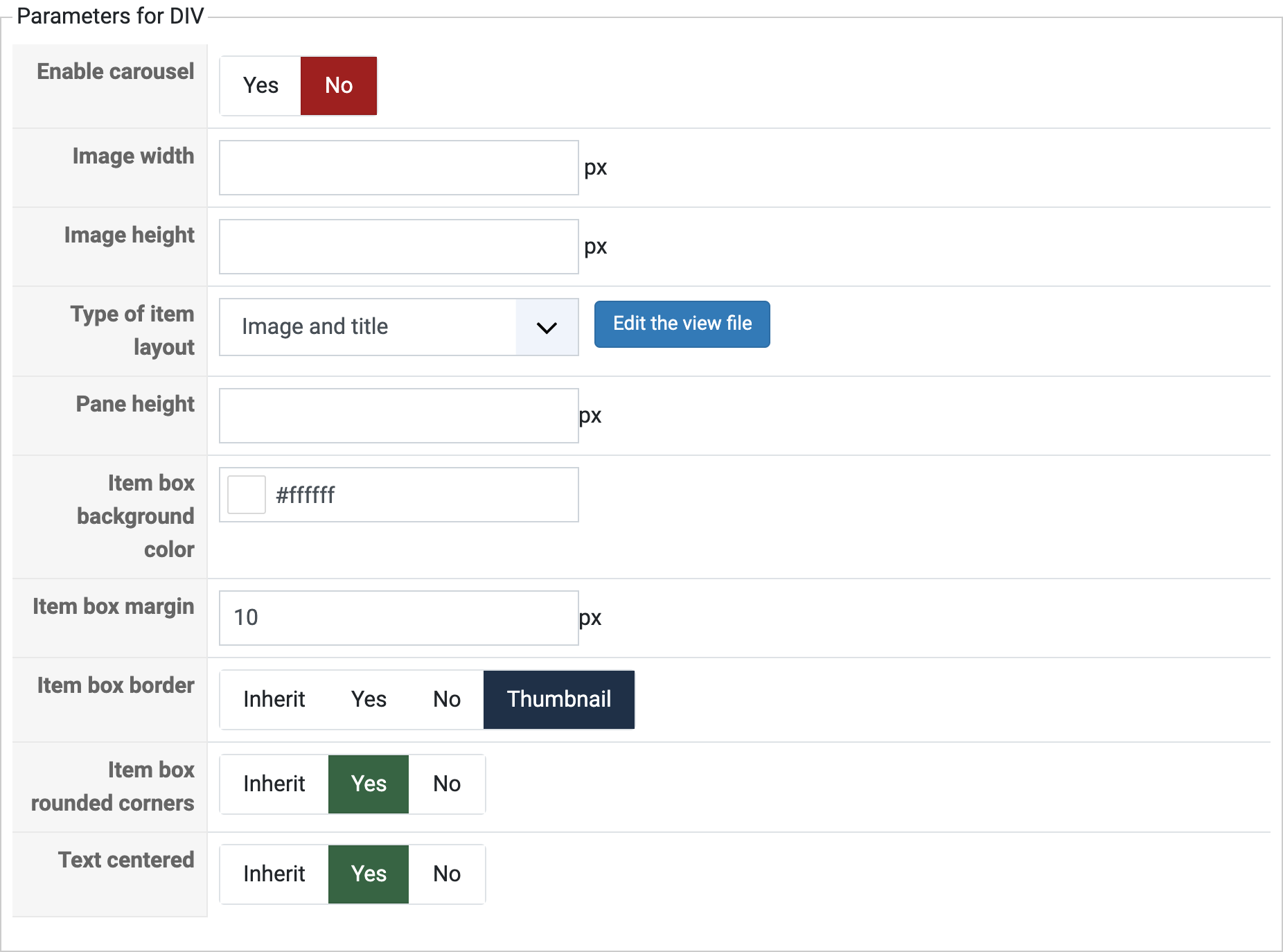
- Enable carousel: This option is only available in Hikashop Business. You can choose here to enable or not the carousel. If you activate this option, a lot of parameters will appear in order to configure the carousel. You can see different examples of carousels on the Hikashop demo website.
- Type of carousel effect: Select an effect between slide and fade to animate your carousel.
- Slide direction: The direction of your carousel transition. This parameter will also define the arrows position (For example if you select a Fade effect).
- Transition effect: This option is displayed only if you have selected a slide effect. This parameter will define the evolution of the speed of your transition. For example, if you choose "Linear", the slide speed will be constant.
- Carousel effect duration: Define here the duration of your effect (in ms).
- Product per slide: This parameter allows you to define the number of products per slide in your carousel. This option can be used with the number of columns option to organize your items like you want.
- Slide one by one: This option is only used if you have selected a slide effect. With this option you can choose to make your carousel slide product by product. If your carousel is multi-dimensional (2 columns to display 4 products), the slide will be column by column or line by line.
- Auto-slide: If this option is enabled, your carousel will slide automatically when the page is loaded.
- Time between two auto-slide: Specify here the duration between two auto-slides. Note that this duration includes the effect duration. So, if you specify the same duration for the auto-slide and for the effect duration, your carousel will slide without stopping (in this case, you need a "Linear" transition for a better result).
- Pagination type: Select here the kind of pagination you want to display.
- Thumbnail width : If you have chosen a thumbnail pagination, you can determine here the dimension of these thumbnails.
- Thumbnail height : The height of those thumbnails.
- Pagination: Select here the position of your pagination.
- Display carousel button: If this option is enabled, the arrows to slide manually be displayed.
- Image width : With this option, you can specify the dimensions of the displayed items. Note that if one the parameters is empty, the other one will be automatically calculated to get the best result possible.
- Image height : The height of those images.
- Type of item layout: You can select a template which will be used for each item display. You will be able to customize them in the views management screen ( front end, category or product views, listing_* layouts ). You can also create new ones by adding new files (listing_*) to the front end category/product tmpl folder as standard joomla views and they will be automatically available here. Note that if you have Hikashop Business you have three more layouts with effect that you can choose here.
- Item effect transition: Only if you have selected vertical_slider or horizontal_slider as layout. Just like for the carousel, choose here the transition type.
- Item effect duration: Only if you have selected vertical_slider or horizontal_slider as layout. Specify here the duration of the effect.
- Pane height : The height of the area the items are displayed in, which is what keeps a carousel from changing height as it slides.
- Item box background color : The color of each item box.
- Item box margin : The margin of each item box.
- Item box rounded corners : Set it to yes if you want each item box to have rounded corners.
- Text centered : Set it to yes if you want the text inside each item box to be centered.
- Details
- Written by: Administrator
- Category: HikaShop
- Hits: 16925
|
|
Description
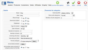
This screen enables you to edit the content module instances. Basically, it is only used for categories listing menus or products listing menus. Those are standard Joomla menus so that you can access them via the Joomla menu interface as usual.
Toolbar

- Joomla menu options : Go to the Joomla options of the menu. It will be handy for setting restrictions of access on the menu thanks to the standard Joomla menu options. If you are creating a new menu, this button will be hidden.
- Save : Save the content menu and return to the content menus Management screen.
- Apply : Apply the modifications to the content menu and stay on the same screen.
- Cancel : Return to the previous screen without saving the modifications.
- Help : This button enables you to turn ON/OFF the help section, this screen will appear or disappear.
Details
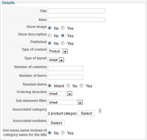
- Title : The name of the menu. That is the same option as the one in the Joomla options.
- Alias : The alias of the menu. That is the same option as the one in the Joomla options.
- Show image : Show the image of the category.
- Show description : Show the description of the category.
- Published : If a content menu is published it means that it will be displayed by Joomla.
- Type of content : You can select what content to display when clicking on the menu : products or categories. Based on your choice, different options will be displayed to you on the right part of the screen.
- Type of layout : You can select how to display the content : using DIVs or lists. Based on your choice, different options will be displayed to you on the right part of the screen.
- Number of columns : The numbers of columns to display your content items in. You will usually want to set several columns.
- Number of items : The maximum number of items to display. If you have three columns set and you limit the items to 6, it means that you will have 2 rows of three items each.
- Random items : If you want, you can have your products randomly selected in all the products matching the options. That is useful when you have more items possible than what you are displaying. This will first fetch all the ids of the possible products, select randomly some ids based on the number of items to be displayed, and then retrieving their full data.
- Ordering direction : You can set a direction for the ordering. For example, if you are loading categories based on their category_created column, if you set the direction to ascending, you will always get the firstly added sub categories displayed, where if you set the direction to descending, you will always get the latest created categories displayed.
- Sub elements filters : For categories, you can choose to only display direct sub categories of the current category or all sub categories regardless of their depth. For products, you choose to only display products in the current category or in all the sub categories of the current category regardless of their depth.
- Parent category : You can select a static category here. The sub categories or products linked to it will be displayed accordingly.
- Associated modules : You can choose a list of modules to display below the main content. It can be useful to have a module displaying products and synchronized attached to a category type menu so that you can display a listing of the products in the categories below.
- Use menu name instead of category name for the title : The label speaks for itself.
Product options
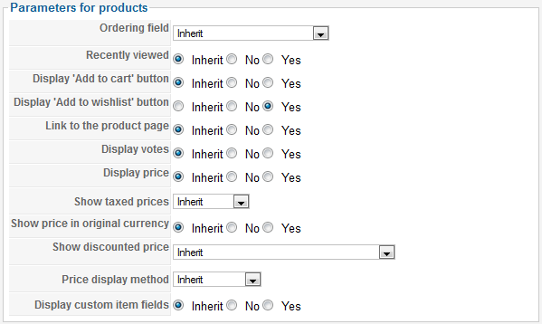
- Ordering field : You can select a field on which the products will be ordered. By default the products will be ordered using the ordering field which enables you to set a specific order of display of between all the products directly linked to a category.
- Recently viewed: If you want, you can have your recently viewed products selected in all the products matching the options.
- Display add to cart button: Enable or disable the add to cart button for the products result of this menu.
- Display add to wishlist button: Enable or disable the add to wishlist button for the products result of this menu.
- Link to the product page: Add a link on the product name in the product listing.
- Display votes: Enable or disable the votes for the products displayed by this menu.
- Display price : You can choose to display or not the prices of products.
- Show taxed prices : This option enables you to display either the prices without taxes, or the prices with taxes, or both.
- Show price in original currency : Based on how you configured your store, HikaShop might have to convert prices dynamically. When doing so, it can add the original price to the converted price.
- Show discounted price : If HikaShop needs to apply discounts to the prices displayed, it can also show the price before the discount was applied as an incentive for your customers to buy the products.
- Price display method : When you have several prices in the same currency for the same product, the system needs to decide what to display. That will be the case for prices based on the quantity. So you will either be able to display the lowest of all the prices, or display the price for buying only one item, or the lowest and highest prices as a range of prices.
- Display custom item fields: Choose if you want to display or not the product custom fields.
Category options
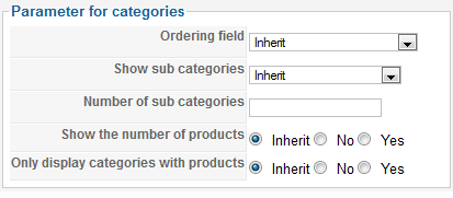
- Ordering field : You can select a field on which the categories will be ordered. By default the categories will be ordered using the category_ordering field which enables you to set a specific order of display between all the sub categories of a category.
- Show sub categories : This field will only be useful if you display categories with a list. It will enable you to display subcategories under each category displayed in the listing.
- Number of sub categories : You will be able to restrict the sub categories to only a certain number in order to avoid having too much of them displayed.
- Show the number of products: You can display or not the number of products contained in the categories listing.
- Only display categories with products: Select if you want to show the empty categories.
DIV options
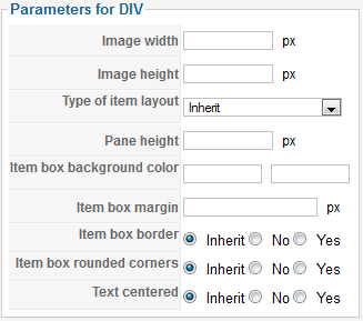
- Image width/height: With this option, you can specify the dimensions of the displayed items. Note that if one the parameters is empty, the other one will be automatically calculated to get the best result possible.
- Type of item layout: You can select a template which will be used for each item display. You will be able to customize them in the views management screen ( front end, category or product views, listing_* layouts ). You can also create new ones by adding new files (listing_*) to the front end category/product tmpl folder as standard joomla views and they will be automatically available here. Note that if you have Hikashop Business you have three more layouts with effect that you can choose here.
- Pane height: Set here the height of the pane.
- Item effect transition: Only if you have selected vertical_slider or horizontal_slider as layout. Just like for the carousel, choose here the transition type.
- Item effect duration: Only if you have selected vertical_slider or horizontal_slider as layout. Specify here the duration of the effect.
- Item box border: Display or not a border around your item.
- Item box background color : The color of each item box.
- Item box margin : The margin of each item box.
- Item box rounded corners : Set it to yes if you want each item box to have rounded corners.
- Text centered : Set it to yes if you want the text inside each item box to be centered.
- Details
- Written by: Administrator
- Category: HikaShop
- Hits: 21703
|
|
Description
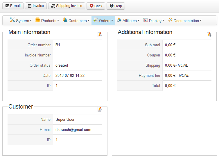
This screen enables you to edit an order. When a client confirms his order at the end of the checkout process the cart product list as well as all the information the customer entered during the checkout process is saved into a new order and the cart information is deleted. From this point in time, whether you change a product price, a discount price, or that the customer changes his addresses on his user account interface, it won't affect the order. You can however change manually the order information and optionally notify the customer of the change using this screen.
Toolbar

Yes, there is no save button in the toolbar, and that's normal. In the edit screen of an order, when you try to modify something, a popup will be displayed for you to input the new data also enabling you to send a notification to the customer and recording information about the modification like your IP address.
- E-mail : If you click on this button, you will be able to send an email to the customer of the order from the popup which will be displayed.
- Invoice : After clicking on this button, a popup will open with the invoice of the order displayed. An additional print icon will be available for you to print it.
- Shipping invoice : After clicking on this button, a popup will open with the shipping invoice of the order displayed. An additional print icon will be available for you to print it.
- Cancel : Return to the previous screen.
- Help : This button enables you to turn ON/OFF the help section, this screen will appear or disappear.
Main information
This area displays the most important information on the order. With the ability, like on the orders listing to change the order status via a popup.
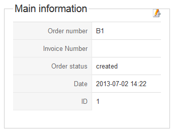
- Order number : This order number is generated from the id of the order. It will be useful for the communication with your customers over their orders.
- Invoice number : This invoice number is generated from the id of the invoice.
- Order status : The status of an order is an important parameter which enables you to follow an order during its life cycle, from its creation to its shipping. Once you changed it, a popup will open asking you more information about why you are changing it (great for later reference). If you want to notify the customer of the change, a notification email interface will also be displayed in that popup.
- Date : The date when the order was made.
- ID : This field indicates the ID of the order.
Additional Information
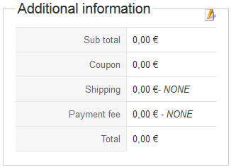
- Sub total : The sum of the prices of products including taxes without the coupon and shipping added.
- Coupon : The coupon value along with the code used for the customer. You can edit both by clicking on the edit icon. A popup will open asking you more information about why you are changing it (great for later reference). If you want to notify the customer of the change, a notification email interface will also be displayed in that popup.
- Shipping : The shipping price along with the shipping method selected by the customer. If you click on the edit icon you will be able to change the price. If you change the shipping method, a popup will open asking you more information about why you are changing it (great for later reference) and the new price. If you want to notify the customer of the change, a notification email interface will also be displayed in that popup. Note that if the order doesn't contain any tangible goods or that you removed the shipping view from the workflow of the checkout process, the customer will not be prompted to select a shipping method and the dropdown won't be visible.
- Payment fee: The payment fee price along with the payment method selected by the customer. If you click on the edit icon you will be able to change the price. If you change the payment method, a popup will open asking you more information about why you are changing it (great for later reference) and the new price. If you want to notify the customer of the change, a notification email interface will also be displayed in that popup. Note that if the order doesn't contain any tangible goods or that you removed the payment view from the workflow of the checkout process, the customer will not be prompted to select a payment method and the dropdown won't be visible.
- Payment method : You will see here the name of the payment method selected by the customer during the checkout process. Once you changed it, a popup will open asking you more information about why you are changing it (great for later reference). If you want to notify the customer of the change, a notification email interface will also be displayed in that popup. Note that if you removed the payment view from the workflow of the checkout process, the customer will not be prompted to select a payment method and the dropdown won't be visible.
Customer
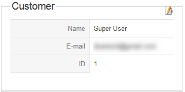
- Name : The name of the user account with which the order was made. The username will also be displayed in parenthesis
- E-mail : The email of the user account with which the order was made.
- ID : The email of the user account with which the order was made. If you click on the arrow icon, you will be transferred to the edit screen of the customer.
- IP : The IP of the computer from which the customer made the order. If you use one of our commercial versions and that you had the geolocation plugin activated while the customer made his order, you will see geolocation information based on this IP : the city, the state and the country of the user.
Partner information
Only if the customer who made the order came from one of your partners, this area will be displayed.
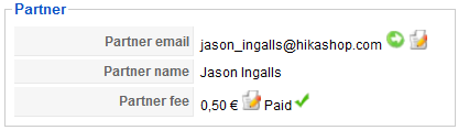
- Partner email : The partner email of the partner. If you click on the arrow icon, you will be transferred to the edit screen of the partner. If you click on the edit icon, you will be able to change the partner information of the order.
- Partner name : The name of the partner.
- Partner fee : The fee which will be paid to the partner accordingly to your affiliate program. If you click on the edit icon, you will be able to change the partner information of the order. After this edit icon, you will either see "paid" or "not paid". At first all the fees will be unpaid. But if you go to the partner edit screen and pay his fees, for all orders where this partner is involved, this fee status will be changed to "paid".
Billing and shipping information
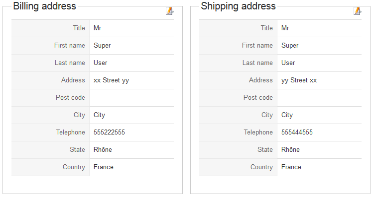
The billing and shipping addresses will be displayed along with an edit icon if they were filled by the customer (if you remove the address view from the checkout workflow they won't be asked to the user. Also, if the order does not contain any tangible goods, the shipping address won't be asked to the customer). When no address is found, a plus icon will be displayed so that you can always add a billing or a shipping address to an order without them.
Product list
When you update the product list, the subtotal and total price will be recalculated automatically.
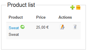
- Product : The name and code of the product.
- Files : Here you will see the list of files attached to a product and additional information about each file: Can the customer download it, the number of times he can still download it, the date until which he can download it, or the reason he can't download it. As you access this information from the back end, you will always be able to download the files.
- Unit price : The price of the product with VAT along with the VAT price.
- Quantity : The quantity bought for products.
- Price : The full price for the product : the price including the VAT times the quantity.
- Actions : Here you will find two icons. The edit icon in order to edit the information on a product of the order. And a delete icon to remove the product from the order. Note that it won't change or remove the product from your store but just change the information in the order.
Additionally, You have a plus icon in order to add a new entry in the product list. If you do so, the entry won't be linked to any product.
History
If the history plugin is activated, each time the order is modified, the modification will be recorded by the plugin. The history events will then be displayed here as an unmodifiable listing. If there are no history events for an order (it should not happen when the plugin is active as an event is recorded on creation), this listing won't be displayed.

- # : An indexing number automatically assigned for ease of reference.
- Type : The type of the event. For now it's either creation or modification.
- Order status : The order status after the modification.
- Reason : The reason for the modification (when you edit something in an order, you will be prompted for a reason.
- IP : The IP which triggered the modification.
- Date : The date of the modification.
- Information : This is currently not used, but it could be used in the future to display additional information.
Modification popup
When you try to modify some information on this screen, a modification popup will be displayed. The first part will either confirm your change or let you enter some new information. Then, you will have standard fields to specify a reason for the change and optionally send an email to the user about the modification. Only when you change the partner information, you won't have those standard fields.
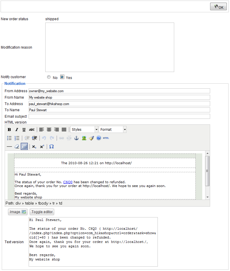
- OK button : Once you're done, you can validate the change by clicking on this button.
- New order status or other fields : This will either confirms your change or let you enter some new information
- Modification reason : You can write here the reason why you did the current modification. It can be really useful to know that when you go back to the order later. You will find it on the history listing on the order edit screen along with other information on the modification.
- Notify customer : If you choose to not notify the customer, you will see the notification options appear below where you can customize the email that will be sent to the user once the modification is applied to the order.
- From Name : That's the name displayed as sender information name when your customers read the email.
- From Address : That's the address displayed as sender information address when your customers read the email.
- To Name : That's your customer name which is automatically filled in.
- To Address : That's your customer email which is automatically filled in.
- Subject : The subject of the email. It will also be automatically filled in based on the configuration of the email.
- HTML version : The HTML version of the email. It will also be automatically filled in based on the configuration of the email.
- Text version : The text version of the email. It will also be automatically filled in based on the configuration of the email.